Activity
-

Sam McWilliams commented on Deborah Gillikin's Photo 4 years, 10 months ago
You’ve created so much movement and drama on the page. 🙂
-
Sam McWilliams commented on Pat Schiebold's Photo 4 years, 10 months ago
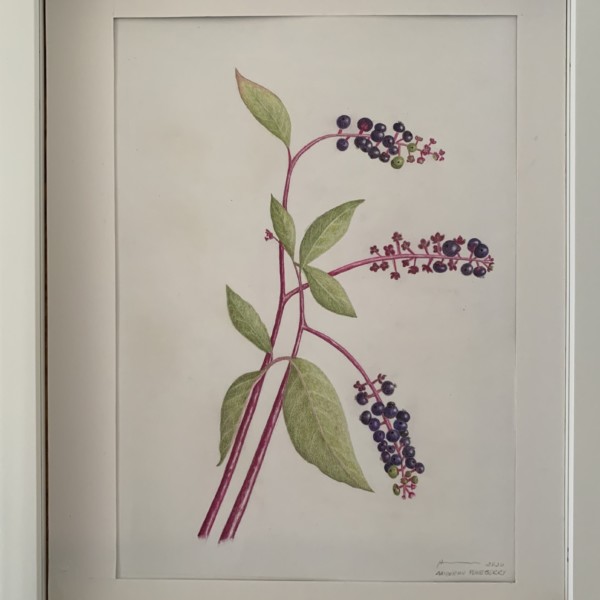
Lovely and elegant. You could work some more darks into your overlaps. Have those stems go a bit darker when behind leaves. Have your leaves achieve some more darks in certain areas, and always observe carefully how the stems connect. This is very pleasing to look at, this drawing. Watch out for stems starting at the same line like int he bottom…[Read more]
-
Sam McWilliams commented on Maureen Doram's Photo 4 years, 10 months ago
So nicely done, Maureen. Great to see you again today.
-

Pat Schiebold added 2 Photos 4 years, 10 months ago
-
What great drawing/painting. If you like, you can still tone the overall forms – ie give the cylinder/stem a shadow side so that a highlight emerges, and tone the overall sphere of the pumpkin. I love the curly-cues and the stem patterning, and the varieties of oranges. You could observe/work a bit more on the area where the stem meets the squash.…[Read more]
-
Lovely and elegant. You could work some more darks into your overlaps. Have those stems go a bit darker when behind leaves. Have your leaves achieve some more darks in certain areas, and always observe carefully how the stems connect. This is very pleasing to look at, this drawing. Watch out for stems starting at the same line like int he bottom…[Read more]
-
I implemented your 3 suggestions. They improved the finished project. Thank you
-
-
Maureen Doram commented on Maureen Doram's Photo 4 years, 10 months ago
@katylyness It took me awhile to really plunge into the centre of the paper, I would often avoid it but it happens a little more often now! Thanks for your comments!
-
Maureen Doram commented on Maureen Doram's Photo 4 years, 10 months ago
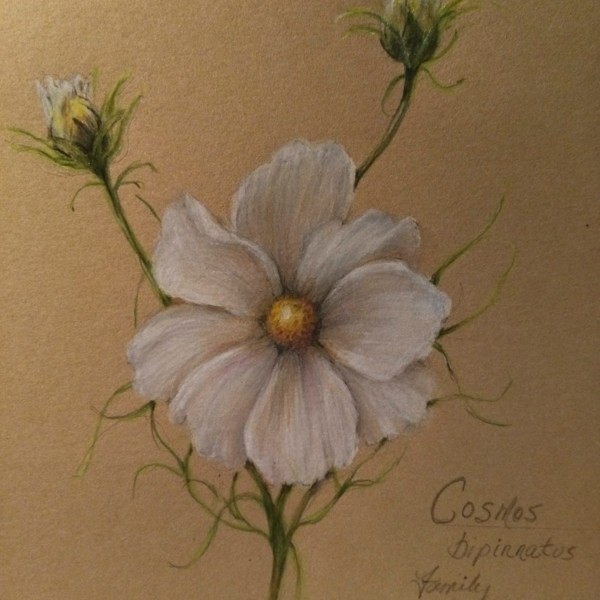
@vern I am really liking the Kraft paper, especially how the midtones can happen so effortlessly. It’s a little more forgiving with erasure too. Had to pick all our cosmos last night as snow has arrived today!
-

sheila y. commented on sheila y.'s Photo 4 years, 10 months ago
@wendy Wendy, thanks for the feedback. I’m going back in for more varied greens, as you suggested- looking at what I’ve got and focusing on overlaps. Wish me luck 😎 -

Wendy Hollender commented on sheila y.'s Photo 4 years, 10 months ago
I think this is looking awesome Shelia, but I do think you can still get more contrast in your leaves so they don’t look boring by comparison to the amazing vibrancy elsewhere. Look at your stems on the leaves as they connect to the radish, there are good darks and contrast but they still appear to be light green. Push those leaves in the…[Read more]
-

Draw Botanical commented on Draw Botanical's Photo 4 years, 10 months ago
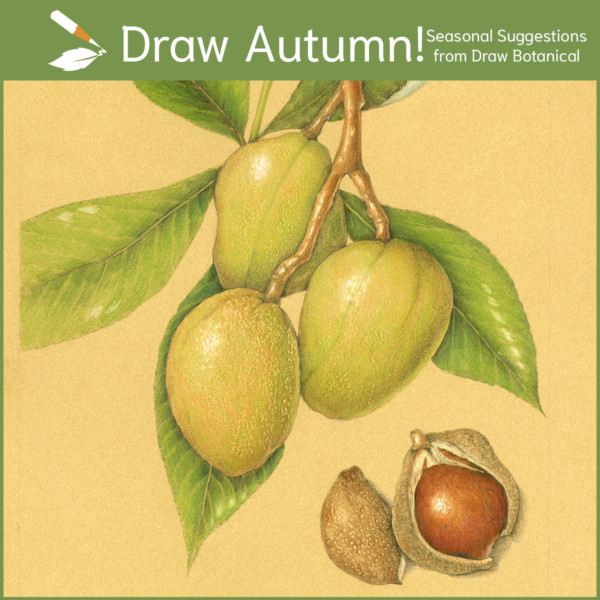
Autumn is a great time to draw nuts and seeds, fall leaves, and mushrooms! It’s fun when several people are drawing the same subjects at the same time. Join us and draw seasonal specimens! Read more about what to draw this season: https://ckarchive.com/b/wvu2hghmlx27
-
Draw Botanical added a Photo 4 years, 10 months ago
-
Autumn is a great time to draw nuts and seeds, fall leaves, and mushrooms! It’s fun when several people are drawing the same subjects at the same time. Join us and draw seasonal specimens! Read more about what to draw this season: https://ckarchive.com/b/wvu2hghmlx27
-
-
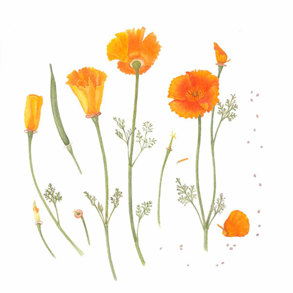
Katy Lyness commented on Elizabeth Ann Roberts's Photo 4 years, 10 months ago
So fun! Beautiful composition! I love that you have included all the relevant information in a jaunty, freeform way. Part of me wants to see more darks in the oranges, so I can read them better. But it works so well as it is, I also don’t want to change a thing.
-
Katy Lyness commented on Maureen Doram's Photo 4 years, 10 months ago
Hi Maureen,
Another lovely drawing! I see you are liking the Kraft paper. Perfect for those white flowers. I really like that you use many colors in those whites. I also love the feathery quality of the stems. It makes a nice contrast to the solidity of the petals. And the yellow center is so pleasing to look at! I am drawn into the piece. -
Elizabeth Ann Roberts added a Photo 4 years, 10 months ago
-
So fun! Beautiful composition! I love that you have included all the relevant information in a jaunty, freeform way. Part of me wants to see more darks in the oranges, so I can read them better. But it works so well as it is, I also don’t want to change a thing.
-
-
Ingrid Schenk commented on Ingrid Schenk's Photo 4 years, 10 months ago
@dougmilne thank you so much for your feedback! Yes, I can see what you mean, will train on the range of tones on an object with a pattern, was concentrated too much on the pattern …
-

Ishbel Galloway commented on Ishbel Galloway's Photo 4 years, 10 months ago
Thanks Sam! -
Maureen Doram commented on sheila y.'s Photo 4 years, 10 months ago
So beautiful!
-
Maureen Doram added a Photo 4 years, 10 months ago
-
Hi Maureen, Another lovely drawing! I see you are liking the Kraft paper. Perfect for those white flowers. I really like that you use many colors in those whites. I also love the feathery quality of the stems. It makes a nice contrast to the solidity of the petals. And the yellow center is so pleasing to look at! I am drawn into the piece.
-
@vern I am really liking the Kraft paper, especially how the midtones can happen so effortlessly. It’s a little more forgiving with erasure too. Had to pick all our cosmos last night as snow has arrived today!
-
@katylyness It took me awhile to really plunge into the centre of the paper, I would often avoid it but it happens a little more often now! Thanks for your comments!
-
So nicely done, Maureen. Great to see you again today.
-
Very elegant giving off a wonderful softness
-

I love this composition.
-
-
Doug Milne commented on Ingrid Schenk's Photo 4 years, 10 months ago
Hi Ingrid- the branch looks great! I think you could use a little more dark toning on the right side, but you have nice smooth toning and you did a great job capturing the bark texture. The apple is also good, but there are still some things to work on. The color selection and saturation are very good. You also did a nice job with the patterning.…[Read more]
-
Doug Milne commented on Douglass Reitter's Photo 4 years, 10 months ago
Great page Douglass! I love the mix of black and white and color. Everything is very nicely rendered! Those roots are wonderful! I would suggest moving your name. Maybe put it under the Preserve line. Right now it looks as if it is connecting the fern and the mushroom. Great job!
-
Doug Milne commented on Pat Schiebold's Photo 4 years, 10 months ago
Beautiful job Pat! You did a great job capturing the colors and details. There are some little details – like how the main vein has some twists and turns that you have straightened out and also how the bottom of each side of the leaf curves down where it meets the stem. These are small details, but are very important because they are common to…[Read more]
- Load More