Activity
-

Doug Milne commented on sheila y.'s Photo 4 years, 11 months ago
Hi Sheila- a flower and seeds next season would look good. If you don’t get to it I think the drawing is dynamic as it is. I love how you did the trio of cut pieces. Great job!
-

Jill Amadei commented on Jill Amadei's Photo 4 years, 11 months ago
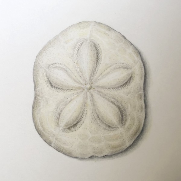
This is one of those puffy sea biscuit sand dollars. It was challenging to try to make it look 3 dimensional without getting too dark. I would appreciate any tips! Also does the cast shadow look ok? Thanks so much!
-
Amanda commented on Amanda's Photo 4 years, 11 months ago
After the composition workshop, I decided to work on the conifer arrangement. I’ve only just started, so a lot of detailing to add to the cones. They will be the focal point, so I’ll keep that area the darkest and perhaps keep the branches and needles lower down the page lighter in general?
-
Jill Amadei added a Photo 4 years, 11 months ago
-
This is one of those puffy sea biscuit sand dollars. It was challenging to try to make it look 3 dimensional without getting too dark. I would appreciate any tips! Also does the cast shadow look ok? Thanks so much!
-
Beautiful
-

BIscuit and shadow look good to me. 🙂 That sand dollar is stunning. You captured it so well and with such fine detail. I think you could add a bit of warm colours in just a few places, maybe a touch of light ochre or some such applied so lightly. You really nailed the feel of it, Jill. Lovely.
-
Thank you! @lizs
-
Thanks so much @sam-mcwilliams for the positive feedback and the helpful tip. I added a slight bit of light ochre here and there and it’s just what it needed to bring it to life a bit more. Thanks! 🙂
-
Beautiful
-
-
Amanda added a Photo 4 years, 11 months ago
-
After the composition workshop, I decided to work on the conifer arrangement. I’ve only just started, so a lot of detailing to add to the cones. They will be the focal point, so I’ll keep that area the darkest and perhaps keep the branches and needles lower down the page lighter in general?
-
Awesome start, of course. We’ll follow along excitedly to see how your plan goes. I already wonder if you’ll need something sneaking out in the background behind that top cone…
-
Thanks Sam! Yes, I was wondering the same thing, it seems a bit abrupt at the top there. Thanks for mentioning that.
-
-

sheila y. commented on sheila y.'s Photo 4 years, 11 months ago
Thanks, Maureen. -
sheila y. commented on sheila y.'s Photo 4 years, 11 months ago
@doug-milne Thanks, Doug. Any other suggestions? I still have some leaves hanging in there. Hoping to get a flower and seeds next season. -
-
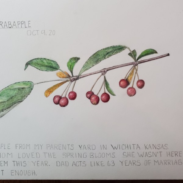
The reason I chose this view is twofold: 1) in this aerial view the cone looks like a flower 2) the spiral aspects of a pine cone are too advanced for me at this time. Maybe in another year things will be different……….
-
-
Katy Lyness commented on Elizabeth Simonson's Photo 4 years, 11 months ago
Such rich, beautiful colors! The cast shadow is a bit heavy though. I’d lighten it by about 50%. You could keep it dark right at the edge then and taper out
-
Katy Lyness commented on Elizabeth Simonson's Photo 4 years, 11 months ago
Sweet composition! Makes me feel sunny! Love all that work on the green sepals. You have managed to give them a voice amid all that Yellowness clamoring for attention. I would take the darks darker. In the center of the flower and in the areas between the petals as they connect to the center section. Even in the greens.
darken the little…[Read more] -
Katy Lyness commented on Pat Schiebold's Photo 4 years, 11 months ago
Again, solid and calming. Beautiful toning. Beautiful drawing. I might suggest a more careful shadow behind the flower on the leaves. Just so it separates and pops up into the foreground a bit more.
-
Katy Lyness commented on Pat Schiebold's Photo 4 years, 11 months ago
Pat, there is a solidness to your work that is very satisfying. Calming even. You are able to take this complicated subject and bring it to a place I can sit back and enjoy it. Thank you for that.
-
Katy Lyness commented on Pat Schiebold's Photo 4 years, 11 months ago
This says autumn to me! Very lovely. I love the textures you have on the seed pods. And the way one feels the brittleness of the twigs. I’m still trying to decide if the composition works for me. With the focal points on either side of the frame. My eye isn’t sure where to go. Which may not be a bad thing. Keeps me moving around so I don’t miss…[Read more]
-
Katy Lyness commented on Pat Schiebold's Photo 4 years, 11 months ago
Hi Pat, This is such a solitary beauty! A lone flower seemingly gone to seed. Muted colors…but such energy. Simple and complex at the same time. Lovely!
-
Elizabeth Simonson added a Photo 4 years, 11 months ago
-
Sweet composition! Makes me feel sunny! Love all that work on the green sepals. You have managed to give them a voice amid all that Yellowness clamoring for attention. I would take the darks darker. In the center of the flower and in the areas between the petals as they connect to the center section. Even in the greens. darken the little triangles…[Read more]
-
Okay I’ll use dk sepia in those areas. I was using walnut but I can se with this scan it doesn’t recede enough. Believe it or not these sunflowers are blooming away on Wurts Street in Kingston. It’s at a garden I maintain.
-
Gorgeous!
-
-
Elizabeth Simonson added a Photo 4 years, 11 months ago
-
Such rich, beautiful colors! The cast shadow is a bit heavy though. I’d lighten it by about 50%. You could keep it dark right at the edge then and taper out
-
Thanks for that suggestion! I think it scanned darker than in actuality BUT I did take out most of the shadow and keep the line only. Much better.
-
-

sara stauffer commented on sara stauffer's Photo 4 years, 11 months ago
This is the most complex drawing I’ve tried. Its very well acquainted with my eraser. Time invested+the wrong pencil stroke=increased anxiety.
-
sara stauffer added a Photo 4 years, 11 months ago
-
This is the most complex drawing I’ve tried. Its very well acquainted with my eraser. Time invested+the wrong pencil stroke=increased anxiety.
-
You are a gem, Sara. I think a book of these will definitely need to be published.
-
-

Wendy Hollender commented on Pat Schiebold's Photo 4 years, 11 months ago
Try a cast shadow with verithin gray and black before adding any dark sepia. Also a gray watercolor wash for a cast shadow is a good place to start as well.
-
- Load More