Activity
-

sara stauffer added a Photo 4 years, 11 months ago
-

Wendy Hollender commented on Pat Schiebold's Photo 4 years, 11 months ago
Try a cast shadow with verithin gray and black before adding any dark sepia. Also a gray watercolor wash for a cast shadow is a good place to start as well.
-

-
Deborah Gillikin commented on Deborah Gillikin's Photo 4 years, 11 months ago
Thank you!
-
-
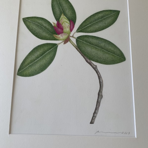
Again, solid and calming. Beautiful toning. Beautiful drawing. I might suggest a more careful shadow behind the flower on the leaves. Just so it separates and pops up into the foreground a bit more.
-
It’s a rhododendron bud
-
I see what you mean. At least I could have faded them out a bit towards the leaf edge. Next time because this piece has been sold! Thanks for your feedback
-
-
-
Pat, there is a solidness to your work that is very satisfying. Calming even. You are able to take this complicated subject and bring it to a place I can sit back and enjoy it. Thank you for that.
-
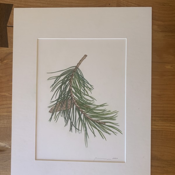
I toned the cone. It looks perfect. A little goes a long way👍 Thanks for your suggestion
-
-
-
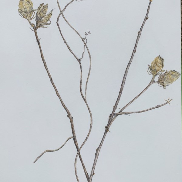
This says autumn to me! Very lovely. I love the textures you have on the seed pods. And the way one feels the brittleness of the twigs. I’m still trying to decide if the composition works for me. With the focal points on either side of the frame. My eye isn’t sure where to go. Which may not be a bad thing. Keeps me moving around so I don’t miss…[Read more]
-
Beautiful
-
-
-
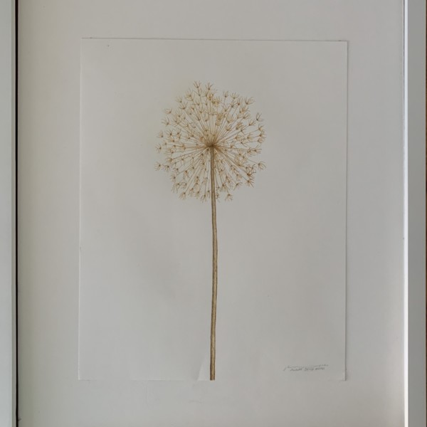
Hi Pat, This is such a solitary beauty! A lone flower seemingly gone to seed. Muted colors…but such energy. Simple and complex at the same time. Lovely!
-

This is so lovely and delicate!
-
-
Doug Milne commented on sheila y.'s Photo 4 years, 11 months ago
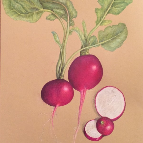
Hi Sheila- the leaves are looking better since you added more toning. They have more weight to them now and your radishes are still the star of the show. Beautiful!
-
Pat Schiebold commented on Pat Schiebold's Photo 4 years, 11 months ago
The bottom of each side of the leaf curves down to meet the stem. Good suggestion thanks
-
Pat Schiebold commented on Pat Schiebold's Photo 4 years, 11 months ago
I implemented your 3 suggestions. They improved the finished project. Thank you
-

sheila y. added a Photo 4 years, 11 months ago
-
Hi Sheila- the leaves are looking better since you added more toning. They have more weight to them now and your radishes are still the star of the show. Beautiful!
-
@doug-milne Thanks, Doug. Any other suggestions? I still have some leaves hanging in there. Hoping to get a flower and seeds next season.
-
Hi Sheila- a flower and seeds next season would look good. If you don’t get to it I think the drawing is dynamic as it is. I love how you did the trio of cut pieces. Great job!
-
Thanks Doug! So glad you’re back in the feedback team!
-
-

Sam McWilliams commented on Pat Schiebold's Photo 4 years, 11 months ago
Beautiful
-
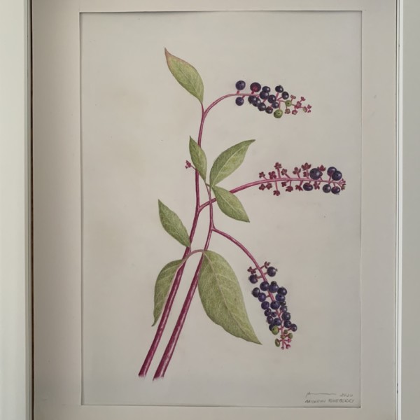
Sam McWilliams commented on Deborah Gillikin's Photo 4 years, 11 months ago
You’ve created so much movement and drama on the page. 🙂
-
Sam McWilliams commented on Pat Schiebold's Photo 4 years, 11 months ago
Lovely and elegant. You could work some more darks into your overlaps. Have those stems go a bit darker when behind leaves. Have your leaves achieve some more darks in certain areas, and always observe carefully how the stems connect. This is very pleasing to look at, this drawing. Watch out for stems starting at the same line like int he bottom…[Read more]
-
Sam McWilliams commented on Maureen Doram's Photo 4 years, 11 months ago
So nicely done, Maureen. Great to see you again today.
-
Pat Schiebold added 2 Photos 4 years, 11 months ago
-
What great drawing/painting. If you like, you can still tone the overall forms – ie give the cylinder/stem a shadow side so that a highlight emerges, and tone the overall sphere of the pumpkin. I love the curly-cues and the stem patterning, and the varieties of oranges. You could observe/work a bit more on the area where the stem meets the squash.…[Read more]
-
Lovely and elegant. You could work some more darks into your overlaps. Have those stems go a bit darker when behind leaves. Have your leaves achieve some more darks in certain areas, and always observe carefully how the stems connect. This is very pleasing to look at, this drawing. Watch out for stems starting at the same line like int he bottom…[Read more]
-
I implemented your 3 suggestions. They improved the finished project. Thank you
-
-
Maureen Doram commented on Maureen Doram's Photo 4 years, 11 months ago
@katylyness It took me awhile to really plunge into the centre of the paper, I would often avoid it but it happens a little more often now! Thanks for your comments!
-
Maureen Doram commented on Maureen Doram's Photo 4 years, 11 months ago
@vern I am really liking the Kraft paper, especially how the midtones can happen so effortlessly. It’s a little more forgiving with erasure too. Had to pick all our cosmos last night as snow has arrived today!
-
sheila y. commented on sheila y.'s Photo 4 years, 11 months ago
@wendy Wendy, thanks for the feedback. I’m going back in for more varied greens, as you suggested- looking at what I’ve got and focusing on overlaps. Wish me luck 😎 - Load More


This is the most complex drawing I’ve tried. Its very well acquainted with my eraser. Time invested+the wrong pencil stroke=increased anxiety.
You are a gem, Sara. I think a book of these will definitely need to be published.