Activity
-

sheila y. commented on sheila y.'s Photo 5 years, 1 month ago
That’s good to hear about the cast shadows because I’ve got my heavy hand going on the Kraft paper. It’s softer than the white paper. -
sheila y. commented on sheila y.'s Photo 5 years, 1 month ago
Doug, thanks. Yes, I see what you mean. I’m going to work on those places. -
Amanda commented on Amanda's Photo 5 years, 1 month ago
Thanks Doug!
-
Sinéad Kane added a Photo 5 years, 1 month ago
-
Thank you Vern
-
-

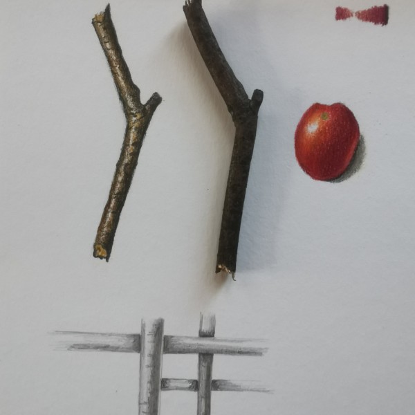
Eleanor McCarthy commented on Eleanor McCarthy's Photo 5 years, 1 month ago
Thanks Doug. Actually this was taken in the kitchen with the ceiling light. It was a really green tomato and should be much lighter and brighter. Do you have any suggestions for keeping the color light?
-

Doug Milne commented on Eleanor McCarthy's Photo 5 years, 1 month ago
This is beautiful Eleanor! The reflected highlight is really nice! Judging from the position of the highlight and the cast shadow your light source was shining down from above the tomato rather than the botanical standard of coming over your left shoulder at a 45 degree angle. Also the cast shadow should be much lighter.
-
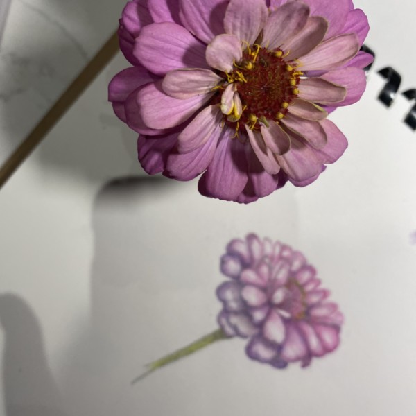
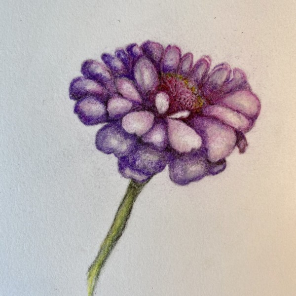
Doug Milne commented on Susan Shaw's Photo 5 years, 1 month ago
Hi Susan- you really nailed the color and intensity of that flower! The right side of the leaf looks closest to the bluish color and fuzzy texture I expect of this plant.
-
Doug Milne commented on Theodora Korasidis's Photo 5 years, 1 month ago
Beautiful Dora! Great composition and colors! Maybe it is the quality of the photo, but some areas of leaves don’t have the same saturation as other leaves. You are getting to practice a lot of leaves and doing a great job on them!
-
Doug Milne commented on Theodora Korasidis's Photo 5 years, 1 month ago
Hi Dora- your daffodil is off to a great start! The colors are so nice and fresh! I think it would benefit from adding some tone to some of the petals. There are a couple of petals where both sides of the petal are light and it needs to have some toning to enhance the curling of the petals and also establish which petal is in front of the other,…[Read more]
-
Doug Milne commented on Pamela Kaye's Photo 5 years, 1 month ago
Hi Pamela- the tomato looks really good! Looking at the photo, you could add more color saturation so your drawing is closer to the live subject. A reflected highlight should not be white and I would add some color to it to tone it down. I would also lighten the cast shadow a little.
-
Nancy Weinman added a Photo 5 years, 1 month ago
-
Nancy Weinman added a Photo 5 years, 1 month ago
-

Nice work Nancy – I want a leaf now! I know, so demanding. 🙂
-
-
Doug Milne commented on sheila y.'s Photo 5 years, 1 month ago
It is a really nice composition Sheila! There are a couple of areas on the tomatoes that I would add some more darker toning both for form and to delineate where some of the tomatoes meet. A couple of them blend into each other. Great job!
-
Doug Milne commented on Amanda's Photo 5 years, 1 month ago
The cherries look great Amanda! Your execution of the highlights really make the cherries shine and enhance the form.
-
Doug Milne commented on sheila y.'s Photo 5 years, 1 month ago
Beautiful Sheila! It looks great on the Kraft paper! I think the cast shadows are good!
-

Carol Burke commented on Maureen Doram's Photo 5 years, 1 month ago
So pretty! A really lovely drawing!
-
Carol Burke commented on Ayse Gilbert's Photo 5 years, 1 month ago
Love your study page! So interesting 😁
-
sheila y. commented on sheila y.'s Photo 5 years, 1 month ago
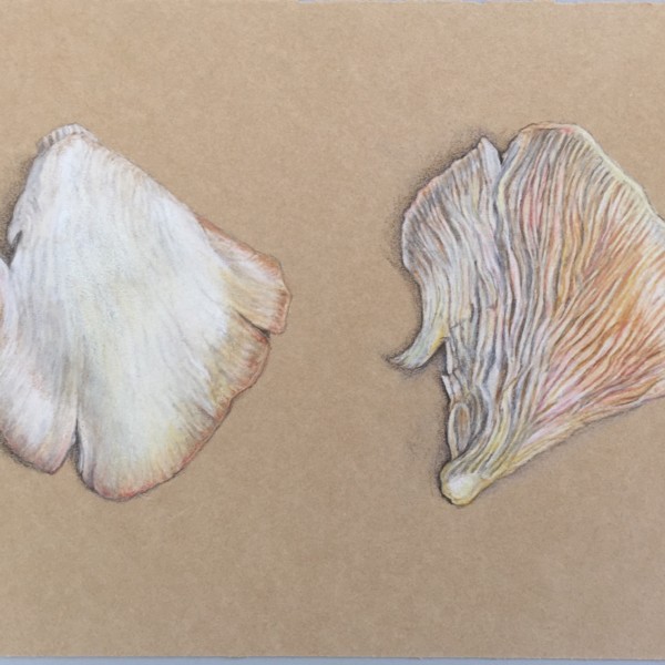
I’ve been wanting to work on a mushroom ever since the workshop that I couldn’t attend. This is an oyster mushroom/seta that is very common in Spain. The shadow on the right mushroom too heavy?
-
sheila y. added a Photo 5 years, 1 month ago
-
I’ve been wanting to work on a mushroom ever since the workshop that I couldn’t attend. This is an oyster mushroom/seta that is very common in Spain. The shadow on the right mushroom too heavy?
-
Beautiful Sheila! It looks great on the Kraft paper! I think the cast shadows are good!
-
Thanks, Doug. I like the Kraft paper, but it’s softer than the white paper and I’m digging into it which makes it harder to erase!
-

Fantastic! Those gills are awesome
-
Shadow doesn’t look too heavy to me. Beautiful – so good on the Kraft paper. Shows us why they are called Oyster Mushrooms – really looking like oysters here. 🙂
-
Thanks everyone for your comments. My “reply” disappeared and now it’s back. I enjoyed those gills because I got to really play around with the different colors to depict the grooves.
-
-
sheila y. commented on sheila y.'s Photo 5 years, 1 month ago
Thanks, Susan! I’m glad the fuzzy stuff shows up. That’s help of the embossing tool and wax paper. - Load More