Activity
-

Doug Milne commented on Rita Haft's Photo 5 years, 3 months ago
Wow Rita!!! This is beautiful! I love how you have positioned the leaf on the page! The drawing has so much going for it! I am impressed with the crisp edges and you did a great job with the highlights and toning! Nice attention to the details! There are a couple of light spots along the dark side of the main vein that I would darken. I hope you…[Read more]
-
Rita Haft added a Photo 5 years, 3 months ago
-
Wow Rita!!! This is beautiful! I love how you have positioned the leaf on the page! The drawing has so much going for it! I am impressed with the crisp edges and you did a great job with the highlights and toning! Nice attention to the details! There are a couple of light spots along the dark side of the main vein that I would darken. I hope you…[Read more]
-
Thank you for the feedback- I am happy with it, after my difficulty with the flowers I decide d to pull back and work on some branches and leaves and try and work on transitions with the toning – I also had a better time combining the watercolor on the branches and leaves than on the flowers and I don’t know why- maybe because the petals are such…[Read more]
-
-
Doug Milne commented on Pam Hancock's Photo 5 years, 3 months ago
Hi Pam- this does look better and I am glad it spurred some reflection on your drawing process. One of the reasons I like putting the grisailles layer on early is that it gives you a map to follow thru the course of the drawing. Right from the start, before I have added any color, I have established where the highlights and toning should be and…[Read more]
-
Doug Milne commented on Rita Haft's Photo 5 years, 3 months ago
Hi Rita- These flowers look like perennial geraniums to me – shape, colors and stamens. Maybe look online and see if that looks right- leaves are very distinctive. Be sure to put in perennial because the annual variety is what most people think of when they hear geranium and they are very different! Take care! Hope we will see you here sometime if…[Read more]
-
Pam Hancock commented on Pam Hancock's Photo 5 years, 3 months ago
I have added some more shading as suggested. I think I am beginning to really understand the concept of shading. I find I probably concentrate too hard on getting the colours right and don’t complete the necessary shading to show the form of the flower. Just need to keep practising!!!
-
-
I have added some more shading as suggested. I think I am beginning to really understand the concept of shading. I find I probably concentrate too hard on getting the colours right and don’t complete the necessary shading to show the form of the flower. Just need to keep practising!!!
-
Hi Pam- this does look better and I am glad it spurred some reflection on your drawing process. One of the reasons I like putting the grisailles layer on early is that it gives you a map to follow thru the course of the drawing. Right from the start, before I have added any color, I have established where the highlights and toning should be and…[Read more]
-
Thanks Doug, stay safe.
-
-
Pam Hancock commented on Pam Hancock's Photo 5 years, 3 months ago
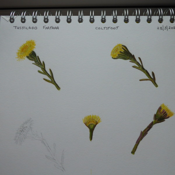
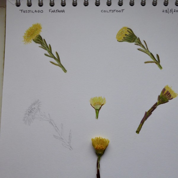
Thanks for uour helpful comments, Doug. I do have trouble with toning especially on small light coloured flowers. Well probably on all flowers! Will try to take a black and white photo of another coltsfoot flower. I noticed that on the photograph the cut specimen looked much darker than in real life. I will try another specimen.
-
Doug Milne commented on HSI TAN CHENG's Photo 5 years, 3 months ago
Hsi- it is a beautiful rendering of the front and back view of these leaves. Such subtle colors! I would consider a little dark toning along the main vein on both views.
-
Doug Milne commented on HSI TAN CHENG's Photo 5 years, 3 months ago
Greetings Hsi- the text and illustration are so beautiful! Each of them tell a story and compliment one another at the same time! Thank you so much for sharing this with us!
-
Doug Milne commented on Pam Hancock's Photo 5 years, 3 months ago
Hi Pam- I can see why you love them! Great color selection and saturation! What I am missing is the toning so I get the sense of their forms and details. Take another look at this photo. On the actual cross section of flower in the middle bottom you can see that some petals are darker than others as do the shorter stamens in the middle. Adding…[Read more]
-
Doug Milne commented on Ishbel Galloway's Photo 5 years, 3 months ago
Beautiful Ishbel! There are a couple of spots that I would tone. The bottom right petal and the second one down from the top on the right. The same view and I think the middle petal would be in shadow (at least close to the center). The bottom right petal of that flower (2nd from top) could also use a little more toning. It is a confusing spot…[Read more]
-
Doug Milne commented on Ayse Gilbert's Photo 5 years, 3 months ago
Beautiful Ayse! Great colors and composition!
-
Doug Milne commented on Ayse Gilbert's Photo 5 years, 3 months ago
Hi Ayse- your preparation is amazing! I am curious why the drawing on the left does not become your finished drawing? The finished drawing on the right is beautiful. Great colors, saturation and composition. The thing I like about the drawing on the left is that I see more highlights and toning. That is missing from the drawing on the right so it…[Read more]
-
Doug Milne commented on sheila y.'s Photo 5 years, 3 months ago
Hi Sheila- beautiful! I agree with you on both points. I don’t think the left side of the bean needs much shading, but it does not look consistent to me. There are sections along the length that have darker toning and then sections that don’t. The toning where it has dark toning looks good! The open pod on the right needs toning on the ext…[Read more]
-
jette anesen commented on Pam Hancock's Photo 5 years, 3 months ago
So fun – the first sign of spring. Love them
-

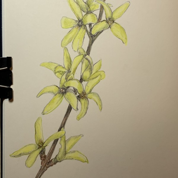
Ishbel Galloway added a Photo 5 years, 3 months ago
-
Beautiful Ishbel! There are a couple of spots that I would tone. The bottom right petal and the second one down from the top on the right. The same view and I think the middle petal would be in shadow (at least close to the center). The bottom right petal of that flower (2nd from top) could also use a little more toning. It is a confusing spot…[Read more]
-
Thanks Doug…I’ll work on it a bit more. Things are not too bad here on my little island…NYC is frightening so glad you guys are in the countryside. Be safe.
-
-
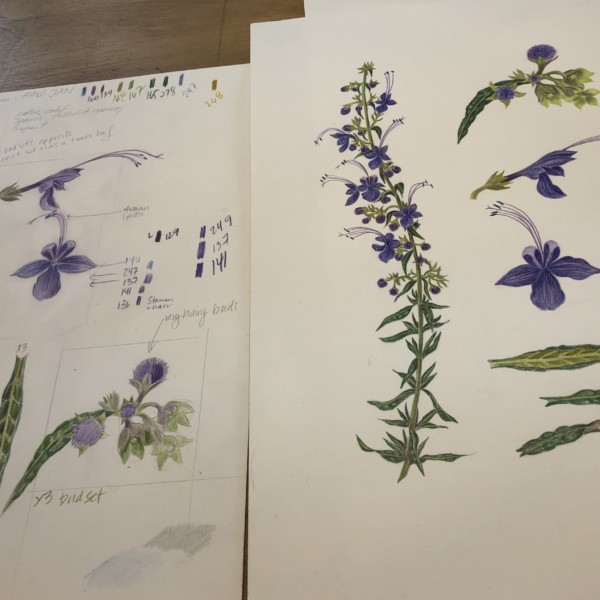
Ayse Gilbert added 2 Photos 5 years, 3 months ago
-
Hi Ayse- your preparation is amazing! I am curious why the drawing on the left does not become your finished drawing? The finished drawing on the right is beautiful. Great colors, saturation and composition. The thing I like about the drawing on the left is that I see more highlights and toning. That is missing from the drawing on the right so it…[Read more]
-
Beautiful Ayse! Great colors and composition!
-
and nice to see you too…. been two years since we met!! thank you both for your suggestions; I promise next time to Label the plants;!! before I send them. The purple plant is a trichostema native to California . On some of these like the malva, you see both the onsite outside drawing plant in hand, and the studio more finished work sheet.…
-
-

sheila y. commented on sheila y.'s Photo 5 years, 3 months ago
Thanks, Hendrika. These beans have an impressive structure, inside and out! -
Pam Hancock added a Photo 5 years, 3 months ago
-
So fun – the first sign of spring. Love them
-
Hi Pam- I can see why you love them! Great color selection and saturation! What I am missing is the toning so I get the sense of their forms and details. Take another look at this photo. On the actual cross section of flower in the middle bottom you can see that some petals are darker than others as do the shorter stamens in the middle. Adding…[Read more]
-
Thanks for uour helpful comments, Doug. I do have trouble with toning especially on small light coloured flowers. Well probably on all flowers! Will try to take a black and white photo of another coltsfoot flower. I noticed that on the photograph the cut specimen looked much darker than in real life. I will try another specimen.
-
-

Hendrika Meina commented on sheila y.'s Photo 5 years, 3 months ago
I like what looks like very subtle veining on the big bean
- Load More