Activity
-

sheila y. added a Photo 5 years, 3 months ago
-

Douglass Reitter commented on Douglass Reitter's Photo 5 years, 3 months ago
Thank you, Doug for your helpful comments. The part of the stem that is attached at the top is that difficult paper -like thing. I don’t know it’s name but it is really hard to convey….at least for me. I have a second, dying daffodil half done to post. It captured my interest because the colors change so and it gets so curly! -
sheila y. commented on sheila y.'s Photo 5 years, 3 months ago
Thanks, Hendrika
-
sheila y. commented on Ginny Bartlett's Photo 5 years, 3 months ago
And the flower head, too! (I missed it because I didn’t scroll up enough.)
-
sheila y. commented on Ginny Bartlett's Photo 5 years, 3 months ago
Ginny, this is wonderful, the bulb so transparent and the greens coming right out! So glad to see you online!
-
sheila y. commented on Carol Burke's Photo 5 years, 3 months ago
Carol, this is beautiful! The leaves! All the views of the flowers!!!
-
sheila y. commented on Doug Milne's Photo 5 years, 3 months ago
Doug, this is gorgeous! And what a great composition , view!
-
sheila y. commented on Hendrika Meina's Photo 5 years, 3 months ago
Hendrika, what a beautiful composition, colors, views. Everything!
-
Rita Haft added a Photo 5 years, 3 months ago
-
Yes Rita, that looks better! The column now looks like it is coming out of the well area rather than sitting on top.
-
-
Rita Haft commented on Rita Haft's Photo 5 years, 3 months ago
I seem to have a lot of difficulty getting a smoothness with the watercolor when I have the pencil beneath- I am still working on this but wondering if you have any suggestions on how to get rid of some of the paper texture
-
Rita Haft added a Photo 5 years, 3 months ago
-
This is a great page Rita! It is good to see you pushing yourself and trying a range of subjects with much success! Even with study pages start to consider the composition. I like grouping subjects that have noticeable similarities. On your page, the brown stem with bud doesn’t harmonize with the other subjects because of it’s color and also bec…[Read more]
-
-
Rita Haft added a Photo 5 years, 3 months ago
-
I seem to have a lot of difficulty getting a smoothness with the watercolor when I have the pencil beneath- I am still working on this but wondering if you have any suggestions on how to get rid of some of the paper texture
-
Hi Rita- first I just want to make sure you are using a hot press watercolor paper. It looks like a smooth surface so I assume you are. Next, you said you are putting watercolor over a color pencil base. You can do that, but the majority of how we work is laying the watercolor down (after applying Grisaille toning with a color pencil) and than…[Read more]
-
Same paper- I was trying to do a lighter touch as I know part of the reason my saturation is so intense is that I get rid of all the texture, but also then I feel like it gets rid of some of the detail and highlights- I will keep layering this one and see if I can get the right feel I want- thanks for your feedback!
-
-
Stephanie Harold added 2 Photos 5 years, 3 months ago
-

On a similar subject, I embossed some marks to create white super fine hairs, and went over it with light grey to show the bright embossed lines behind.
-
If you do an underlay of white the brighter colours pop more on Kraft paper. Also on Kraft paper you want to up the contrast and use bright white highlights in important areas.
-
-

Hendrika Meina commented on Hendrika Meina's Photo 5 years, 3 months ago
thank you Doug!
-
Doug Milne commented on Helene Duplessis's Photo 5 years, 3 months ago
Beautifully rendered Helene! Wonderful toning and I love the movement of it!
-
Doug Milne commented on Helene Duplessis's Photo 5 years, 3 months ago
This is my favorite one yet Helene! Love the colors!!!!!
-
Doug Milne commented on Theodora Korasidis's Photo 5 years, 3 months ago
That would be great too! Vern gave us a lettering lesson at the workshop and she is a master at it! She will look on line for fonts that she likes and then works it out on tracing paper. Then she transfers it to her drawing using a light box (use whatever method you prefer to transfer). She prefers to do it in graphite pencil as it is not as bold…[Read more]
-
Doug Milne commented on Hendrika Meina's Photo 5 years, 3 months ago
Beautiful Hendricka! I love the colors! Very realistic and great saturation! This drawing ticks all of the boxes! Your toning, highlights, reflected highlight and shadows all look wonderful! It is nice to see your work again!!!!
-
Theodora Korasidis commented on Theodora Korasidis's Photo 5 years, 3 months ago
Hi Doug, I did think myself something there would be nice. I was wondering whether to write the botanical name of the plant there somehow?
-
Doug Milne commented on Machi's Photo 5 years, 3 months ago
Beautiful Machi! The well placed highlights really establish that these are shiny leaves. Wonderful color selection and saturation!
- Load More
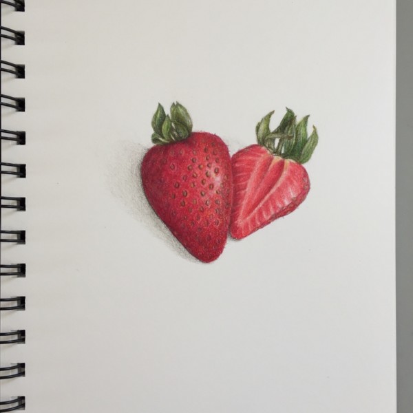


We can tell you are eating healthy! Beautiful job on these strawberries Sheila! It is not easy to get that highlight around the individual seeds! A masterful job! It is snowing here this morning with a prediction of 2-4” after no snow for months.
gorgeous!