Activity
-

sheila y. commented on sheila y.'s Photo 5 years, 4 months ago
Thanks, Doug. I’m not sure when I can wander up to the mountains now for a fresh flower. Everyone in Spain is in mandatory “stay at home”, except to get groceries,basically, for at least the next two weeks! Be well, all of you! -

Doug Milne commented on Douglass Reitter's Photo 5 years, 4 months ago
Hi Douglass- thanks for sending the photo! When I look at it I see the veins on the off shoots continue onto the vein of the primary stalk, which is what I would expect, but don’t see on your drawing. I think changing that where applicable would eliminate the confusion I had.
-
Doug Milne commented on Ginny Bartlett's Photo 5 years, 4 months ago
Me again. I meant to also say the reflected highlight and shadow look good. I would angle the shadow back more instead of angling forward. Nice job!
-
Doug Milne commented on Elizabeth Harvey's Photo 5 years, 4 months ago
Me again! In the future could you edit the picture before posting it so the image is not sideways? Thanks!
-
Doug Milne commented on Ginny Bartlett's Photo 5 years, 4 months ago
Hi Ginny- your sphere looks very good. Nice smooth application and range of tones! The shape looks off to me. The area where the reflected highlight is located looks more angled than curved which gives the sphere an odd shape. Easy to correct. In the future could you edit the picture and reposition the page so we don’t have to look at it sideways? Thanks!
-
Doug Milne commented on Elizabeth Harvey's Photo 5 years, 4 months ago
Hi Liz- the sphere looks great and I enjoy the purple! I would lighten the area around the highlight so there is not such a distinct circle. There should be more of a transition of tone as the toning nears the highlight. The reflected highlight looks really good. I would angle the shadow back more. Great job!
-
Doug Milne commented on Douglass Reitter's Photo 5 years, 4 months ago
Hi Douglass- I thought this was color pencil because of the stroke marks. If you are using watercolor pencils I would add more water to smooth out the lines. Is this the base that you are going to add color to? Will it all be all watercolor or are you going to add some color pencil?
-
Doug Milne commented on sheila y.'s Photo 5 years, 4 months ago
Nicely rendered Sheila- we look forward to seeing what comes next! These are crazy times! Safe travels!
-
Doug Milne commented on Rita Haft's Photo 5 years, 4 months ago
Hi Rita- I got your name right this time! I agree with you that it is time to venture on to a range of new colors. The leaves are nicely rendered. Are they this color or are you going to add some green? The colors and saturation of the flower are good. I would go back with a red violet or dark sepia and hit the “V” areas where the petals meet. I a…[Read more]
-
Doug Milne commented on Rita Haft's Photo 5 years, 4 months ago
Hi Rita- my apologies for making a mistake on your name above!
-
Doug Milne commented on Rita Haft's Photo 5 years, 4 months ago
Hi Jette- I enjoyed seeing this page! I especially like the stem with buds on the top. Your placement of the highlights and toning is very well done here! The branch segment has nice detail and I think it would benefit from a little more dark/mid-range toning to enhance it’s cylindrical shape. I would also add some more toning on the folding l…[Read more]
-
Doug Milne commented on Mayra Richards's Photo 5 years, 4 months ago
Hi Mayra- this is a really nice page! The branch segment on the left is very well toned and it could be your guide for the grouping of branches. Although the composition is very good the branches don’t have the same level of toning as the single branch so they don’t appear to be cylinders. The leaf is beautifully done! Great color saturation, nic…[Read more]
-
Doug Milne commented on jette anesen's Photo 5 years, 4 months ago
Hi Jette- nice job on this apple! There are a couple of areas to revisit. The toning on the shadow is much smoother. I would just lighten it a little and have it angle back more. The standard for lighting is that light is coming over your left shoulder at a 45 degree angle. Your shadow placement looks like it was based on the light coming form the…[Read more]
-
Doug Milne commented on sheila y.'s Photo 5 years, 4 months ago
Interesting subject Sheila. Nice details! Is this a study for a future drawing?
-
Mayra Richards commented on Mayra Richards's Photo 5 years, 4 months ago
The leaf is from a really large camphor tree in my back yard.
-
Mayra Richards commented on Mayra Richards's Photo 5 years, 4 months ago
The leaf veins were tough. Will have to practice that a lot more! This has been a lot of fun. I don’t usually draw this small, so it’s been a good exercise for me.
-
Mayra Richards added a Photo 5 years, 4 months ago
-
The leaf veins were tough. Will have to practice that a lot more! This has been a lot of fun. I don’t usually draw this small, so it’s been a good exercise for me.
-
The leaf is from a really large camphor tree in my back yard.
-
Hi Mayra- this is a really nice page! The branch segment on the left is very well toned and it could be your guide for the grouping of branches. Although the composition is very good the branches don’t have the same level of toning as the single branch so they don’t appear to be cylinders. The leaf is beautifully done! Great color saturation, nic…[Read more]
-
Thanks Doug!
-
-
-
Interesting subject Sheila. Nice details! Is this a study for a future drawing?
-
I’ve done this flower in pieces on small pages, so yes, I like your idea. A study for a larger page with all the parts. The wild pigs, jabalíes, dig them up at night.
-
-
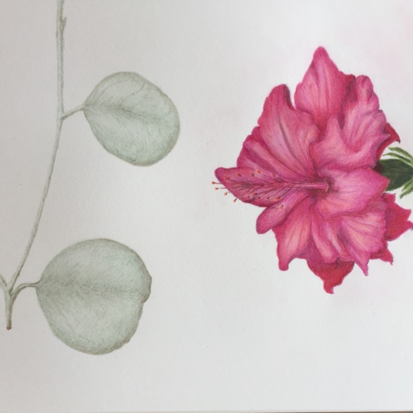
Rita Haft commented on Rita Haft's Photo 5 years, 4 months ago
I can’t seem to stay away from the pink- This will be last one for a while
-
Rita Haft added a Photo 5 years, 4 months ago
-
I can’t seem to stay away from the pink- This will be last one for a while
-
Hi Rita- I got your name right this time! I agree with you that it is time to venture on to a range of new colors. The leaves are nicely rendered. Are they this color or are you going to add some green? The colors and saturation of the flower are good. I would go back with a red violet or dark sepia and hit the “V” areas where the petals meet. I a…[Read more]
-
Thanks!- and no problem about the name- i found those leaves outside on the ground and they are almost a grey color so I think I will leave them as is- I will keep working on the flower- i had used more watercolor on this flower than I had before, and so sort of challenging for me but I am going back to work on it with your suggestions- thank you…[Read more]
-
Happy Spring!!!!!!
-
- Load More