Activity
-

Doug Milne commented on Carol Burke's Photo 5 years, 6 months ago
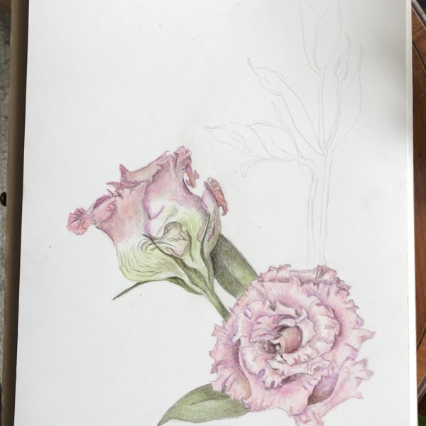
Hi Carol- Lisianthus is a great flower to draw and you have done a wonderful job! I love how you captured the swirl on the front facing bloom. I am not familiar with this double variety, which is amazing! The colors are soft, but I don’t think the image is grainy. I would proceed with the leaves on the right and then see if you could or should a…[Read more]
-
Elizabeth Harvey added a Photo 5 years, 6 months ago
-
Hi Liz- you are off to a good start! With the cylinder, there are a couple of spots to revisit. I am not sure what you used for a model, but it looks like the perspective is off. I think the bottom needs to have more of a curve. Make sure the highlight is the color of the paper from top to bottom and it should also curve up onto the top. The…[Read more]
-
-
-
Hi Ginny- your cylinder is coming along. The transitions are much smoother! I think you could still lighten both sides of the highlight a little more. Look at the right side again. The toning is not consistent so there is lighter section just before you reach the middle (from the top). The branch is looking good. Be aware of the highlight. There…[Read more]
-
-
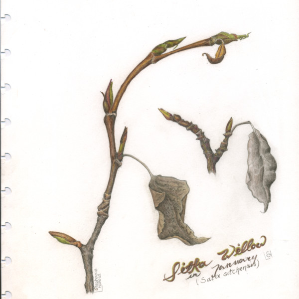
Doug Milne commented on Stephanie Harold's Photo 5 years, 6 months ago
Hi Stephanie- I love how you captured the color and textures of the transition from old wood to new wood. Everything is beautifully rendered and I appreciate the composition and calligraphy. Great job!!!
-
Doug Milne commented on Carol Burke's Photo 5 years, 6 months ago
It looks great Carol!!!! That leaf in the back is perfect and the other leaves make sense now. Beautiful job!
-

Hendrika Meina commented on Stephanie Harold's Photo 5 years, 6 months ago
love this
-
.jpg)
Helene Duplessis added a Photo 5 years, 7 months ago
-
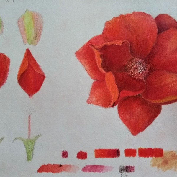
Beautiful, rich, saturated color Helene. I think you could go in with a red violet or dark red to hit a couple of spots. Especially in the dark areas around the stamen. Nice study page!
-

Georgeous color!
-
-

Carol Burke commented on Carol Burke's Photo 5 years, 7 months ago
Lisianthus, a darling of the wedding flower industry! This is an unusual coral coloured, double, fringe petaled variety that caught my eye this snowy February.You gotta love these ‘ bit over-the-top’ varieties, don’t you!!? I I was caught by it’s coral colour. ( We used lisianthus in my daughter-in-laws wedding bouquets and I loved its lyrical…[Read more]
-
-
Lisianthus, a darling of the wedding flower industry! This is an unusual coral coloured, double, fringe petaled variety that caught my eye this snowy February.You gotta love these ‘ bit over-the-top’ varieties, don’t you!!? I I was caught by it’s coral colour. ( We used lisianthus in my daughter-in-laws wedding bouquets and I loved its lyrical…[Read more]
-
Hi Carol- Lisianthus is a great flower to draw and you have done a wonderful job! I love how you captured the swirl on the front facing bloom. I am not familiar with this double variety, which is amazing! The colors are soft, but I don’t think the image is grainy. I would proceed with the leaves on the right and then see if you could or should a…[Read more]
-
Beautiful drawing!
-
Oh wow! was my initial reaction. I think it’s lovely.
-
-
Stephanie Harold added a Photo 5 years, 7 months ago
-
love this
-
Hi Stephanie- I love how you captured the color and textures of the transition from old wood to new wood. Everything is beautifully rendered and I appreciate the composition and calligraphy. Great job!!!
-
-
Carol Burke commented on Carol Burke's Photo 5 years, 7 months ago
Is this better???
-
Carol Burke added a Photo 5 years, 7 months ago
-
Is this better???
-
It looks great Carol!!!! That leaf in the back is perfect and the other leaves make sense now. Beautiful job!
-
Wow, what a difference 🙂
-
-

Ishbel Galloway commented on Ishbel Galloway's Photo 5 years, 7 months ago
Thanks Doug – I darkened it a bit in the later post with the flowers but maybe I could do a bit more!
-
Doug Milne commented on Rita Haft's Photo 5 years, 7 months ago
Hi Rita- this is a nice drawing with a lot of positive qualities. You have really captured the color and paper like quality of this red onion. The thing that really throws me is it’s shape. I know onions come in many different shapes and there can be a lot of beauty found in the odd and unusual, but there is something about the shape of this one (…[Read more]
-
Doug Milne commented on Ginny Bartlett's Photo 5 years, 7 months ago
Hi Ginny- good start on this cylinder toning exercise. Your darks are nice and rich! Be aware that the dark toning on the left side should not be as dark as the shadowed side. You want to work left from the highlight to a tone 4 or 5. I would suggest a couple of other things to work on. I see distinct vertical lines separating the tones. Work on…[Read more]
-
Doug Milne commented on Ginny Bartlett's Photo 5 years, 7 months ago
Hi Ginny! It is fun to see your watercolor testing bars. The tomato is nicely rendered. I would give it more dark and mid-range toning to enhance it’s round form. You could also saturate the color more overall. Looking forward to seeing more of your work!
-
Doug Milne commented on Machi's Photo 5 years, 7 months ago
Beautiful Machi! As Vern suggested I think the cut section reads better now. This is a very successful page in every way!
-
Doug Milne commented on Ishbel Galloway's Photo 5 years, 7 months ago
Great job on the bulb Ishbel! The roots are amazing! I think you could use some dark and mid-tone shading on the bulb to enhance it’s form.
-
Carol Burke commented on Carol Burke's Photo 5 years, 7 months ago
THANKYOU both so much for the input!! A second and third pair of eyes see things that one just doesn’t see after staring at a drawing for hours! And thanks Doug for those excellent sketches, it’s a perfect method of ‘explaining’ what doesn’t get through verbally. ( I guess most of us on this feed are visual learners😁) I shall get to work on this.…[Read more]
-
Ishbel Galloway commented on Ishbel Galloway's Photo 5 years, 7 months ago
Happiest with the bulb…your lesson on roots was really good Wendy!
- Load More