Activity
-

Wendy Hollender commented on Wendy Hollender's Photo 5 years, 7 months ago
Last year I drew this amaryllis as it started to grown and bloom. It was fun. Maybe this year I will do it again and create a big painting! A great winter subject!
-
Wendy Hollender added a Photo 5 years, 7 months ago
-
Last year I drew this amaryllis as it started to grown and bloom. It was fun. Maybe this year I will do it again and create a big painting! A great winter subject!
-

So nice to get colourful flowers like this mid winter. Did you Start with a watercolor wash?
-
Grisalle layer of red violet colored pencil followed by watercolor wash.
-
-
.jpg)
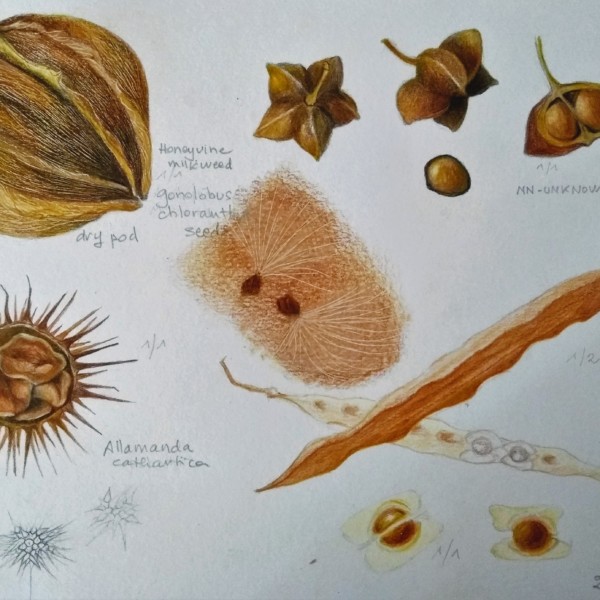
Helene Duplessis added a Photo 5 years, 7 months ago
-
This is a great study page of interesting seeds and pods! I would comment on two things. The drumstick tree pod (both interior and exterior views) don’t read as finished as the other subjects. I think they would benefit from a little toning. That would also be my suggestion for the dry pod on the top left. I see detail, but not form and it would h…[Read more]
-
just reading yous comments ok . yes i have a bit of a problem with light in my studio and i think this affects my drawing .i understand your point about the lack of real shadows and light wich makes the drawing look unfinished . i must see to this soon . thanks .
-
-

sheila y. commented on sheila y.'s Photo 5 years, 7 months ago
Thanks, Wendy. I’d like to find out more about making the drawing into “something “!
-
Mary Weideman commented on Mary Weideman's Photo 5 years, 7 months ago
I’d just add to what I wrote above that my drawing looks quite blurry, even though the printing I added looks much more crisp. Thanks again.
-
Mary Weideman commented on Mary Weideman's Photo 5 years, 7 months ago
I’m new to the course, and it’s great to be here. I began by trying to do the exercises Wendy ran through in the Intro. I found myself struggling a lot when working with the watercolor. So while still practicing that, I went to part 1 of the Twig exercise. My submission is colored pencil only, just to get me started. I think one problem I had…[Read more]
-
-
I’m new to the course, and it’s great to be here. I began by trying to do the exercises Wendy ran through in the Intro. I found myself struggling a lot when working with the watercolor. So while still practicing that, I went to part 1 of the Twig exercise. My submission is colored pencil only, just to get me started. I think one problem I had was…[Read more]
-
I’d just add to what I wrote above that my drawing looks quite blurry, even though the printing I added looks much more crisp. Thanks again.
-
Welcome Mary! Wendy does a few toning exercises on the Botanical Basics section and by repeating the exercises plus working your way through the courses it will become easier for you. As you can see on the ArtFeed many artists start off doing a tone bar on every drawing they do. You are off to a good start! The colored tone bar on top is the more…[Read more]
-
Thanks for your input, very helpful. I, too, noticed that the mid-tones all look the same, sputter, sputter. I’ll use all your tips when moving forward. Oh, and Wendy sent along a helpful e-mail to me re using a scanner and related issues [I’d emailed re same], it was also very helpful. thanks.
-
-
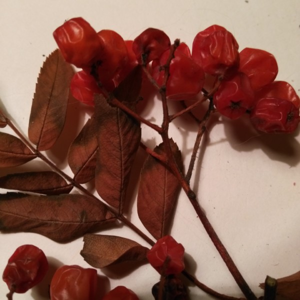
Maureen Doram added a Photo 5 years, 7 months ago
-
Anyone have tips on how to capture all those irregular highlights on the berry wrinkles? This is first stage of sketchbook of the season, mountain ash tree.
-
-
Wendy Hollender commented on sheila y.'s Photo 5 years, 7 months ago
really fun. I see some kind of card, kitchen towel, etc. in your future! I like your all lower case text very playful.
-
sheila y. commented on sheila y.'s Photo 5 years, 7 months ago
Thanks Susanalora, I will try again next year. The brown kraft paper really helps with mid tones.
-
sheila y. commented on sheila y.'s Photo 5 years, 7 months ago
Thanks Vern and Doug, for your suggestions about practicing text with tracing paper. I’m moving on to the next scavenger hunt!
-
Doug Milne commented on Elizabeth Simonson's Photo 5 years, 7 months ago
Elizabeth- the shadows look better now that they are lighter. I think you could go farther and even eliminate some of them. I don’t think you need the shadows on the top between the persimmons. Also the shadow doesn’t need to go up so high on the right side. The right persimmon could use a little more shading on the left where it meets the oth…[Read more]
-
Doug Milne commented on Pam Hancock's Photo 5 years, 7 months ago
This is a better picture Pam and the paper does not look as textured. It is a good start on your oranges and I think the orange on the right is the most successful. You could add more mid and dark tones to establish more form. It looks like the color does not go right up to the edge, as if there is a reflected highlight around most of the orange.…[Read more]
-
Doug Milne commented on sheila y.'s Photo 5 years, 7 months ago
I really like how the names are both vertical and horizontal. With the script added I don’t think you need to add any plant material that I suggested before. Great page Sheila!
-
sheila y. added a Photo 5 years, 7 months ago
-
I really like how the names are both vertical and horizontal. With the script added I don’t think you need to add any plant material that I suggested before. Great page Sheila!
-
Thanks Vern and Doug, for your suggestions about practicing text with tracing paper. I’m moving on to the next scavenger hunt!
-
really fun. I see some kind of card, kitchen towel, etc. in your future! I like your all lower case text very playful.
-
Thanks, Wendy. I’d like to find out more about making the drawing into “something “!
-

Love this! So whimsical 😁
-
Thanks, Carol. I like poking around and gathering things.
-
-
Pam Hancock commented on Pam Hancock's Photo 5 years, 7 months ago
Yes I agree this paper does look very textured!! I have taken a further photo. Thanks for your comments.
-
Pam Hancock commented on Pam Hancock's Photo 5 years, 7 months ago
Thanks for your comments – I will try to draw some more textured twigs.
-
Pam Hancock commented on Pam Hancock's Photo 5 years, 7 months ago
Thanks Doug for your comments. I took another photograph which I hope is better than the previous one. I see what you mean about the paper looking like cold press paper but it is supposed to be a hot pressed paper. All three drawing are done on the samemake of paper. I do have a different hp paper which I will try out.
-
-
Thanks Doug for your comments. I took another photograph which I hope is better than the previous one. I see what you mean about the paper looking like cold press paper but it is supposed to be a hot pressed paper. All three drawing are done on the samemake of paper. I do have a different hp paper which I will try out.
-
This is a better picture Pam and the paper does not look as textured. It is a good start on your oranges and I think the orange on the right is the most successful. You could add more mid and dark tones to establish more form. It looks like the color does not go right up to the edge, as if there is a reflected highlight around most of the orange.…[Read more]
-
-
Doug Milne commented on Pam Hancock's Photo 5 years, 7 months ago
Nice drawing! You have good crisp lines and color saturation. Keep observing the highlights on twigs, etc.. and now I would try drawing some twigs that are more textured.
- Load More