Activity
-

Pam commented on Wendy Kleinman's Photo 2 years ago
Wow Wendy! This is soooo cool.
-
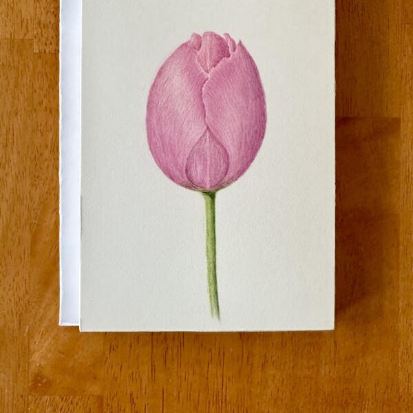
Pam commented on Laurie McConnachie's Photo 2 years ago
Laurie, I love the beautiful simplicity of this composition. It’s a really lovely drawing. You are handling those overlapping petals nicely. I think you could push that 3-D form a little more by darkening the crescent-shape/core-shadow area some more, and maybe lightening up that main highlight a bit. I really like the point of view. It looks…[Read more]
-

-
Laurie, I love the beautiful simplicity of this composition. It’s a really lovely drawing. You are handling those overlapping petals nicely. I think you could push that 3-D form a little more by darkening the crescent-shape/core-shadow area some more, and maybe lightening up that main highlight a bit. I really like the point of view. It looks like…[Read more]
-
-
Wendy Kleinman added a Photo 2 years ago
-
Wow Wendy! This is soooo cool.
-
This is great Wendy! Your watercolor work is lovely!
-
-
Hélène Chiasson commented on Hélène Chiasson's Photo 2 years ago
The time difference caught up to me and this is late coming. I added shading to the interior of the flower – not sure if this is an improvement.
-
Hélène Chiasson added a Photo 2 years ago
-
The time difference caught up to me and this is late coming. I added shading to the interior of the flower – not sure if this is an improvement.
-
Helene. Just wow. LOVE it.
-
The shading added a lot of dimension and you really get the sense of the depth of the center well. Bravo Helene!
-
-
.jpg)
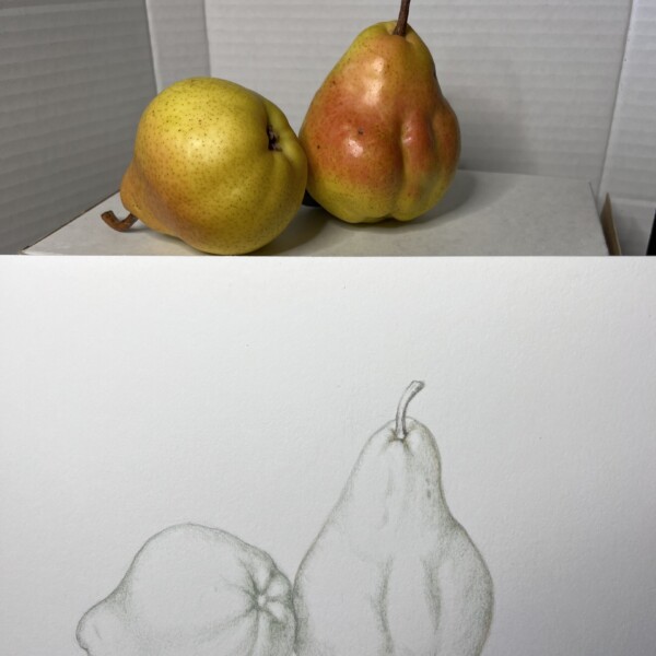
Patricia Nadon-Koro commented on Patricia Nadon-Koro's Photo 2 years ago
Hi Doug. I see that you have rendered a beautiful pear of the same variety I’m presently doing. Your colours seem so fresh and there is absolutely no smudgy toning that so many of my drawings have. I would love to get advice on how to achieve that freshness while giving the fruit a 3D feel.
-
Patricia Nadon-Koro added a Photo 2 years ago
-
Hi Doug. I see that you have rendered a beautiful pear of the same variety I’m presently doing. Your colours seem so fresh and there is absolutely no smudgy toning that so many of my drawings have. I would love to get advice on how to achieve that freshness while giving the fruit a 3D feel.
-
-
Hi Patricia- these are great subjects! It looks like you have used earth green for the grisailles, which is a good choice. First off, a couple of things I would point out about the drawing. The drawing of the pear on the left looks quite different than the actual pear. The top of the actual pear is wider and I also do not see the bottom view of…[Read more]
-
-
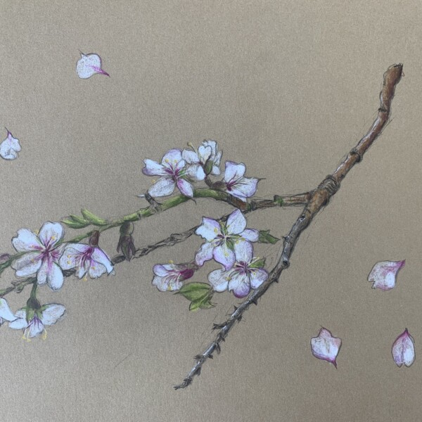
Dolores Duran-Cefalu added a Photo 2 years ago
-
Beautiful, Dolores. I’m loving this on the Kraft paper. Those petals blowing around in the breeze are wonderul!
-
wow thanks! the white flowers were daunting.
-
-
Dolores Duran-Cefalu added a Photo 2 years ago
-
Oh COOL!
-
-
Dolores Duran-Cefalu added a Photo 2 years ago
-
Dolores Duran-Cefalu added a Photo 2 years ago
-
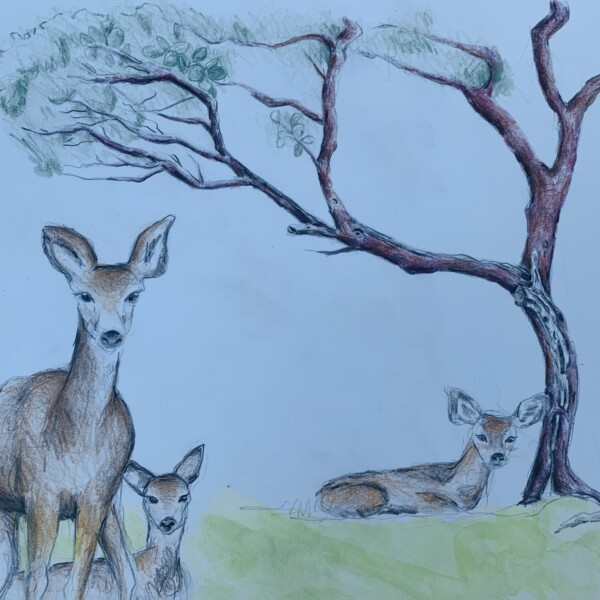
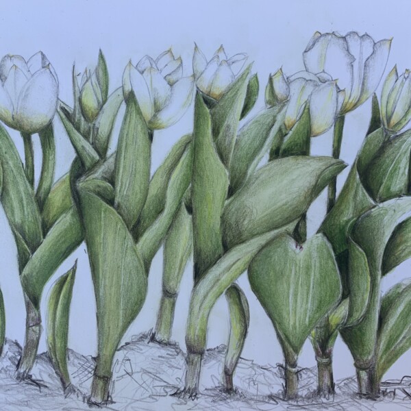
Wow, Dolores. All of those leaves. And white flowers. No small task. This is gorgeous. I’m wondering whether you have a focal point in mind?
-

love your tulips!
-
Thanks! I didn’t have a focal point. My inspiration was, JUST TRY THE TULIPS! hahaha. Getting over my white flower phobia
-
-
Dolores Duran-Cefalu added a Photo 2 years ago
-
Patricia Nadon-Koro commented on Wendy Hollender's Photo 2 years ago
Gorgeous!
-
Patricia Nadon-Koro commented on Doug Milne's Photo 2 years ago
So pretty!
-
Patricia Nadon-Koro commented on Doug Milne's Photo 2 years ago
Oh my! Such beautiful balance in composition and colour!
-
Patricia Nadon-Koro commented on Doug Milne's Photo 2 years ago
Wow! The fruit are so plump! And their colour is gorgeous!
-
Patricia Nadon-Koro commented on Doug Milne's Photo 2 years ago
I’m doing a similar pear next. May I ask what colour you used for the grisaille? Your pears are so beautiful!
-
Doug Milne commented on Hélène Chiasson's Photo 2 years ago
Hi Helene- this looks great! I don’t think you overdid the shading on that petal. You might consider using a green (earth green or a medium green) for the toning on yellow subjects rather than dark sepia, etc which will muddy yellow colors. You can certainly keep some highlights. I would add a little more toning on the petals in the well area a…[Read more]
-
Marie Faile commented on Marie Faile's Photo 2 years ago
Thank you for the comment Doug! I can see what you mean. I used an eraser to make the highlight more noticeable and it does look better now. I guess it’s ok to leave some area free of color, I was feeling like I had to “color” the entire piece.
- Load More