Hi Karen! Your rose is nicely rendered! I like the leaves, stem and sepals very much!!! One of the reasons is that you let the Kraft paper show though in spots to act as mid-tones and there is indeed a range of tones and colors. The flower itself is reading very severe because there is not much variety of color or intensity and the use of a dark pencil for the toning. I expect roses to have a soft, delicate appearance. White flowers are a challenge to be sure. When you really examine white flowers a lot of times you will see there are hints of light greens or blues, pinks etc that you can use for the form toning in addition to adding details. It helps convey the delicacy rather than using dark sepia or other dark pencil. And as I mentioned you can use the color of the paper to achieve some of the range of tones on the flower as you do so well on the green parts!!!!

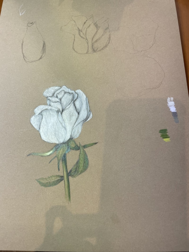
Hi Karen! Your rose is nicely rendered! I like the leaves, stem and sepals very much!!! One of the reasons is that you let the Kraft paper show though in spots to act as mid-tones and there is indeed a range of tones and colors. The flower itself is reading very severe because there is not much variety of color or intensity and the use of a dark pencil for the toning. I expect roses to have a soft, delicate appearance. White flowers are a challenge to be sure. When you really examine white flowers a lot of times you will see there are hints of light greens or blues, pinks etc that you can use for the form toning in addition to adding details. It helps convey the delicacy rather than using dark sepia or other dark pencil. And as I mentioned you can use the color of the paper to achieve some of the range of tones on the flower as you do so well on the green parts!!!!
Thanks Doug. I tried lighter tones on two “experimental” petal drawings.