Activity
-

Pam commented on Rita Haft's Photo 3 years, 3 months ago
This is a gorgeous composition, Rita. And those details are incredible!
-
Pam commented on Machi's Photo 3 years, 3 months ago
forgive all my typos and mis-spellings (gah!)
-
Pam commented on Machi's Photo 3 years, 3 months ago
Gorgeous. You really have a way with orchids. I love how you have the stem in the back fade into the background, add some nice interest to the composition. I love that you are showing so many views of the flowers, you can really get to know this plant through this drawing. That pulled-apart flower in the upper left is just great. I think you could…[Read more]
-
Pam commented on Ishbel Galloway's Photo 3 years, 3 months ago
Nice graphite study, Ishbel! II especially like that curling petal out in front. Although you have a lot of variation in tone, I feel like it looks a little flat, but I’m not sure why. I think it may be because all of your highlights are similar in value? Maybe you could try toning down some of your secondary highlights? I’m not sure. I’m anxious…[Read more]
-
Pam commented on sheila y.'s Photo 3 years, 3 months ago
I get excited every time I see one of your posts. This is so lovely. I love the subjects you chose, and the colors are gorgeous on the page. I love the movement, and the way my eye moves around the page. The only thing that is bothering me just an itty bitty bit, is the leaf on the lower left directing my eye off the page. But that just may be my eyes.
-

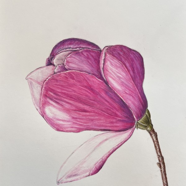
Rita Haft added 2 Photos 3 years, 4 months ago
-
This is a gorgeous composition, Rita. And those details are incredible!
-
So pretty. All of these magnolias are making me long from spring – sigh. I like this view a lot. That petal tipping down makes me think of a courtier doing that hand twirling flourish bowing thing to a king. There is one thing that bothers me about it, but I think it’s just my brain. That petal in front also makes me think of a tongue of a panting…[Read more]
-
The toning and highlights on the petals are so good Rita!!! Each petal has great form and you can see how they cup and curve! Really appreciate how strong the colors are, but yet the texture of the petals have a delicacy to them too! Wonderful job!!!!!
-
I really enjoy the mix of graphite and color Rita! The details on the seed pod and stems are particularly amazing and everything is beautifully rendered! The one that is bothering me is that all the color is on one side and the graphite is on the other side. Think about how the placement of color helps carry your eye around the page.
-

Rita, you’re on fire. 🙂
-
Vibrant, strong, good looking. I don’t see the dog tongue but a touch more veining couldn’t hurt. @pgthompson dog tongue. lol.
-
-

Sandra Gortemaker commented on Sandra Gortemaker's Photo 3 years, 4 months ago
I did the sketching in the garden, and used a photo later on. I did try to burnish with ivory but stil to much lines. -
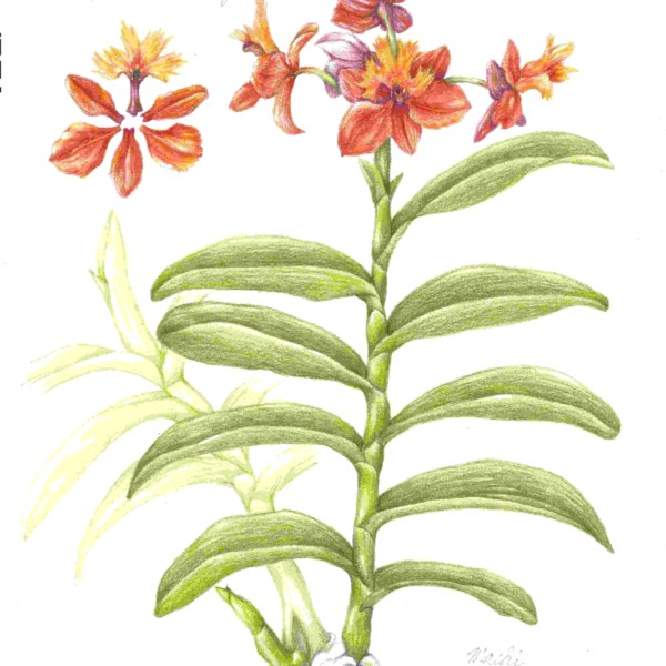
Machi commented on Machi's Photo 3 years, 4 months ago
Finally finished a page started back in the fall – a lot happened in between.
-
Machi added a Photo 3 years, 4 months ago
-
Finally finished a page started back in the fall – a lot happened in between.
-
Gorgeous. You really have a way with orchids. I love how you have the stem in the back fade into the background, add some nice interest to the composition. I love that you are showing so many views of the flowers, you can really get to know this plant through this drawing. That pulled-apart flower in the upper left is just great. I think you could…[Read more]
-
forgive all my typos and mis-spellings (gah!)
-
-

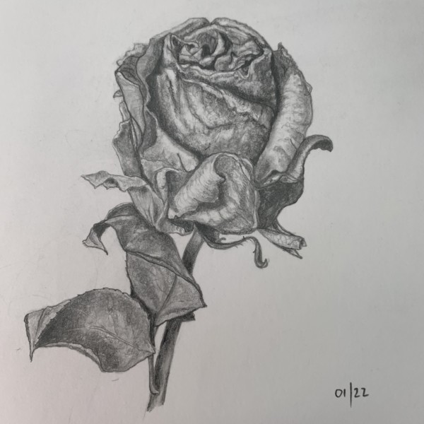
Ishbel Galloway added a Photo 3 years, 4 months ago
-
Nice graphite study, Ishbel! II especially like that curling petal out in front. Although you have a lot of variation in tone, I feel like it looks a little flat, but I’m not sure why. I think it may be because all of your highlights are similar in value? Maybe you could try toning down some of your secondary highlights? I’m not sure. I’m anxious…[Read more]
-
Thanks for your comments Pam. Again I think the exposure is off in this one which does make the highlights very grey. I need to work on that.
-
I can see what you’re talking about Ishbel, since the paper looks grey due to exposure. I’m thinking of buying a new scanner and getting the settings right.
-
-

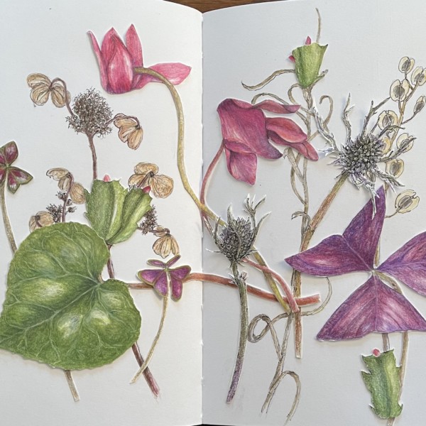
sheila y. added a Photo 3 years, 4 months ago
-
I get excited every time I see one of your posts. This is so lovely. I love the subjects you chose, and the colors are gorgeous on the page. I love the movement, and the way my eye moves around the page. The only thing that is bothering me just an itty bitty bit, is the leaf on the lower left directing my eye off the page. But that just may be my eyes.
-
@pgthompson thanks for your feedback! I see what you mean about that leaf…hmm, I was thinking of adding some element to the center. Maybe that will draw the eye back. I’ll experiment before gluing:)
-
I like all the different textures in here too – super engaging.
-
Thanks, Sam. It’s a hunt for fresh and dried these days. We had a heavy, wet snow yesterday!
-
-
Maureen Doram commented on Maureen Doram's Photo 3 years, 4 months ago
@vern The little fuzzies would be a good challenge for the next project, very fine paintbrush needed I think!
-
Maureen Doram commented on Maureen Doram's Photo 3 years, 4 months ago
@sam-mcwilliams This was a really fun project, I traipsed through knee deep snow in minus 30 to get the cattail!
-
Maureen Doram commented on Sam McWilliams's Photo 3 years, 4 months ago
Beautiful Sam, I always love seeing your work. I agree it’s good use of the tan paper for shadows!
-
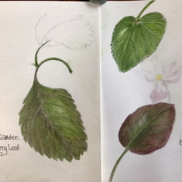
Cathie Hunter added 2 Photos 3 years, 4 months ago
-
Nice job observing the leaf margins, Cathie. I always find them so interesting. 🙂 Also the colours on the begonia leaf – way to go.
-
-
Emet Lipson commented on Draw Botanical's Photo 3 years, 4 months ago
6-8pm EST! -
Pam commented on Draw Botanical's Photo 3 years, 4 months ago
What time, so I can get it on my calendar? 🙂
-
Pam commented on Jill Amadei's Photo 3 years, 4 months ago
Jill, I can always tell which drawings are yours- you have such a lovely style. This is just gorgeous. I want to see that center portion look more spherical. Maybe consider adding some more toning to the core shadow area of that center part, and then also lighten up the area where the highlight would be. It’s gorgeous as is, but I think you could…[Read more]
-
Pam commented on Elizabeth Simonson's Photo 3 years, 4 months ago
Oh wow. This is absolutely gorgeous. What a beautiful display of native plants & bees. I LOVE the composition.
-
Pam commented on Sharon Combey's Photo 3 years, 4 months ago
Beautiful colors and toning. To give it more of a 3 dimensional form, I would go in with a darker pencil(s) (maybe some dark sepia & chrome oxide green?) and slowly layer in some shadow on the right and bottom of the lime (core shadow). I would start there, see what you think, and then maybe think about lifting out a bit more highlight with a…[Read more]
- Load More