Activity
-

-
Katy Lyness commented on Jill Amadei's Photo 3 years, 9 months ago
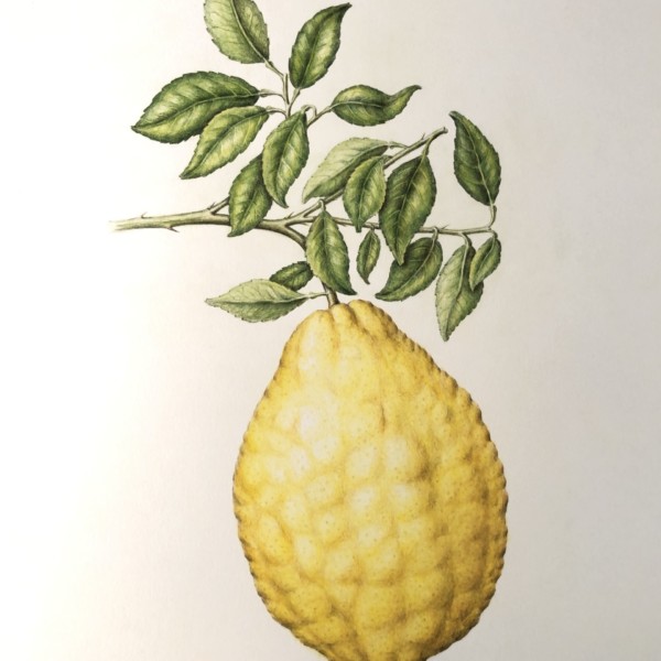
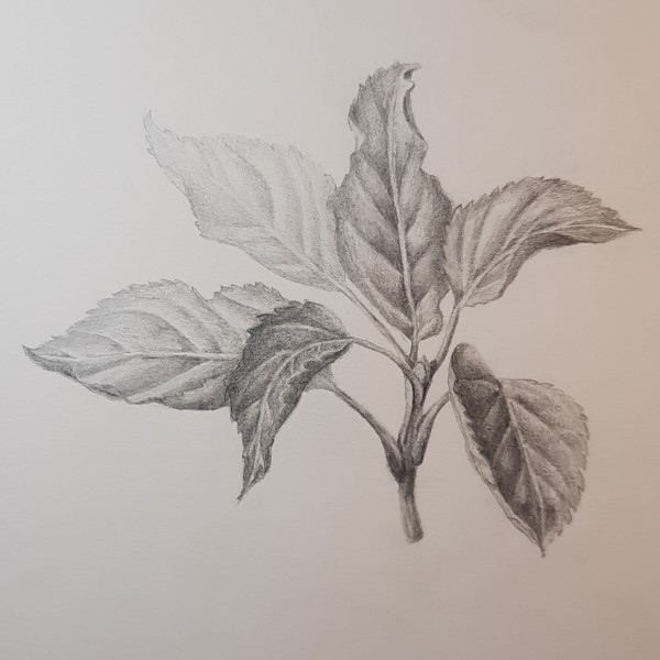
Oh, and I forgot to mention the leaves. I love them! They are so lively. Almost like they are having a conversation with each other.
-
Katy Lyness commented on Jill Amadei's Photo 3 years, 9 months ago
Hi Jill, I love a well drawn yellow colored anything. So I’m lovin this. As usual your toning is exquisite! Flawless! I can almost feel that bumpy surface. The one thing that bothers me about this drawing is that the edges seem a bit “outlined”. I think it would help if you bring some of those darker values into the shadows of the bumps as it…[Read more]
-

-
Hi Jill, I love a well drawn yellow colored anything. So I’m lovin this. As usual your toning is exquisite! Flawless! I can almost feel that bumpy surface. The one thing that bothers me about this drawing is that the edges seem a bit “outlined”. I think it would help if you bring some of those darker values into the shadows of the bumps as it…[Read more]
-
Oh, and I forgot to mention the leaves. I love them! They are so lively. Almost like they are having a conversation with each other.
-

So lovely! What kind of fruit is this?
-
Beautiful bumps like on your beautiful sand dollar.
-

Wow, Jill, this is gorgeous. I like Katy’s suggestion – I think it’ll be unifying.
-
-
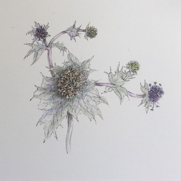
Doug Milne commented on Ishbel Galloway's Photo 3 years, 9 months ago
Gorgeous Ishbel! Love the colors, the composition, everything!!!
-
Doug Milne commented on Dorothee Frandsen's Photo 3 years, 9 months ago
Nice Dorothee- I like how the leaves in back are lighter!
-
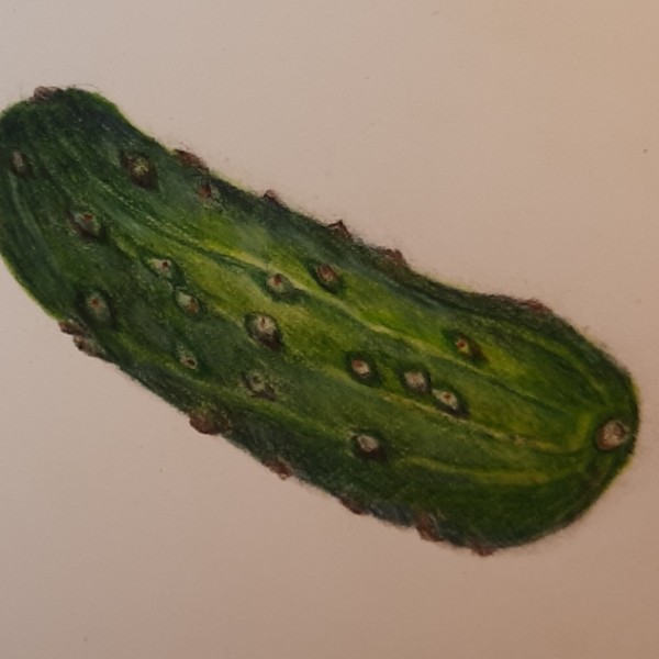
Doug Milne commented on Dorothee Frandsen's Photo 3 years, 9 months ago
Hi Dorothee- it looks like what I call a Kirby cucumber. The colors are great! The main highlight in the middle is throwing me off and it is hard for me to tell where your light source is coming from.
-
Doug Milne commented on Dorothee Frandsen's Photo 3 years, 9 months ago
Sorry Dorothee! I am blaming the name error on my iPad!
-
Doug Milne commented on Dorothee Frandsen's Photo 3 years, 9 months ago
So lifelike Dorothea! The colors are spot on and great texture too!
-
Doug Milne commented on sheila y.'s Photo 3 years, 9 months ago
Lovely Sheila! The style of it looks like a combination of your works of years past combined with what you have been doing recently. The centers (flowers?) are mesmerizing!
-
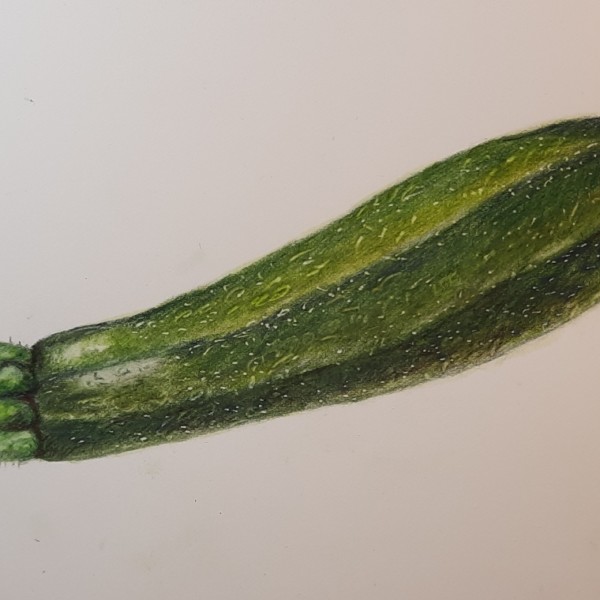
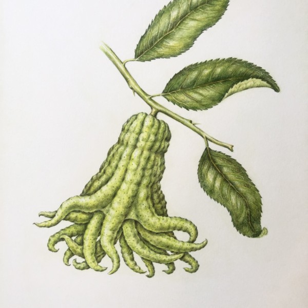
Doug Milne commented on Jill Amadei's Photo 3 years, 9 months ago
Great Jill- it looks like you crossed an octopus and a squash! Beautiful toning and details!
-

Ishbel Galloway added a Photo 3 years, 9 months ago
-
Gorgeous Ishbel! Love the colors, the composition, everything!!!
-
Thanks Doug!
-
I echo Doug here, Ishbel. It’s overall a lovely drawing/painting /composition for me. Just lovely. Makes me feel peaceful and restful and happy. I am so very drawn to it.
-
-
Dorothee Frandsen commented on Dorothee Frandsen's Photo 3 years, 9 months ago
I’ve added a few suggested minor changes.
-
Dorothee Frandsen added a Photo 3 years, 9 months ago
-
I’ve added a few suggested minor changes.
-
Nice Dorothee- I like how the leaves in back are lighter!
-
-
Dorothee Frandsen added a Photo 3 years, 9 months ago
-
Hi Dorothee- it looks like what I call a Kirby cucumber. The colors are great! The main highlight in the middle is throwing me off and it is hard for me to tell where your light source is coming from.
-
-
Dorothee Frandsen added a Photo 3 years, 9 months ago
-
So lifelike Dorothea! The colors are spot on and great texture too!
-
Sorry Dorothee! I am blaming the name error on my iPad!
-
-
Ishbel Galloway commented on Ishbel Galloway's Photo 3 years, 9 months ago
Good point Doug, I see that. Thanks.
-

-
-
Lovely Sheila! The style of it looks like a combination of your works of years past combined with what you have been doing recently. The centers (flowers?) are mesmerizing!
-
Thanks, Doug. I think the centers are made of little flowers, like other composite (?) flowers. It was fun for me to look at them.
-
-
Jill Amadei added a Photo 3 years, 9 months ago
-
Great Jill- it looks like you crossed an octopus and a squash! Beautiful toning and details!
-
- Load More
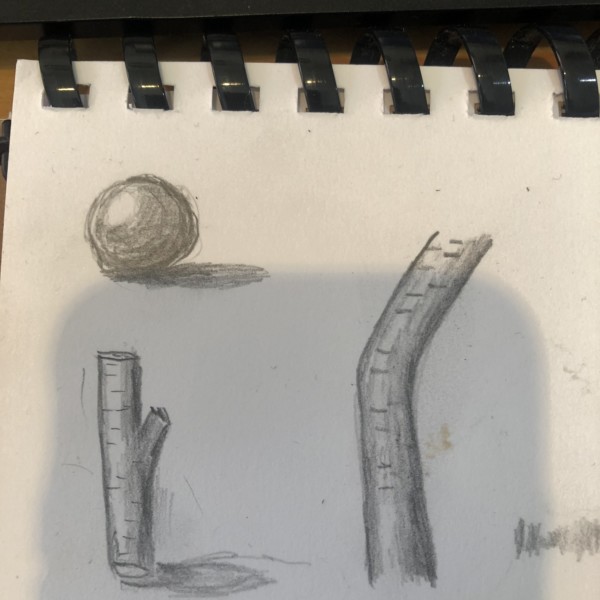


Hi Elizabeth, Good to see you working on those basics! I like that you are getting a good value range from dark to light. Keep working on getting more control of your toning. It just takes practice. Achieving a smooth gradient in those lighter values can be challenging.
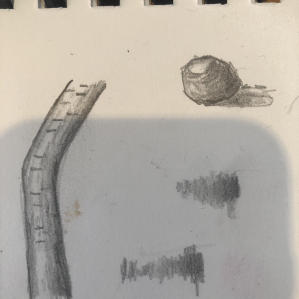
Hi again Elizabeth, Nice work. On the two on the left side of the page, I’m seeing a good understanding of the light source. Again, you just need practice on getting more control of your toning. Also when you include the textural details as you have in the twigs, try to make them follow the curve of the object. This will help define the form.
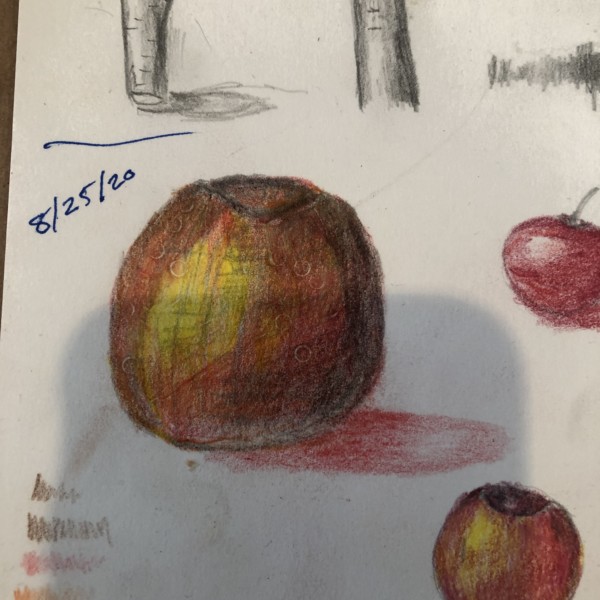
Hey Elizabeth, I love that you are being bold with your colors! However, I think your darkest shadow color is too black. You could use that color for the shadow directly under the apple. I’d use a burgundy or maroon for the darker areas on the apple. And though I love the yellow tone you have in the highlight area, I’d like to see you leave the…[Read more]
TY!