Activity
-

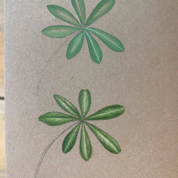
Hélène Chiasson added a Photo 12 months ago
-
Hélène Chiasson added a Photo 12 months ago
-
Hélène Chiasson added a Photo 12 months ago
-
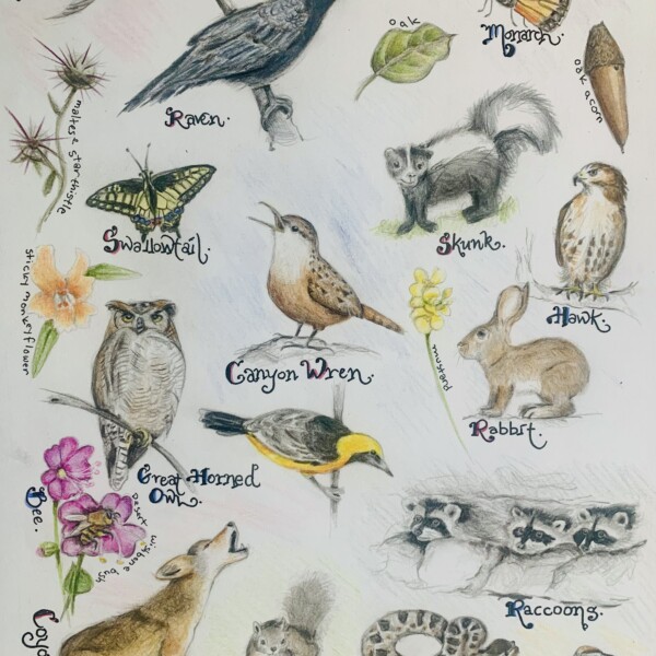
Dolores Duran-Cefalu added 2 Photos 1 year ago
-
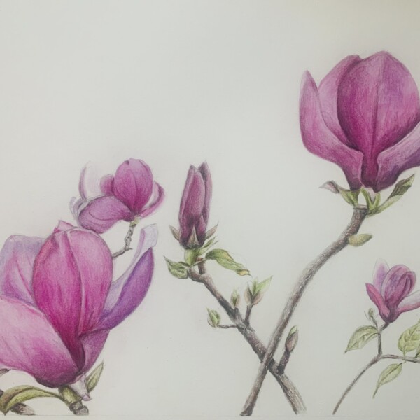
Hi Dolores! Beautiful colors and I enjoy seeing the different stages. Our magnolias often get hit with a frost here on the east coast, but they have been magnificent this year!
-
What a fun page Dolores! Except for the rattlesnake! The dogs and I regularly see barred owls on our morning walks. Babies are expected soon! So many wonderful images! Great page!
-
-
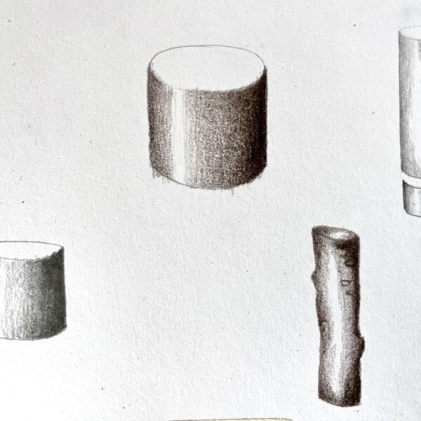
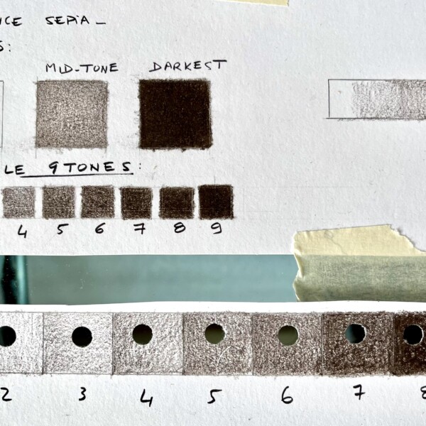
claire mignard added 2 Photos 1 year ago
-
Welcome to the ArtFeed Claire! Nice job on the these tone squares! I would point out a couple of things. The thing to remember is that the middle square (in your 3 squares at the top) should be half the strength of the darkest square. The #5 square in the 9 squares below looks darker and I think more accurate. #5 in the larger squares on the…[Read more]
-
Another good page Claire! You are achieving a nice range of tones. With the wider cylinder on the top, the areas flanking the highlight could be lighter.
-
Thank you very much for your help. I had to put on pause my trial but I want to come back, this course is amazing
-
Thank you so much for all the advise, I will correct. Also, I have a question…I am using Luminance pencils, and my pencil is Sepia. It seems darker than the one demonstrated on the course. Would you have any advise on which luminance pencil I could use ? I already have a good collection of Pablo and Luminance pencils from Caran D ache and I…[Read more]
-
-
claire mignard commented on Hélène Chiasson's Photo 1 year ago
Wowwwwww I cannot imagine how long you spent on it
-
claire mignard commented on Hélène Chiasson's Photo 1 year ago
Very elegant, love it
-
claire mignard commented on Hélène Chiasson's Photo 1 year ago
Wowwww this is impressive
-

Ishbel Galloway commented on Ishbel Galloway's Photo 1 year ago
Thank you Doug!
-
Ishbel Galloway commented on Ishbel Galloway's Photo 1 year ago
-
Ishbel Galloway commented on Ishbel Galloway's Photo 1 year ago
Great comment Doug, thanks. This petal bothered me too. I think softening the edges has helped although it is still a bit odd.
-
Doug Milne commented on Faye Forman's Photo 1 year ago
Beautifully rendered Faye! It is nice to see the progression!
-
Doug Milne commented on Faye Forman's Photo 1 year ago
This is fun Faye! I love the torn edge of the tea packet!
-
Doug Milne commented on Faye Forman's Photo 1 year ago
Wonderful colors Faye! There are a couple of areas to revisit. You could add more shadow toning where leaves overlap. The berries also need highlights and a range of dark toning. I see that the berries that are behind are slightly more saturated, but it is subtle. Because there are no highlights or range of tones the berries are too similar and…[Read more]
-
Doug Milne commented on Faye Forman's Photo 1 year ago
Welcome to the ArtFeed Faye! Good job on these berries! The rendering is nice as are the colors! My one comment would be consistency. A couple of the red berries could use more tonal range to enhance their form and a number are missing a highlight. Same goes for the blue berries. Pay attention to the placement of the highlights as some are not…[Read more]
-
Doug Milne commented on Ishbel Galloway's Photo 1 year ago
Wow Ishbel! Gorgeous! You really captured the folds and details! The colors are so soft, but the image has such impact. I could look at this for hours! Bravo!
-
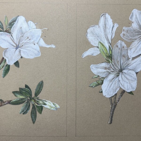
Doug Milne commented on Ishbel Galloway's Photo 1 year ago
You are mastering white flowers on Kraft paper Ishbel! The one spot I wonder about is the bottom right petal on the bottom flower. Unlike all the other petals it has a strong outline. That is causing a strong contrast which is demanding my attention and makes the petal look as if it is applied. Softening the two side edges of that petal will…[Read more]
-
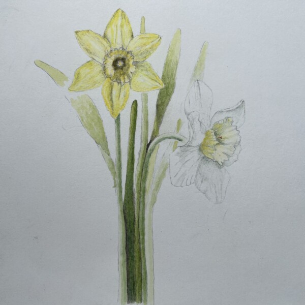
Doug Milne commented on Ishbel Galloway's Photo 1 year ago
Another white beauty Ishbel! The one area I would take another look at is the petal at the top that is seen between the two petals of the large flower in front of it. I think you need more dark in the “v” as you did in other spots. Visually, I wish the top edge of that petal in the back did not almost line up with the tip of the large petal to it’…[Read more]
-
Doug Milne commented on sheila y.'s Photo 1 year ago
Hi Sheila! I thought I had responded to this piece, but I guess only in my mind. I am struggling with the composition. The top section seems busy, while the bottom area is dominated by the two leaves creating a strong inequity. Personally, rather than covering the two leaves with something I would rather see more exposure of the leaves in the…[Read more]
-
Faye Forman added a Photo 1 year ago
-
Beautifully rendered Faye! It is nice to see the progression!
-
- Load More