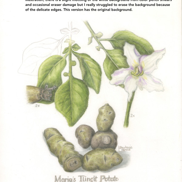
Activity
-

Wendy Kleinman added a Photo 4 years, 6 months ago
-
-
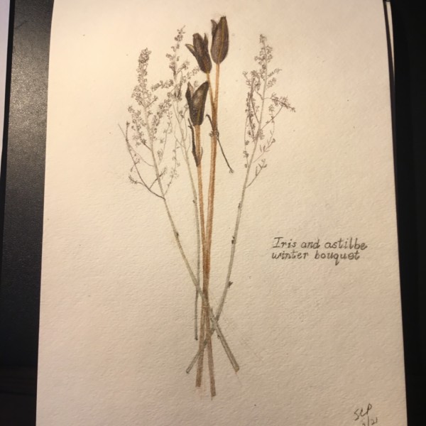
I absolutely love this Sharon!!! I love the contrast between the strong Iris pods and the delicate astilbe stems!!!! Beautifully rendered!!!!!
-
@doug-milne. Thanks so much for your comment about my iris astilbe drawing! Much appreciated!
-
-
Janegold added a Photo 4 years, 6 months ago
-

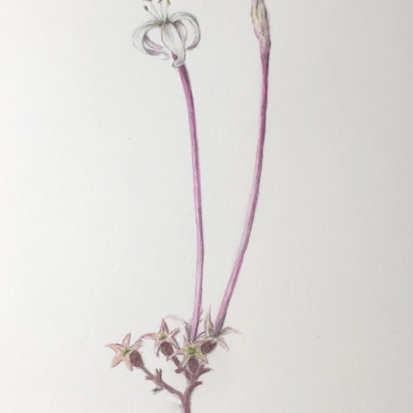
Oh I love this, Jane. What a standout. The curves on the white petals, the overall gracefulness, and the star shapes below. Beautiful.
-
-
Janegold added a Photo 4 years, 6 months ago
-
This is great Jane! The skin texture is so good and I love how you illustrated the well area! I think you could continue to add more darker toning above what you have all ready done on the right side and also add some along the bottom. Beautiful!
-
So good Jane! I want to pick it up.
-
-

Pam commented on Pam's Photo 4 years, 6 months ago
Awww. Thanks. Fun to draw something colorful for a change 🙂
-
Cyndi Reed added a Photo 4 years, 6 months ago
-
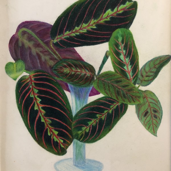
Yes I like the velvety deep dark green you achieved contrasted with the glow of the red and bright greens.
-
-
Cyndi Reed added a Photo 4 years, 6 months ago
-

sheila y. commented on sheila y.'s Photo 4 years, 6 months ago
Watercolor base, and then pencil. Added the seed today. Darker on the right?
-
sheila y. added a Photo 4 years, 6 months ago
-
Watercolor base, and then pencil. Added the seed today. Darker on the right?
-
Yes, I would say darker. Needs something to make one feel the the curve on the left side. Somewhat flat on that side. I feel it lacks a core shadow and reflective light. Otherwise quite lovely. I especially love the color and delicate texture.
-
Katy, thanks for that suggestion! I’ll get to work:)
-
-
Theodora Korasidis added a Photo 4 years, 6 months ago
-
Theodora Korasidis added a Photo 4 years, 6 months ago
-
Sweet drawing! I love the complementary colors! So pleasing. And you work on the petal textures is sensitive and lovely! Also great subtle work on the veins of the leaf.
-
Thank you…might add to this…I found it pretty difficult actually..
-
-
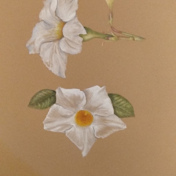
Theodora Korasidis added a Photo 4 years, 6 months ago
-
Lovely! Was this all watercolor? I like the way you have used the tone of the Kraft paper to achieve the values. Especially on the bottom one. That technique takes control. It is so easy to overdo the white.
-
Thanks Katy. I’m just practicing ATM on Kraft paper. From memory the bottom one is mostly water colour and my second attempt. I watched Wendy’s lesson and it sunk in a bit better on my second try about using the tone of the craft paper to show shadows. I’m not too successful with leaves on Kraft paper and feel a little lost there but it is fun and…[Read more]
-
Thanks for the feedback Vern. I shall give leaves on craft paper a few more tries…
-
-
-
Katy Lyness commented on Katy Lyness's Photo 4 years, 6 months ago
Thanks, Camille! I see you have been doing some beautiful drawings of clementines yourself. Aren’t they fun? I love drawing the little segments and the curling peel! -
Camille Maravegias added a Photo 4 years, 6 months ago
-
Another beauty! I love the deep rich darks. And your rendering of the veining is well done.. I also love your use of color! My only suggestion would be to tone down the cast shadow. It looks too “drawn”. Soften the edge. It should never have even a hint of an outline.
-
Beautiful, as usual, Camille. I especially appreciate the back of the leaf – the softness, the muted green and the reddish tones. Just lovely. I could look at it for a long time.
-
Thank you. I did many leaf backs in order to understand the visual differences. This is the only one that was convincing. Unfortunately that long shadow was needed to be convincing. I will keep trying to render the leaf backs for a while. Thank you for your comments. It helps a lot to propel me forward.
-
Thank you, Katy. I am amazed by your comments. Since your work is so inspiring.
-
-
Camille Maravegias added a Photo 4 years, 6 months ago
-
Hi Camille, Lovely drawing. We both love the clementine! I love how you have rendered the peel on the right side. I really feel its texture and thickness. Also the glow of the translucent fruit is beautiful! the one comment I would have concerns the shadows. I think you will find there should be more of a shadow where the peel overlaps the fruit…[Read more]
-
Hi Camille, I really love this drawing. It has a lovely orange glow and I like how it turns and opens up towards something. It’s an inviting and dynamic composition.
-
-
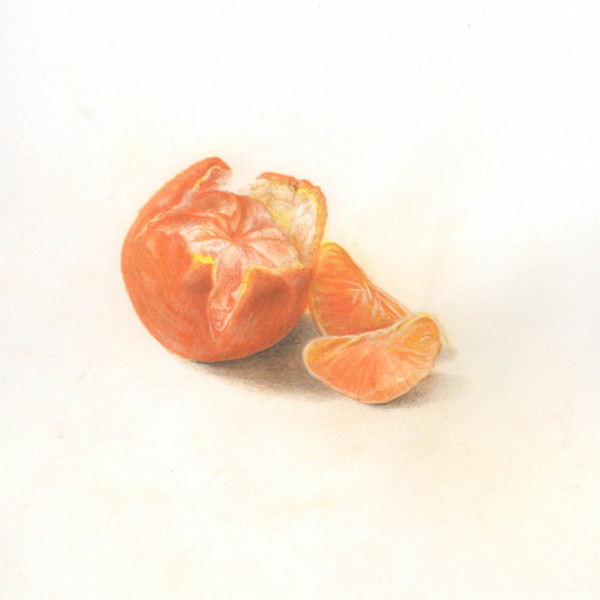
Camille Maravegias added a Photo 4 years, 6 months ago
-
I love a simple, well done drawing of a piece of fruit! Thank you for this! The slices are so well done! I think the whole fruit maybe has too obvious pencil lines. Try toning with small circular movements. If the subject has natural contour lines you can use them to indicate form, but I think in this case it is distracting. Especially since the…[Read more]
-
-
Camille Maravegias commented on Katy Lyness's Photo 4 years, 6 months ago
Lovely rendering
-
Camille Maravegias commented on Colleen Brannen's Photo 4 years, 6 months ago
Lovely composition and rendering
-
Doug Milne commented on Lucille Alice's Photo 4 years, 6 months ago
Hi Lucille- no – you haven’t gone too far. You could still go darker in spots as we discussed. Be sure to leave your highlights! Is this color (red-violet?) you used good for your grisailles layer? If the flower is a deep red, you could even be a little more saturated with the shading.
- Load More

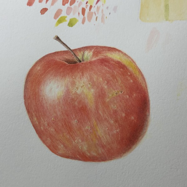


Added more toning on lower third of larger apples to try to provide greater contour.
The forms do read better Wendy!!!
Thanks for the follow up Doug. I didn’t see the lower flatness until you pointed it out.
Congratulations on such a constant feel in form and texture in the three stages. I can really tell that its the same apple. Wow! something to aspire to.
Really fun exercise you mapped out here – and beautiful, strong painting. Fun composition too.
Thank you Sam!