Activity
-
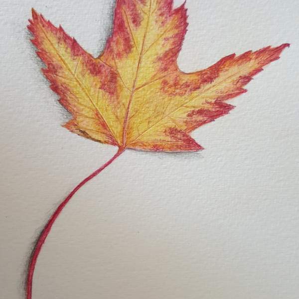
Doug Milne commented on Marina Segalovitch's Photo 4 years, 5 months ago
This is beautiful Marina! It is nicely rendered and the colors are beautiful!
-
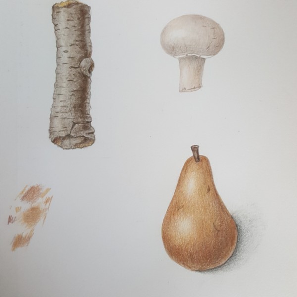
Doug Milne commented on Marina Segalovitch's Photo 4 years, 5 months ago
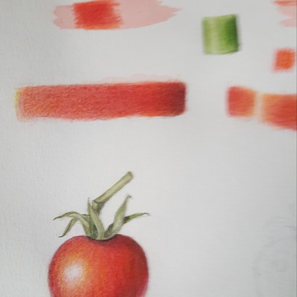
Hi Marina- your three subjects look great! They all have really nice form and great even toning! You are not showing a cast shadow on the branch segment so I would not do a reflective highlight on it. If you leave it I would make it narrower and add some more dark toning. Right now the dark toning looks like a stripe instead of a transition from…[Read more]
-
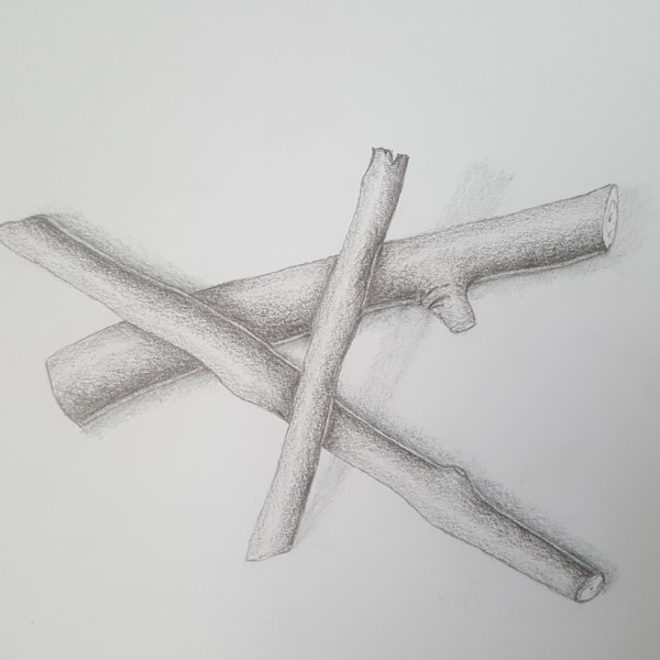
Doug Milne commented on Marina Segalovitch's Photo 4 years, 5 months ago
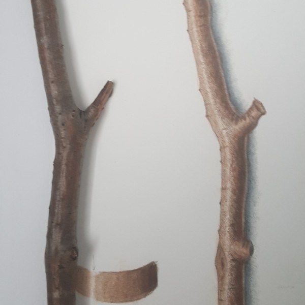
Hi Marina-the branches are looking good. There are a couple of areas I would revisit. Your reflective highlight is too dominant. Especially on the vertical branch the reflected highlight does not look like it is on the branch. Reflective highlights are not as light as the main highlight and I would tone them down. Also look at the cast shadows on…[Read more]
-
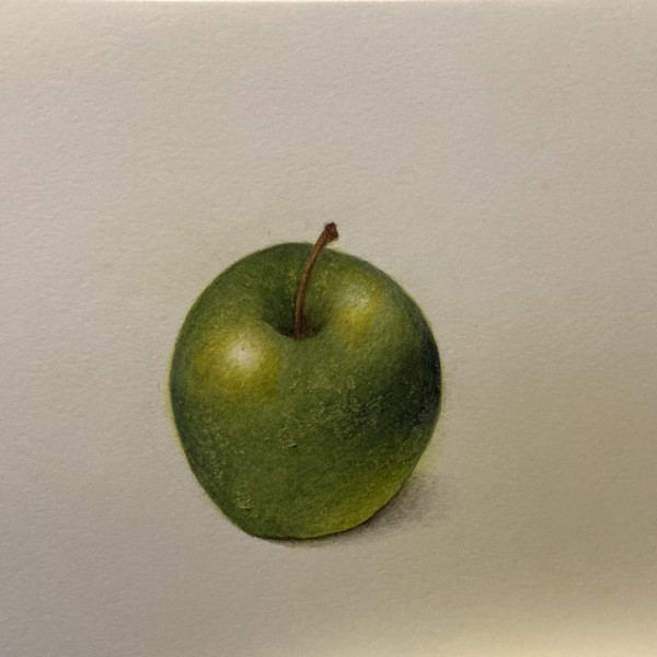
Doug Milne commented on Laurie McConnachie's Photo 4 years, 5 months ago
Hi Laurie- your apple has such beautiful form!! The color selection and saturation are wonderful! The highlights and the dark toning in the well are also great! I would expect to see a shadow from the stem coming out of the well and curving up on the right side. I think your cast shadow could continue up the side a little, but what is there so…[Read more]
-
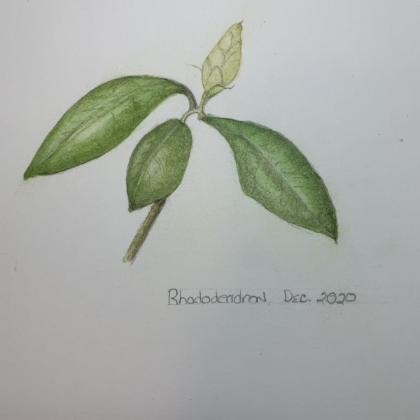
Doug Milne commented on Douglass Reitter's Photo 4 years, 5 months ago
Hi Douglass- I am wondering what happened to the stem. You see it go behind the leaf, but it does not come out the other side to attach to the base of the bud. The leaves are a nice color green and they have a nice fullness to them. I would add some toning to your flower bud to give it some form. For a light color like the bud a medium to dark…[Read more]
-
-
Hi Laurie- your apple has such beautiful form!! The color selection and saturation are wonderful! The highlights and the dark toning in the well are also great! I would expect to see a shadow from the stem coming out of the well and curving up on the right side. I think your cast shadow could continue up the side a little, but what is there so far…[Read more]
-
Hi Doug, Thank you for the helpful comments. I will make those adjustments. I used Stonehenge Aqua Hot Press- for the first time. I had trouble with the color lifting off of the paper in several places. I burnished with the ivory pencil and added more layers of yellow, green, and indigo on top of that. Is there a point when you can put on too many…[Read more]
-
Thanks for explaining this to me- very helpful!
-
Hi Laurie – your build up of layers looks so great – rich like an oil painting on panel. Lovely to look at. I might tone down the upper right highlight a bit – I think it distracts me a bit and my eye jumps back and forth too quickly.
-
-
sheila y. commented on Maureen Doram's Photo 4 years, 5 months ago
What a fantastic cluster. Love the color, and darks at the overlapping.
-
sheila y. commented on Jill Amadei's Photo 4 years, 5 months ago
Jill, ditto on the wows and stunning. It has such a beautiful presence!
-
sheila y. commented on Wendy Hollender's Photo 4 years, 5 months ago
This is incredible. I feel like it’s growing or moving before my eyes!
-
sheila y. commented on Marina Segalovitch's Photo 4 years, 5 months ago
These are beautifully toned!
-
sheila y. commented on Douglass Reitter's Photo 4 years, 5 months ago
This is lovely. I really admire your leaves!
-
sheila y. commented on sheila y.'s Photo 4 years, 5 months ago
@jillamdei
Thank you, Jill! -
Dolores Duran-Cefalu commented on Teresa Goetz's Photo 4 years, 5 months ago
wow the acorn caps!
-
Dolores Duran-Cefalu commented on Jill Amadei's Photo 4 years, 5 months ago
WOWWWWW NEXT LEVEL!
-
-
This is lovely. I really admire your leaves!
-
Hi Douglass- I am wondering what happened to the stem. You see it go behind the leaf, but it does not come out the other side to attach to the base of the bud. The leaves are a nice color green and they have a nice fullness to them. I would add some toning to your flower bud to give it some form. For a light color like the bud a medium to dark…[Read more]
-
Hi Douglass, a tiny detail that helps, I think, is to vary the length of the lines at the bottom of the stem when we “cut” it off in our drawings. For example, the lower right line could extend down a bit and the colour/toning continue a bit down there. Pam has an example of this in a recent drawing on her page that illustrates what I’m thinking.
-
-
Marina Segalovitch added a Photo 4 years, 5 months ago
-
Hi Marina-the branches are looking good. There are a couple of areas I would revisit. Your reflective highlight is too dominant. Especially on the vertical branch the reflected highlight does not look like it is on the branch. Reflective highlights are not as light as the main highlight and I would tone them down. Also look at the cast shadows on…[Read more]
-
Hi Doug, thank you very much for your feedback. It was very helpful, I am a beginner.
-
-
Marina Segalovitch added a Photo 4 years, 5 months ago
-
These are beautifully toned!
-
Hi Marina- your three subjects look great! They all have really nice form and great even toning! You are not showing a cast shadow on the branch segment so I would not do a reflective highlight on it. If you leave it I would make it narrower and add some more dark toning. Right now the dark toning looks like a stripe instead of a transition from…[Read more]
-
-
Marina Segalovitch added a Photo 4 years, 5 months ago
-
Marina Segalovitch added a Photo 4 years, 5 months ago
-
Marina Segalovitch added 2 Photos 4 years, 5 months ago
-
This is looking good Marina! Nice toning and attention to detail! It is great seeing your actual subject. You can see that the reflected highlight is not as strong as your drawing. As I mentioned on another one of your posts I would add some color to the reflected highlight to tone it down. Also notice that the main highlight fades in and out of…[Read more]
-
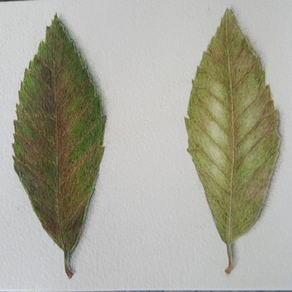
Hi Marina- on most leaves there is a noticeable dark and light side of the main vein. It really helps me to think of a leaf as an open book and then I know which side will be which. I am missing a highlight or at least lighter tones of green on the front view of the leaf. Especially since the highlights are so prominent on the back view. You have…[Read more]
-
The others already covered the feedback here – so I can just say, good drawing – it’s fun to look at. 🙂
-
- Load More
