Activity
-

sheila y. commented on sheila y.'s Photo 4 years, 5 months ago
Thanks, Teresa. It was fun to keep adding to! -

Katy Lyness commented on sheila y.'s Photo 4 years, 5 months ago
Also, I like the “Is it autumn or is it spring?” question the composition poses. I’m feeling that now as I see the peach trees bloom here in Jersey City.
-
Katy Lyness commented on sheila y.'s Photo 4 years, 5 months ago
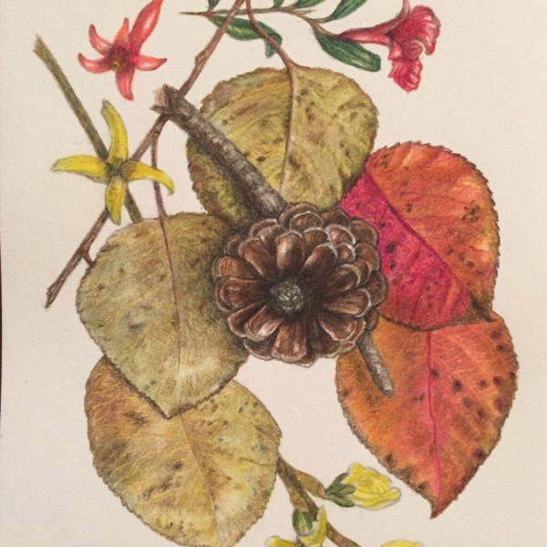
Boy! That pinecone just jumps off the page! And I love the way you do leaves!
Quite the challenge to place the cone front & center and head first. But you pull it off. I think it is the rich darks that really make to work. -
Katy Lyness commented on Douglass Reitter's Photo 4 years, 5 months ago
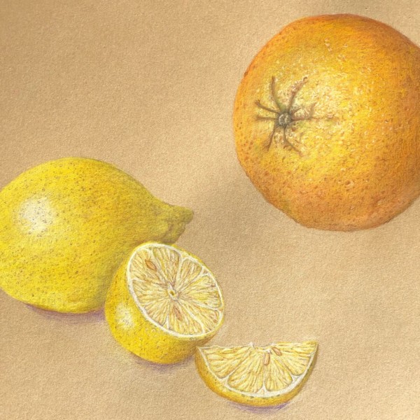
Hey Douglass, Nice seeing you in the workshop! We already commented on this lovely citrus piece, but I will restate that I think you can take both drawings further with colored pencil. Bring in more darks. and hit the highlights with some white specks in the center. Be careful not to go too gray with the lemon. Also add more dots on the lemon, so…[Read more]
-
Teresa Goetz commented on Teresa Goetz's Photo 4 years, 5 months ago
after modifications from suggestions in workshop over weekend…
-
Teresa Goetz added a Photo 4 years, 5 months ago
-
after modifications from suggestions in workshop over weekend…
-
Yes! Much better. The colors are working. It was partly that the color of the photo was off on the one we viewed in the workshop. It was much greyer. I like that you are adding cast shadows. I would have them extend more to the right a bit. You have that strong highlight that indicates the light is coming from the left so there should be shadows…[Read more]
-
thanks Katy. Do you think there should be shadow between the cut piece and the wedge?
-
Thanks Vern! I appreciate how much I learned in the class!
-
-
Teresa Goetz commented on Jill Amadei's Photo 4 years, 5 months ago
this is truly beautiful
-
Teresa Goetz commented on sheila y.'s Photo 4 years, 5 months ago
this is gorgeous!
-
Katy Lyness commented on Jill Amadei's Photo 4 years, 5 months ago
Aaaah! to be on the beach!
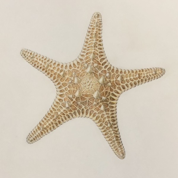
Beautiful! Such exquisite detail! I love the contrast of the lower mottled surface with that smooth detailed upper layer. It has a real sense of depth. Makes me wonder about why a starfish had developed that way. Great job. -
sheila y. added a Photo 4 years, 5 months ago
-
this is gorgeous!
-
Boy! That pinecone just jumps off the page! And I love the way you do leaves! Quite the challenge to place the cone front & center and head first. But you pull it off. I think it is the rich darks that really make to work.
-
Also, I like the “Is it autumn or is it spring?” question the composition poses. I’m feeling that now as I see the peach trees bloom here in Jersey City.
-
Thanks, Teresa. It was fun to keep adding to!
-
That’s true about what season it is. The forsythia is blooming and I have a mini potted pomegranate in the house.
-
Thanks, Katy. I started with the pinecone right smack in the center and then faced the dilemma!
-

Love it!
-

Oh Sheila. This is great!
-
Thanks, Pam.
-
Thanks, Vern. It was a whacky thing to put the pinecone like that, but I liked the center. Yeah, forsythia is blooming, but now we’ve got a scary amount of snow about to fall! Got our snowshoes out of the garage and ready!?!
-
-
Katy Lyness commented on Maureen Doram's Photo 4 years, 5 months ago
Hi Maureen, I love the painterly quality of this piece! I agree with Doug that the edges of the nut need to be more distinct. A bit more shadow should work. Maybe a carefully placed highlight, as well.
-

Jill Amadei commented on Jill Amadei's Photo 4 years, 5 months ago
Sorry, I know the starfish is seasonally out of sync, but I wanted to try drawing it! I would appreciate any feedback. Thanks 🙂
-
Jill Amadei added a Photo 4 years, 5 months ago
-
Sorry, I know the starfish is seasonally out of sync, but I wanted to try drawing it! I would appreciate any feedback. Thanks 🙂
-
Aaaah! to be on the beach! Beautiful! Such exquisite detail! I love the contrast of the lower mottled surface with that smooth detailed upper layer. It has a real sense of depth. Makes me wonder about why a starfish had developed that way. Great job.
-
this is truly beautiful
-
Thanks so much for your feedback @katylyness It was really interesting / challenging to try to draw the texture and patterns of this creature!
-
Wow Jill! What an incredible pattern to capture. It can be seasonal cuz it does remind me of a decorated gingerbread. 🙂 You know what I’m about to say – you can still push some darks if you want to emphasize the form or mass/volume more. If not, it’s stunning as is, as always.
-
You should teach the course on starfish patterns, ok?
-
Wow. That pattern and texture on the starfish is fantastic!
-
Beautiful!
-
Thanks so much @sam-mcwilliams for your helpful feedback! I took your advice and added some more dark tones and I am really happy with the effect!
-
-
-
Hey Douglass, Nice seeing you in the workshop! We already commented on this lovely citrus piece, but I will restate that I think you can take both drawings further with colored pencil. Bring in more darks. and hit the highlights with some white specks in the center. Be careful not to go too gray with the lemon. Also add more dots on the lemon, so…[Read more]
-
-
Doug Milne commented on Maureen Doram's Photo 4 years, 5 months ago
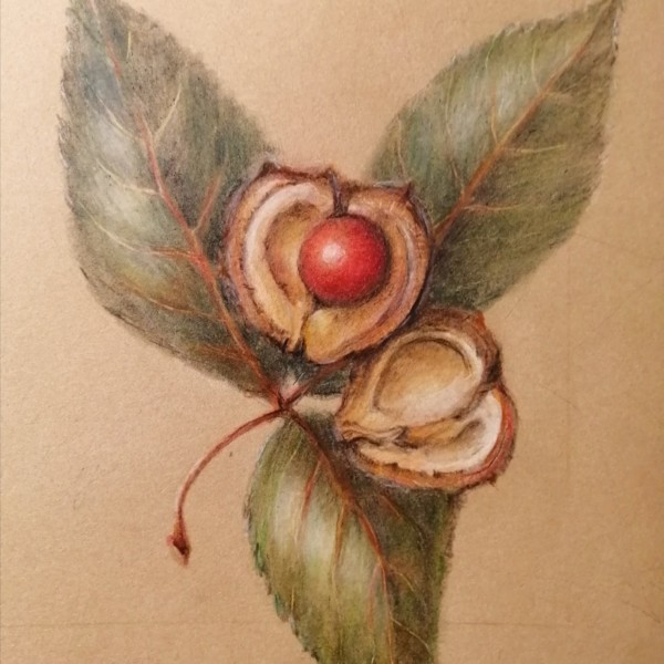
Hi Maureen-I love how the red nut is center stage and nestled in the casing. I think some more dark toning on the leaves in appropriate places would help the two halves of the open nut pop even more! Great job!
-
Doug Milne commented on Kyra Saulnier's Photo 4 years, 5 months ago
Hi Kyra- I love your analogy! You are off to a good start with the image on the left. There are a lot of details on the top of your branch that are not on your drawing yet. The right side on your drawing also sets in where the diving helmet is (which plays up the helmet look) and I don’t see an indentation on the actual branch. Correcting the i…[Read more]
-
Kyra Saulnier commented on Kyra Saulnier's Photo 4 years, 5 months ago
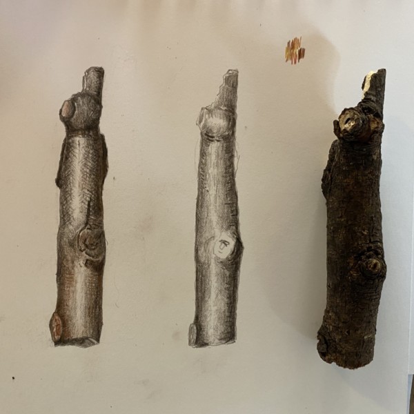
I haven’t finished toning or adding color because I’m having such a hard time getting the top stub correct. It’s coming out like a Jules Verne ocean diving helmet!
-
Kyra Saulnier added a Photo 4 years, 5 months ago
-
I haven’t finished toning or adding color because I’m having such a hard time getting the top stub correct. It’s coming out like a Jules Verne ocean diving helmet!
-
Hi Kyra- I love your analogy! You are off to a good start with the image on the left. There are a lot of details on the top of your branch that are not on your drawing yet. The right side on your drawing also sets in where the diving helmet is (which plays up the helmet look) and I don’t see an indentation on the actual branch. Correcting the i…[Read more]
-
Haha you made me laugh. Sometimes I’ll trace the actual stick – and then still measure and refine my tracing – but use the tracing as a shape guide for help.
-
I’m going to look for simpler branches without helmet bumps, LOL, now that I am back home near the woods.
-
-
Maureen Doram added a Photo 4 years, 6 months ago
-
Hi Maureen-I love how the red nut is center stage and nestled in the casing. I think some more dark toning on the leaves in appropriate places would help the two halves of the open nut pop even more! Great job!
-
Hi Maureen, I love the painterly quality of this piece! I agree with Doug that the edges of the nut need to be more distinct. A bit more shadow should work. Maybe a carefully placed highlight, as well.
-
Hi Maureen – I Love how my eye goes to that warm, red nut nestled in the pod. Gorgeous quality to this drawing. I like Katy and Doug’s suggestions.
-
This looks great on the Kraft paper, and I love the complimentary colors. The inside of that nut feels so nice and concave, and the red fruit looks like it’s tucked in there and nice and cozy.
-
@doug-milne nice to hear from you, yes I’ll revisit the leaves and edges of nut, hope all is well
-
@katylyness Hi Katy, Where are you thinking of highlight? Great to get feedback, looking forward to more ideas
-
I was thinking along the edge of the nut next to where you darken for shadow. Not much. Just a touch to bring your eye forward. And broken up so as not to create an outline.
-
Maureen – not sure if the @ feature was working. I used watercolour and pencil on that chestnut drawing.
-
-
Sam McWilliams commented on Ingrid Schenk's Photo 4 years, 6 months ago
Yes, cross section of a hip yes!
- Load More