Activity
-

Sam McWilliams commented on Collins Redman's Photo 4 years, 9 months ago
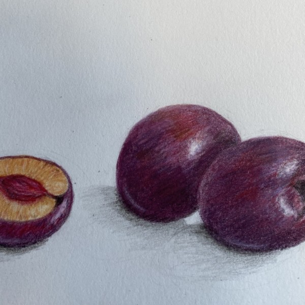
Nice drawing and colours, Collins. You’ve done a nice job with warms and cools. Makes it vibrant. The composition of the 2 plums in front leads my eye on a nice curve to the interior of the cut section. Am I looking at the pit or the pit where the pit was? 😉 You could define that a bit better for me. The shape of the lower curve of the central…[Read more]
-
Sam McWilliams commented on Elizabeth Ann Roberts's Photo 4 years, 9 months ago
Beautiful drawing, Elizabeth, such an elegant rise and feel to it, beautifully serene. I second Katy’s feedback, and agree that you have a wonderful drawing and composition here.
-

-
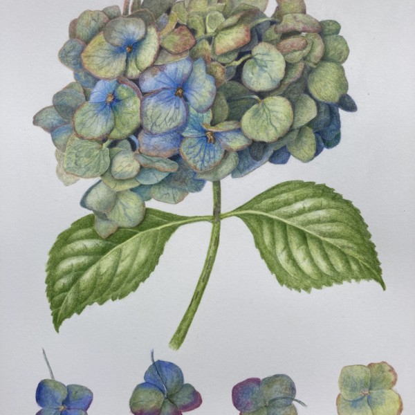
Gorgeous, Leslie! I love it. I think you could still darken a bit more where your flowers overlap the leaf and in some other areas on your stem and leaves for balance. I think those touches of a bit more darks will really give it a strong finish! You should be so proud. What an epic amount of work and complexity – those hydrangeas. Love the four…[Read more]
-
I love looking at this. It’s fun to be plant/drawing nerds all together in this community.
-
Thank you Sam! It was a lot of work! Good feedback; you’re never quite finished until someone objectively looks at it! I agree especially the right leaf is lighter than the left, and I see where I could get in some more darks.
-
Very beautiful!
-
Thank you! And definitely would go darker in a few places as you said. Fun subject once I had the time to get into it!
-
Wonderful, wonderful colors. So glad to be back to drawing!
-
Thank you Wendy! Glad to see you back too!
-
Thank you Wendy! Glad to see you back too!
-
-
Linda TALLEY added a Photo 4 years, 9 months ago
-
Linda, this is looking fantastic. Do you know the type of Acorn/Oak?
-
Thanks, Sam. The very large acorn is from a Burr Oak. The cup has split and opened up. Like a flower! I don’t know what kind of oaks the other two types of acorn come from. While doing this Lesson I was wishing I had a nice deep rich brown pencil. Doesn’t seem to be one in the Polychromos. Any suggestions?
-
Thanks Vern! I have Bistre, which I use a lot. I will try your second suggestion. I haven’t used watercolor yet, but need to jump in.
-
I bet you’ll like the water-colours once you get comfortable with them.
-
-
Sam McWilliams commented on Patricia Nadon-Koro's Photo 4 years, 9 months ago
Patricia – it is lovely. Your delicate, thoughtful rendering and pale colour palette are just stunning. What a lovely touch and colour sense you have.
-
Pam Rice added 2 Photos 4 years, 9 months ago
-
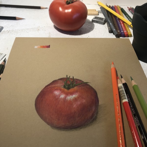
Looks so good on the Kraft paper, right!? Double check your overall shape to make sure you get that roundness.
-
That slice is going along really nicely. Get your darks in there to match your tomato. Keep up the good work!
-
Thank you Sam! It’s nice to hear encouragement. :o)
-
Yes, I am loving the Kraft paper! I can’t wait for the workshop!
-
Me too – I’ve been scoping out all the white flowers about town…
-
-
-
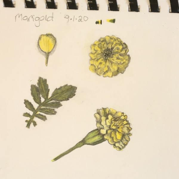
Ooh, nice Pam. So ruffley. 🙂 Maybe I’d like to see some more variation in the yellows. Do some of the yellows tend toward orange or ochre to give some dimension? Maybe you can lift/erase a bit on your greens to bring back bait of highlight. or rush the greens darker in some areas to give me a range of values. Nice work. Lovely page.
-
Thank you for your comments. :o)
-
-
Carol Ventura commented on Carol Ventura's Photo 4 years, 9 months ago
Thanks, I’ll be more mindful of that.
-

Lucille Alice added a Photo 4 years, 9 months ago
-
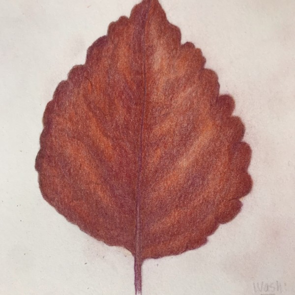
This is beautiful and has a great feel, Lucille. You could try pushing your value range, giving a full range on your value scale or tone bar from light to dark to give more depth or form to your leaf. Love the warm colours.
-
Thank you. You have identified exactly what I am struggling with. This is the third coleus leaf– I didn’t want you to see the first two! How to get the rich, deep colors, yet keeping the range shading. I will try again. And thanks again.
-
I’ll have to find one and try it again to accompany you on this Coleus journey.
-
One challenge is to get a range of value within in the limited space of the veining. My leaf does not look like the real specimen which is stunning.
-
I tried to upload a photo of the specimen but can’t seem to do it. The back of the leaf is also stunning with deep purple.
-
Try again to upload the photo if you can – I’d love to see it.
-
-
.jpg)
Patricia Nadon-Koro commented on Patricia Nadon-Koro's Photo 4 years, 9 months ago
Thanks for the advice Katy. I get what you mean about the parallel lines. Distracts from a single focal point too.
-
Amanda commented on Amanda's Photo 4 years, 9 months ago
Almost done. I will get to the final leaf, but work is getting in the way at the moment!
-
Amanda added a Photo 4 years, 9 months ago
-
Almost done. I will get to the final leaf, but work is getting in the way at the moment!
-
Coming along so well, Amanda. Fun to watch the progress.
-
-
Michelle Medvedoff commented on Elizabeth Ann Roberts's Photo 4 years, 9 months ago
Masterful.
-
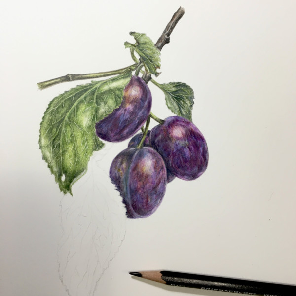
Collins Redman added a Photo 4 years, 9 months ago
-
Nice drawing and colours, Collins. You’ve done a nice job with warms and cools. Makes it vibrant. The composition of the 2 plums in front leads my eye on a nice curve to the interior of the cut section. Am I looking at the pit or the pit where the pit was? 😉 You could define that a bit better for me. The shape of the lower curve of the central…[Read more]
-
-
Katy Lyness commented on Elizabeth Ann Roberts's Photo 4 years, 9 months ago
Elizabeth, you have been busy! This is great! So well drawn! My only comments would be that I would add some more darks in the right side of the shell. Seems a bit flat, like it needs the punch of contrast to define the form. More dark as it curves into shadow. Based on where your highlight is, think about what area of the shell would be the most…[Read more]
-
Katy Lyness commented on Elizabeth Ann Roberts's Photo 4 years, 9 months ago
Hi Elizabeth, Another exquisite drawing. Beautiful composition and such delicate rendering! The pattens on the petals are beautifully done.
-
Katy Lyness commented on Elizabeth Ann Roberts's Photo 4 years, 9 months ago
So beautiful! It calms me to look at it. I love the touches of yellow in the buds. Promise of thing to come! And so delicately drawn! I also like the attention you have paid to the reproductive aspects of the flower. One thing I’d mention is that I’d like to see the warm shadow of the top petals brought down into the tube part of the flower just…[Read more]
-
Katy Lyness commented on Inna Stratiichuk's Photo 4 years, 9 months ago
Yes, Beautiful! I agree with Sam about the reflective highlight. I’d also bring the shadow on the right side around a bit more. You have such a nice dark in the divot where the stem comes out. I would like to see that in the shadow side of the apple. I think that will help unify the drawing. Try to keep the red color though. If it goes too brown…[Read more]
-
Katy Lyness commented on sara stauffer's Photo 4 years, 9 months ago
Very nice page! I love all the fall colors. I like that you have a green and brown acorn together. I’m also like’n the lichen!
-
Elizabeth Ann Roberts added a Photo 4 years, 9 months ago
-
Elizabeth, you have been busy! This is great! So well drawn! My only comments would be that I would add some more darks in the right side of the shell. Seems a bit flat, like it needs the punch of contrast to define the form. More dark as it curves into shadow. Based on where your highlight is, think about what area of the shell would be the most…[Read more]
-
You have done such a delicate drawing. Very nice.
-
- Load More