Activity
-

Pam Hancock added a Photo 5 years, 3 months ago
-

sheila y. commented on Douglass Reitter's Photo 5 years, 3 months ago
Beautiful!!
-
Rita Haft commented on Rita Haft's Photo 5 years, 3 months ago
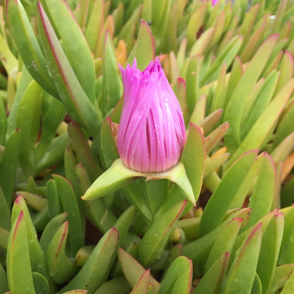
This is not the exact flower I used, but hopefully gives the idea- I actually wanted to do a water drop but I don’t really know how yet- I am noticing in posting this that there is a nice reflective highlight along the base and I made mine uniformly dark- although this is outside and I had done mine inside so there was less overhead light
-
Rita Haft added a Photo 5 years, 3 months ago
-
This is not the exact flower I used, but hopefully gives the idea- I actually wanted to do a water drop but I don’t really know how yet- I am noticing in posting this that there is a nice reflective highlight along the base and I made mine uniformly dark- although this is outside and I had done mine inside so there was less overhead light
-
Hi Rita- thanks for sending the photo! Examining the photo you can get a lot of ideas on how to make your ice plant look more realistic. The first thing I noticed was that the leaves are darker at the base and get lighter as you look up to the top of the leaves. This condition exists and is very noticeable because the photo was taken outside. Does…[Read more]
-
Thank you!!!
-
-
Rita Haft commented on Rita Haft's Photo 5 years, 3 months ago
I thought I would add an open floser coming out from behind in the lower left corner- perhaps a yellow- we have purple, pink and yellow all around- I know what you mean about the cactus leaves- Im going to post a picture so you can see- they almost look plastic without much variation at all- I must admit I exaggerated the difference between the…[Read more]
-
Doug Milne commented on Rita Haft's Photo 5 years, 3 months ago
Hi Rita- you are back to your “signature” color. I would take another look at the toning of the stem and leaves. Especially on the leaves and the very bottom of the stem, there are only light and dark tones without any mid-range tones. Conversely the majority part of the stem is missing dark and mid-range tones. I would expect to see the base of…[Read more]
-
Doug Milne commented on Elizabeth Simonson's Photo 5 years, 3 months ago
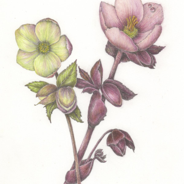
Hi Elizabeth- beautiful! It does look better with fewer water drops and I really like how you changed where the stems cross. I like these two hellebores together and they compliment each other. I look forward to seeing more!
-
Rita Haft added a Photo 5 years, 3 months ago
-
Hi Rita- you are back to your “signature” color. I would take another look at the toning of the stem and leaves. Especially on the leaves and the very bottom of the stem, there are only light and dark tones without any mid-range tones. Conversely the majority part of the stem is missing dark and mid-range tones. I would expect to see the base of…[Read more]
-
I thought I would add an open floser coming out from behind in the lower left corner- perhaps a yellow- we have purple, pink and yellow all around- I know what you mean about the cactus leaves- Im going to post a picture so you can see- they almost look plastic without much variation at all- I must admit I exaggerated the difference between the…[Read more]
-
Hi Rita- I left a comment on your photo post about working on the leaves. After looking at the photo what I would like to see on your flower are some of those dark areas where some sections of the petals are recessed and overlap. In the photo I can also see each distinct petal and I am missing that on your drawing. A red or pink verithin pencil…[Read more]
-
-
Mary Weideman commented on Mary Weideman's Photo 5 years, 3 months ago
Thanks so much for your comments, Doug and Vern. It’s amazing how much time slips by when getting set up for virtual activities, each using a different app/virtual system. I can’t agree more about Doug’s suggestion to scale small things up before starting to draw, and tone. I have one of those Accura Proportional dividers but am rusty on how to…[Read more]
-
Elizabeth Simonson commented on Elizabeth Simonson's Photo 5 years, 3 months ago
Hi Doug and Vern! With your help I think I was able to improve the drawing. In hindsight I wouldn’t have drawn the pink hellebore because it really isn’t as beautiful. Now I have an even more gorgeous hellebore to drawn that is pale yellow. I’m in hellebore heaven. many thanks again
-
Elizabeth Simonson added a Photo 5 years, 3 months ago
-
Hi Doug and Vern! With your help I think I was able to improve the drawing. In hindsight I wouldn’t have drawn the pink hellebore because it really isn’t as beautiful. Now I have an even more gorgeous hellebore to drawn that is pale yellow. I’m in hellebore heaven. many thanks again
-
Hi Elizabeth- beautiful! It does look better with fewer water drops and I really like how you changed where the stems cross. I like these two hellebores together and they compliment each other. I look forward to seeing more!
-
-
Ayse Gilbert added 2 Photos 5 years, 3 months ago
-
Hi Ayse- love the detail views! I think the leaves would benefit from some toning where they cross each other and also where the stems cross over the leaves. Beautiful!
-
Hi Ayse- beautiful composition! Some of the leaves get lost because the color of the leaf behind is too similar to the one on top. Leaves often have a light and dark side especially along the center vein, which would also help give some variation to the leaves. Nice job!
-
-
-
Beautiful!!
-
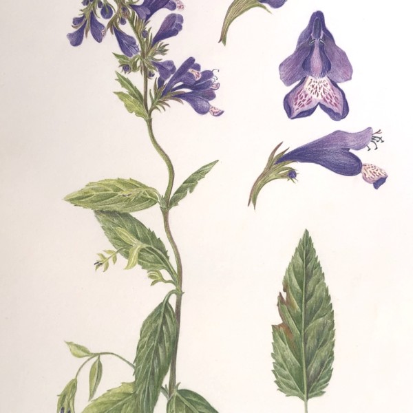
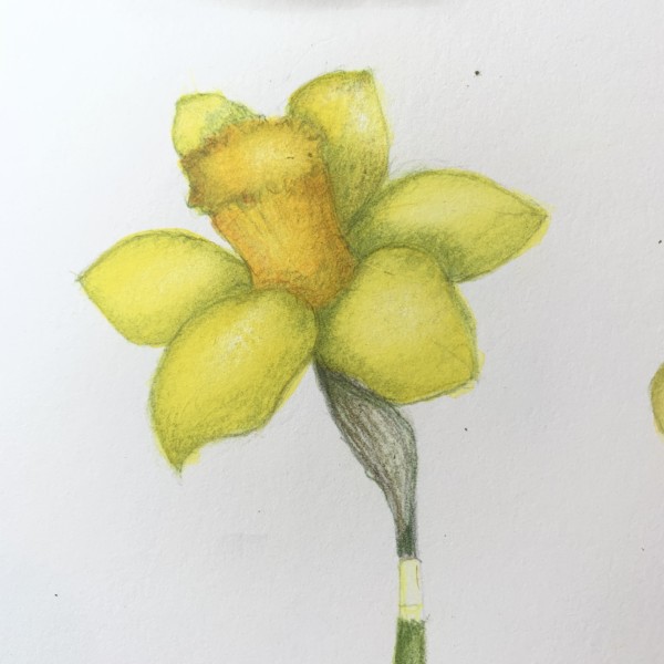
Hi Douglass- Wendy recently posted a similar view of a daffodil which might give you some ideas for those last details.
-
-
-

ShellJohn added a Photo 5 years, 3 months ago
-
DianeC added a Photo 5 years, 3 months ago
-
Doug Milne commented on Colleen Brannen's Photo 5 years, 3 months ago
Hi Colleen- overlaps are very challenging! With the overlap drawing, it looks like the pieces are flat. Give it a try as if the pieces are cylindrical instead of flat. I posted an overlap example for cylinders on Feb 21 if you want to check it out for reference. Each piece has to be toned as a cylinder. Whether something is flat or cylindrical if…[Read more]
-
sheila y. commented on sheila y.'s Photo 5 years, 3 months ago
Thanks, Doug. We even cracked open a pit here. The seed looks like a tiny almond. Will see about including it. Otherwise, on to the next. -
Pam Hancock commented on Pam Hancock's Photo 5 years, 3 months ago
Thanks Doug, the female green catkin was a challenge but Wendy’s new video on Lesson 16 helped! This video gave me the idea of using a watercolour base for that catkin.
-
Colleen Brannen added a Photo 5 years, 3 months ago
-
Hi Colleen- overlaps are very challenging! With the overlap drawing, it looks like the pieces are flat. Give it a try as if the pieces are cylindrical instead of flat. I posted an overlap example for cylinders on Feb 21 if you want to check it out for reference. Each piece has to be toned as a cylinder. Whether something is flat or cylindrical if…[Read more]
-
- Load More
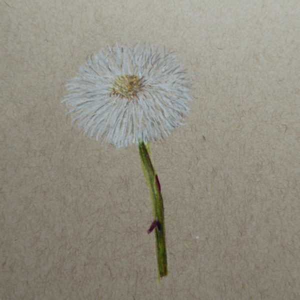


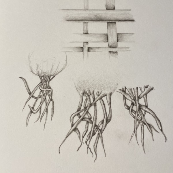
Coltsfoot seed head on Strathmore 400 toned tan paper. My attempt at this seed head!! Wasn’t quite sure how to tackle such a subject but here we go.
This beautiful Pam! It looks really nice on the tan paper! I feel like I would like to see some dark toning where the yellow center meets the white petals. I would expect to see toning from the middle of the bottom around on the right toward the top in the area where the yellow meets the white.
Many thanks Doug, I had tried to darken this area but probably did’t go dark enough will add more shading. Used tan paper because white paper would not allow white to show plus no leaves yet on this plant to draw seed head against.