Activity
-

Doug Milne commented on sheila y.'s Photo 5 years, 3 months ago
Hi Sheila- I see you figured out a solution to the erasing mishap. Good job! The translucent quality on these plums is really nice. Looking forward to the next stage!
-

sheila y. commented on sheila y.'s Photo 5 years, 3 months ago
Probably pits on the way.
-
sheila y. added a Photo 5 years, 3 months ago
-
Probably pits on the way.
-
Hi Sheila- I see you figured out a solution to the erasing mishap. Good job! The translucent quality on these plums is really nice. Looking forward to the next stage!
-
Thanks, Doug. The pits are going to take some work before they’re in “drawing condition.”
-
Oh! Those temperamental models!!!!!
-
Marbella is one of the capitals of esthetic surgery 😂
-
-
sheila y. commented on sheila y.'s Photo 5 years, 3 months ago
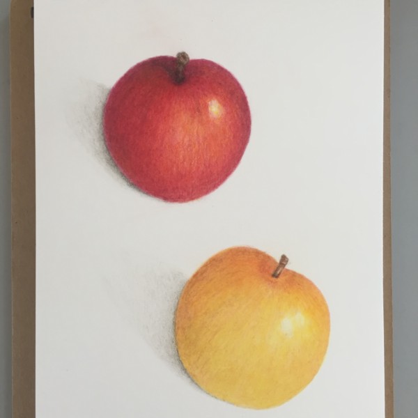
Thanks Vern and Doug, really helpful feedback. Definitely taking out the extra highlight, there are windows all around me. Branches and leaves, probably not available this year… but we’ve got yellow plums, too.
-
HSI TAN CHENG commented on HSI TAN CHENG's Photo 5 years, 3 months ago
Thank you Vern, this drawing is more likely to be a diary record. I captured the pink of flowers, however need to draw more details of the tiny center of flowers.
-
Doug Milne commented on Mary Weideman's Photo 5 years, 3 months ago
Me again! I was just scrolling thru the ArtFeed and there are a number of very successful acorn studies back in January that would be worth checking out!
-
Doug Milne commented on Mary Weideman's Photo 5 years, 3 months ago
Hi Mary- I am glad you are enjoying the course! Acorns are great subjects because there is such diverse characteristics in a small subject. The nut itself is smooth and shiny and the caps are heavily textured and have a matte finish to name just a couple of the differences. Thanks for sending along the separate photo of the view that was giving…[Read more]
-
Doug Milne commented on Douglass Reitter's Photo 5 years, 3 months ago
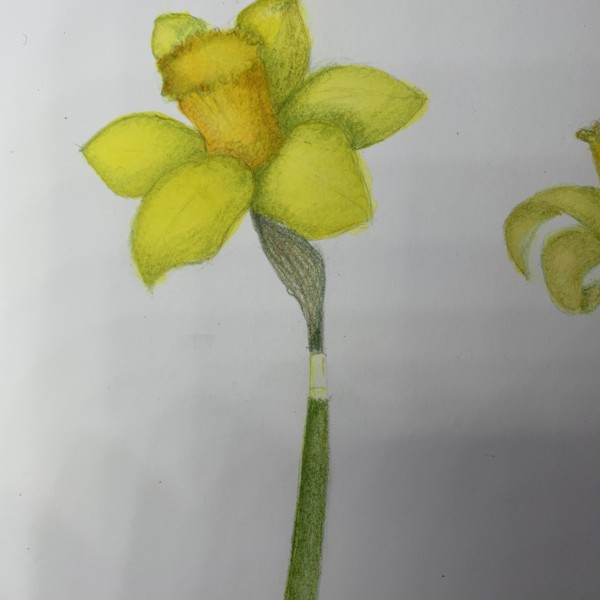
Hi Douglass- I like the darker color you added to the the trumpet. I think it would help if you could reclaim some lighter areas on the petals that are facing the light source. Right now there is not much variation in color that I think would benefit your drawing.
-
Doug Milne commented on Rita Haft's Photo 5 years, 3 months ago
Hi Rita- this is a good rendering! I like the composition and how you positioned the plant to exhibit it’s graceful curve. Very nice! There are some areas to work on. I feel the leaves are a little lacking. They could use more toning to convey which are in front and behind, etc.. Even though the leaves are small I think you could do more to g…[Read more]
-
Doug Milne commented on Colleen Brannen's Photo 5 years, 3 months ago
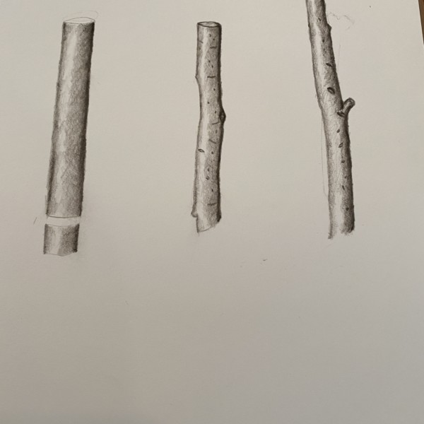
Hi Colleen- nice job on the branch segments! With a little more work they will be spot on. The one on the right is the most successful of the three. It has a little bit of an outline along each side, but I would add a little more darker toning to the left of your darkest right side edge. That is the problem with the middle and left branch. You…[Read more]
-
Liesbeth Reynders commented on Liesbeth Reynders's Photo 5 years, 3 months ago
thank you. Yes, indeed, this was a strawberry leaf. I think it’s to early for berries 🙂 I was sitting outside in the sun, so indeed, the light source shifted a bit during the day. I find it difficult to keep the balance between rich color, light shading and keeping it fresh. I’ll keep on practising. Thank you for the feedback!
-
Rita Haft commented on Rita Haft's Photo 5 years, 3 months ago
Hi- Again, I am having a little trouble not knowing how much more pencil to use to smooth out the transitions on seedpods and the split pod- i did do a combination of watercolor and pencil and feel I am holding back again as worried about getting rid of highlight by coloring to deeply on it- anyway, thanks in advance!
-
Rita Haft added a Photo 5 years, 3 months ago
-
Hi- Again, I am having a little trouble not knowing how much more pencil to use to smooth out the transitions on seedpods and the split pod- i did do a combination of watercolor and pencil and feel I am holding back again as worried about getting rid of highlight by coloring to deeply on it- anyway, thanks in advance!
-
Hi Rita- this is a good rendering! I like the composition and how you positioned the plant to exhibit it’s graceful curve. Very nice! There are some areas to work on. I feel the leaves are a little lacking. They could use more toning to convey which are in front and behind, etc.. Even though the leaves are small I think you could do more to give t…[Read more]
-
-
-
Hi Douglass- I like the darker color you added to the the trumpet. I think it would help if you could reclaim some lighter areas on the petals that are facing the light source. Right now there is not much variation in color that I think would benefit your drawing.
-
-
Colleen Brannen added a Photo 5 years, 3 months ago
-
Hi Colleen- nice job on the branch segments! With a little more work they will be spot on. The one on the right is the most successful of the three. It has a little bit of an outline along each side, but I would add a little more darker toning to the left of your darkest right side edge. That is the problem with the middle and left branch. You…[Read more]
-
-
Colleen Brannen added a Photo 5 years, 3 months ago
-
Mary Weideman commented on Mary Weideman's Photo 5 years, 3 months ago
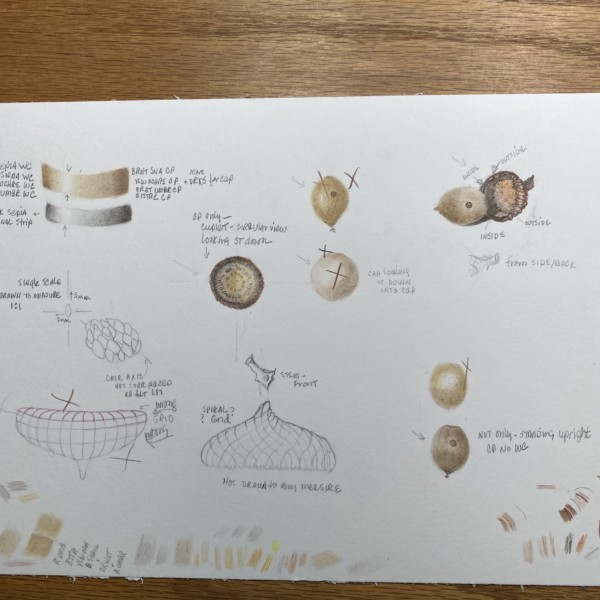
There are portions of this worksheet that I liked, but overall, this work needs more practice. One of the biggest challenges for me is trying to render tiny details in a very small space. I know that Wendy said there is flexibility when rendering scales on an acorn, but there are also a lot of details inside the cuplet that can be very hard to…[Read more]
-
Mary Weideman commented on Mary Weideman's Photo 5 years, 3 months ago
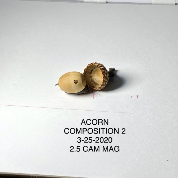
This shows nthe composition I usednfor this acorn, drawn in the next upload. I liked it because it allows the viewer to clearly see the line of demarcation alongn the acorn, the uppermost part being that which was originally under the cup, and the lowermost part being the portion of the nut that was not under the cuplet.
-
Mary Weideman added a Photo 5 years, 3 months ago
-
This shows nthe composition I usednfor this acorn, drawn in the next upload. I liked it because it allows the viewer to clearly see the line of demarcation alongn the acorn, the uppermost part being that which was originally under the cup, and the lowermost part being the portion of the nut that was not under the cuplet.
-
-
-
There are portions of this worksheet that I liked, but overall, this work needs more practice. One of the biggest challenges for me is trying to render tiny details in a very small space. I know that Wendy said there is flexibility when rendering scales on an acorn, but there are also a lot of details inside the cuplet that can be very hard to…[Read more]
-
Hi Mary- I am glad you are enjoying the course! Acorns are great subjects because there is such diverse characteristics in a small subject. The nut itself is smooth and shiny and the caps are heavily textured and have a matte finish to name just a couple of the differences. Thanks for sending along the separate photo of the view that was giving…[Read more]
-
Me again! I was just scrolling thru the ArtFeed and there are a number of very successful acorn studies back in January that would be worth checking out!
-
Thanks so much for your comments, Doug and Vern. It’s amazing how much time slips by when getting set up for virtual activities, each using a different app/virtual system. I can’t agree more about Doug’s suggestion to scale small things up before starting to draw, and tone. I have one of those Accura Proportional dividers but am rusty on how to…[Read more]
-
- Load More