Activity
-

Doug Milne commented on Dolores Duran-Cefalu's Photo 1 year, 10 months ago
Great composition Dolores! I love how the respective stems are relating to each other. It looks like they are having a party!
-
Doug Milne commented on Dolores Duran-Cefalu's Photo 1 year, 10 months ago
Wow Dolores! I love the composition! The flowers are really well done, but the branch is what has me enthralled!
-
Doug Milne commented on Dolores Duran-Cefalu's Photo 1 year, 10 months ago
Beautiful page Dolores! Nice composition!
-
Doug Milne commented on Becky Bruno's Photo 1 year, 10 months ago
Nice Becky! I would revisit the reflected highlights. They are really demanding my attention. I would tone them down a little and also make them a little more organic in shape. They should not be so controlled in shape.
-
Doug Milne commented on Susan Belfry's Photo 1 year, 10 months ago
Good color saturation Susan. You could add a highlight and more of a range of tones on the stem. I would also expect that the flower would cast a shadow on the top of the stem.
-
Doug Milne commented on Emily Arnett's Photo 1 year, 10 months ago
Hi Emily! You are off to a good start! You need to have more of a range of tones. Refer back to the tone bar exercise you did with the 9 tones. There is too much of a mid-range tone. Add to the dark toning you have on the right side and transition lighter as you move left. I am missing a highlight and adding that and the range of tones will give…[Read more]
-
Doug Milne commented on sheila y.'s Photo 1 year, 10 months ago
Nice color story Sheila! Maybe consider something for the negative space to the right of the Iris stem.
-
Becky Bruno added a Photo 1 year, 10 months ago
-
Nice Becky! I would revisit the reflected highlights. They are really demanding my attention. I would tone them down a little and also make them a little more organic in shape. They should not be so controlled in shape.
-
@doug-milne, Thank you for the feedback. Can you please elaborate on what you mean by organic? Are you thinking they should be shaped different or a little jagged or just more blended?
-
Hi Becky – sorry for the confusion. By saying organic, in conjunction with my comment about the reflected lights as being too controlled in shape I was hoping you could picture them in your mind as being softer in appearance. I should have also said that the reflected lights should blend into the dark toning above them. Lastly, toning down the…[Read more]
-
-
Susan Belfry added a Photo 1 year, 10 months ago
-
Good color saturation Susan. You could add a highlight and more of a range of tones on the stem. I would also expect that the flower would cast a shadow on the top of the stem.
-
Thank you Doug. I know there are areas that need more toning – but did not think of the stem. Burnishing with white #107 seems to dull the colour – so I will go back with more purple.
-
-
-

Lovely, Susan! I LOVE that leaf, you captured it wonderfully. Your flower is great – those colors are wonderful.
-
Thank you Pam, I really enjoyed re-creating this funky leaf. I had to make the leaf darker than it appears so the stem would stand out in front.
-
-
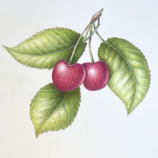
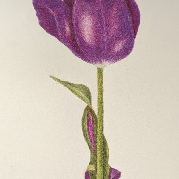
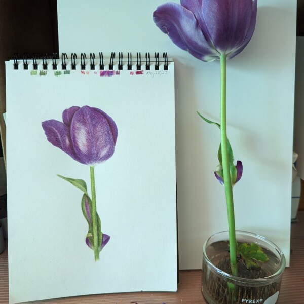
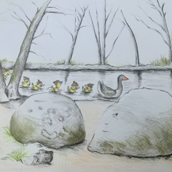
Dolores Duran-Cefalu added 6 Photos 1 year, 10 months ago
-
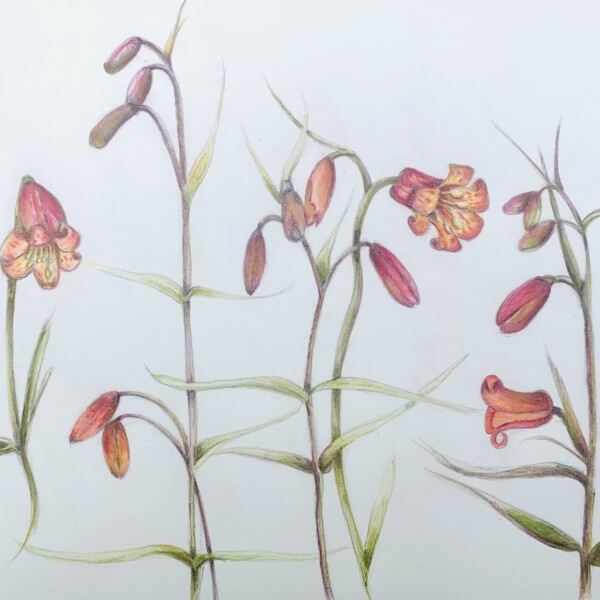
Beautiful page Dolores! Nice composition!
-
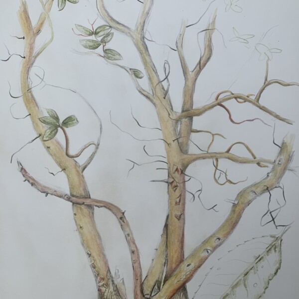
Wow Dolores! I love the composition! The flowers are really well done, but the branch is what has me enthralled!
-
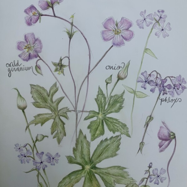
Great composition Dolores! I love how the respective stems are relating to each other. It looks like they are having a party!
-
Charming Dolores!
-
Thank you! I’ve been “branching” out into flowers more, getting over my slight fear of them.
-
Thanks! Learning how to draw water.
-
Oh Dolores. This is fantastic!!!
-
Another lovely drawing. It’s fun to see you doing some more strictly botanical work. These are great.
-
Another beauty.
-
I love the whimsy of this one.
-
Ahhh. I just love your duckies. such a fun illustration.
-
What an interesting plant. I’m really enjoying our compositions.
-
-
Emily Arnett added a Photo 1 year, 10 months ago
-
Hi Emily! You are off to a good start! You need to have more of a range of tones. Refer back to the tone bar exercise you did with the 9 tones. There is too much of a mid-range tone. Add to the dark toning you have on the right side and transition lighter as you move left. I am missing a highlight and adding that and the range of tones will give…[Read more]
-
Nice to see you continuing through the lessons, Emily!
-
-

-
Nice color story Sheila! Maybe consider something for the negative space to the right of the Iris stem.
-
Oooh. Interesting on the Kraft paper. I think that the Kraft paper makes it more obvious that these are cutouts. I feel like the standards of the iris may need a little more contrast/darks? I don’t know. What do you think?
-
Thanks, Doug. That’s a good idea. I’m reconfiguring the page.
-
Thanks for your feedback, Pam. Actually, I’m not happy with my iris and I’ll be reworking the page. My pencil drawing of the iris was a lot better, but I did it on cheap sketch paper.
-
-
Hélène Chiasson commented on Hélène Chiasson's Photo 1 year, 10 months ago
Hi Glen. This is Ohia lehua, a native tree of Hawaii. The bottom structure does look like a Hoya flower. They may be related. Thank you for your interest.
-
Glenn Kotnik commented on Hélène Chiasson's Photo 1 year, 10 months ago
A species in the genus Hoya?
-
Doug Milne commented on Becky Bruno's Photo 1 year, 10 months ago
Nice job Becky! You have maintained the rich, fresh yellows and golds and still gave the fruit beautiful form.
-
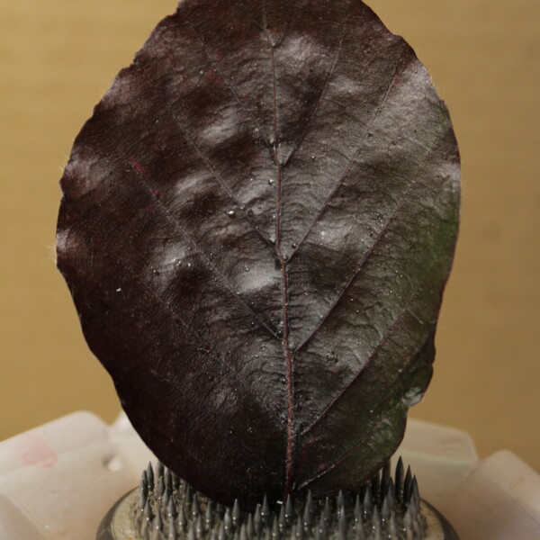
Patricia Del Greco commented on Patricia Del Greco's Photo 1 year, 10 months ago
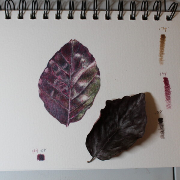
Hello @pgthompson @sam-mcwilliams This is a copper beech leaf from my tree. Copper beeches turn a variety of different colors but right now they are a purple blue color with some green. I am struggling with the colors and the light. I started drawing when the leaf was fresh (see other photo). But now I am working from the photo – as the leaf is…[Read more]
-
-
Hello @pgthompson @sam-mcwilliams This is a copper beech leaf from my tree. Copper beeches turn a variety of different colors but right now they are a purple blue color with some green. I am struggling with the colors and the light. I started drawing when the leaf was fresh (see other photo). But now I am working from the photo – as the leaf is…[Read more]
-
Hi Patricia, I’m so sorry this took me so long to get to! This is such a beautiful leaf. That purple color is so rich. I think you are doing a great job. Your highlights are great, your veins look nice and natural, and your colors are fantastic. If you want to try to get a little bit darker, you could go back in with some more dark indigo, and…[Read more]
-
-
Patricia Del Greco added a Photo 1 year, 10 months ago
-
Becky Bruno added a Photo 1 year, 10 months ago
-
Nice job Becky! You have maintained the rich, fresh yellows and golds and still gave the fruit beautiful form.
-
- Load More