Activity
-

Pam commented on Becky Bruno's Photo 2 years, 11 months ago
Becky, this is beautiful. I also love how you photograph your pieces on fabric. Are you planning to frame your pieces incorporating these fabric patterns?
-

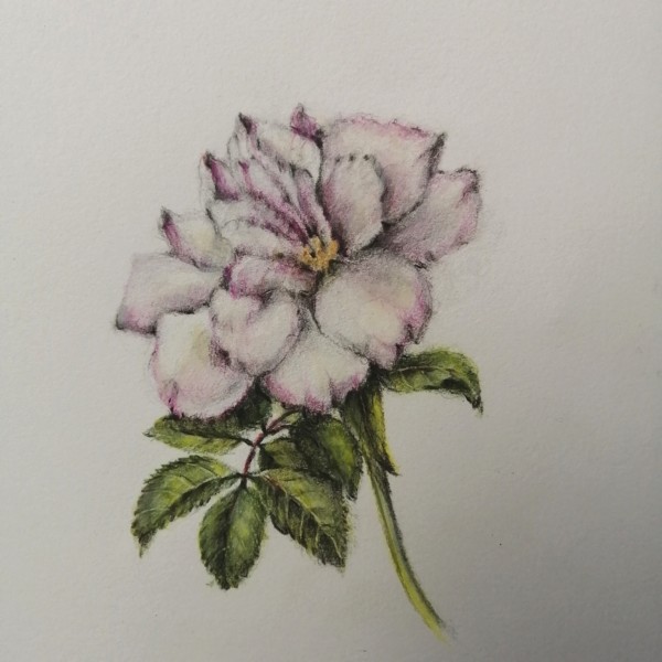
Maureen Doram added a Photo 2 years, 11 months ago
-
Maureen, This drawing has such beautiful curves and gracefulness. I LOVE your leaves – beautiful light and dimension. I like how you really studied those individual petals on your flower, and are showing their form. I think that the overall form of the flower is getting a bit lost, and flattening it out a bit. This is such a common struggle,…[Read more]
-
@pgthompson Thank you for your insights, you’re right in that it is so tricky to keep the overall form. I really did fall in love with each petal, I’ll see if I can figure out some deeper toning with tracing paper first. I think a watercolor wash to darken shadows would be helpful too.
-
-
Doug Milne commented on Becky Bruno's Photo 2 years, 11 months ago
Great job Becky! Your tomato looks so plump and juicy! Your color selection and saturation are really well done! Shiny tomatoes usually have multiple highlights which you have captured beautifully! There are a couple of spots where I see white lines such as the very bottom and in some of the creases where segments meet. I would not expect…[Read more]
-
-
Great job Becky! Your tomato looks so plump and juicy! Your color selection and saturation are really well done! Shiny tomatoes usually have multiple highlights which you have captured beautifully! There are a couple of spots where I see white lines such as the very bottom and in some of the creases where segments meet. I would not expect…[Read more]
-
Becky, this is beautiful. I also love how you photograph your pieces on fabric. Are you planning to frame your pieces incorporating these fabric patterns?
-
-
Zara Harraden commented on Zara Harraden's Photo 2 years, 11 months ago
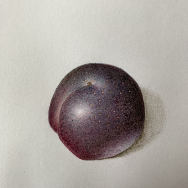
@pgthompson thanks so much for taking the time to give me such great feedback! The colours are a mix of dark indigo, red-violet and madder at the bottom (also dark sepia), it took quite a lot of layers to get the right colour of the plum. I did think the reflective highlight was too light but was unsure, and I thought I can always add more later…[Read more]
-
Maureen Doram commented on Maureen Doram's Photo 2 years, 11 months ago
@doug-milne Yes, a little violet or Italian red might work nicely! Always good to hear from you, thanks Doug!
-
Pam commented on Zara Harraden's Photo 2 years, 11 months ago
Ooooh, Zara, such gorgeous darks! Is it a mix of dark indigo and red-violet? It’s such a nice rich color. Beautiful smooth toning on this plum, and I love the highlights. I think you can add a little more shadow color to your reflected highlight. Keep in mind that reflected light is never as intense as direct light, so that little bit of reflected…[Read more]
-
Erin Russek commented on Erin Russek's Photo 2 years, 11 months ago
Thank you Pam and Katy!
-
Leslie Garwood commented on Leslie Garwood's Photo 2 years, 11 months ago
Oh no!! Too late; I already went and painted it in right after webinar! Sigh… its actually smaller and more rounded than what I drew here and I might even get to put another b/w leaf behind. Either that or start over (roll eye emoji)
Good to hear from you! Missed you in Spain 🙂
-
Leslie Garwood commented on Leslie Garwood's Photo 2 years, 11 months ago
Thanks for all those comments and you are 100% right about that overlapping area.n Easy to fix. In retrospect I wish I’d put the cut section in front but that’s too much of a change!
-
Zara Harraden commented on Zara Harraden's Photo 2 years, 11 months ago
I really enjoyed drawing this – the dark colours were quite challenging to get right, especially with the toning.
-
Zara Harraden added a Photo 2 years, 11 months ago
-
I really enjoyed drawing this – the dark colours were quite challenging to get right, especially with the toning.
-
Ooooh, Zara, such gorgeous darks! Is it a mix of dark indigo and red-violet? It’s such a nice rich color. Beautiful smooth toning on this plum, and I love the highlights. I think you can add a little more shadow color to your reflected highlight. Keep in mind that reflected light is never as intense as direct light, so that little bit of reflected…[Read more]
-
@pgthompson thanks so much for taking the time to give me such great feedback! The colours are a mix of dark indigo, red-violet and madder at the bottom (also dark sepia), it took quite a lot of layers to get the right colour of the plum. I did think the reflective highlight was too light but was unsure, and I thought I can always add more later…[Read more]
-
-
Dolores Duran-Cefalu commented on Dolores Duran-Cefalu's Photo 2 years, 11 months ago
Thanks for the awesome useful feedback!
-
Pam commented on Becky Bruno's Photo 2 years, 11 months ago
These vibrant saturated colors are just gorgeous! Your drawing is very nice and you captured the texture of those petals beautifully. I would just echo what Doug suggested. You can go back in there, while imagining the light is coming from the upper left, and add in some darker toning on the right side and bottom of the flower, and in the deepest…[Read more]
-
Pam commented on Becky Bruno's Photo 2 years, 11 months ago
Becky, these are such crisp bold drawings. They have a beautiful quality to them that really stands out. You are doing a great job. You may want to try adding a little more toning to the right and bottom of the flower to give it more of a three dimensional feel. Maybe first set up an egg with light hitting it from the upper left and really study…[Read more]
-
Pam commented on Margaret Hahn's Photo 2 years, 11 months ago
Such a lovely drawing. I love all of the elements. That single bulblet on the left is so cute, and I really like how are handling all the different textures. Lovely!
-
Pam commented on Ethel's Photo 2 years, 11 months ago
Yup. Really nice. I love the part where the stems are attached. It looks to me like they are clasping hands 🙂
Keep going. I bet you can get even more saturated. -
Pam commented on Ethel's Photo 2 years, 11 months ago
What adorable little cherries. They are so bright and cheerful! How did you like the meditation aspect?
-
Pam commented on Leslie Garwood's Photo 2 years, 11 months ago
Now that I’m looking at this again with Doug’s comment in mind, I agree. That white flower is so interesting, but because those other flowers are so bright, may eye barely goes to it. You could try adding some more darks and contrast to that white flower, especially in the center where near the stamen. You could could carefully add a little more…[Read more]
-

Ishbel Galloway commented on Ishbel Galloway's Photo 2 years, 11 months ago
Thanks for your encouragement!
- Load More