Activity
-

WILLIAM BENNER commented on Ishbel Galloway's Photo 3 years, 3 months ago
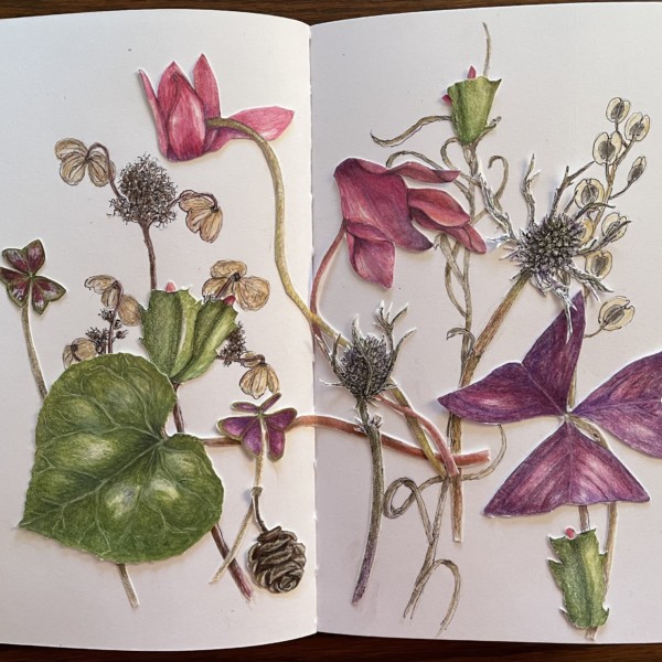
Beautiful composition.
-

-
Hi Sheila, I can see you are ready for spring! This page makes me smile and gives me hope for warmer weather! Beautiful composition! I love the way you incorporated the monochromatic dried elements with the bright vibrant leaves and flowers that are so alive!
-

I love the addition of the cone. This whole page is just so beautiful.
-
Thanks, Katy! I am looking for signs os spring:)
-
Thanks, Pam. I’m glad the cone adds to the composition.
-

Yes to the cone. 🙂 What a great conversation going on in this piece. (Signs of spring – I’m seeing some snowdrop shoots coming up here in BC)
-
Glad you like the cone! Wow, you’re lucky to see snow drops. We have a few months still….
-
Thanks, Vern. Good to hear. Leaves are always a challenge for me!
-
This is fantastic! Are you exploring the technique of drawing and cutting out the drawings for composition? I have started to do that as I test out a bouquet in vase drawing.
-
Yes, I’m collaging my own drawings. It’s fun. Enjoy your bouquet explorations! I look forward to seeing them!
-
-
Pam commented on Pam's Photo 3 years, 3 months ago
Thanks Doug, That was very helpful. -
Doug Milne commented on Pam's Photo 3 years, 3 months ago
Hi Pam- I think the composition tells a story starting with the leaf (and seed pods) that are still attached to the stem versus the leaves that are in various stages of decay. I don’t feel like the original leaf looks stiff. It looks like a leaf in the later stage of it’s life that is still connected to it’s life source. I really like your compo…[Read more]
-
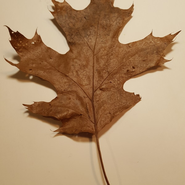
Doug Milne commented on Hélène Chiasson's Photo 3 years, 3 months ago
Hi Helene- the leaf is nicely rendered! What I would continue to work on is toning and details. When I look at the photo of the leaf I see variations of color and there are areas that have some shadows, highlights, etc. Adding those will add more interest to your drawing. Be careful not to have your light source too close to the subject as it can…[Read more]
-
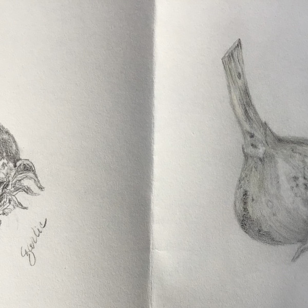
Doug Milne commented on Cathie Hunter's Photo 3 years, 3 months ago
Wow Cathie!!! You definitely rose to the challenge!!!! You have achieved all those great details and the form is so much better! I think you need to have a highlight where there was one on the original drawing and I would also add some more dark tones on the right side of the bulb to emphasize the form even more. Also more dark toning where the…[Read more]
-
Doug Milne commented on Rita Haft's Photo 3 years, 3 months ago
I really enjoy the mix of graphite and color Rita! The details on the seed pod and stems are particularly amazing and everything is beautifully rendered! The one that is bothering me is that all the color is on one side and the graphite is on the other side. Think about how the placement of color helps carry your eye around the page.
-
Doug Milne commented on Rita Haft's Photo 3 years, 3 months ago
The toning and highlights on the petals are so good Rita!!! Each petal has great form and you can see how they cup and curve! Really appreciate how strong the colors are, but yet the texture of the petals have a delicacy to them too! Wonderful job!!!!!
-

Ishbel Galloway commented on Ishbel Galloway's Photo 3 years, 3 months ago
Thanks for your comments Pam. Again I think the exposure is off in this one which does make the highlights very grey. I need to work on that.
-
Ishbel Galloway added a Photo 3 years, 3 months ago
-
Beautiful composition.
-
Yes, a nice rhythmic feel! it seem like it is dancing.
-
Lovely
-
LOVE the lines
-
-
-
Hi Fiona, Nice shine on those leaves! And I like the little cluster of berries. I also like your rich darks. You have a good value range. I’d like to see a bit more care with the embossing. Embossing is tricky. It tends to be too uniform. Partly because you are working blind. Try practicing to get more variations in value and width. The lines…[Read more]
-
Thanks Kate for your feedback . I agree re embossing, I tend to get a bit carried away instead of really observing my subject .
-
Thanks Vern .
-
-
Pam commented on Pam's Photo 3 years, 3 months ago
I drew some more sycamore leaves on scrap pieces of paper, and then photographed them and played around with where I might want to place them in my composition using photoshop. Any comments about what works and what doesn’t? I’m kind of feeling like that main leaf (the one in the original drawing) is looking really stiff. I might start from…[Read more]
-
Pam added a Photo 3 years, 3 months ago
-
I drew some more sycamore leaves on scrap pieces of paper, and then photographed them and played around with where I might want to place them in my composition using photoshop. Any comments about what works and what doesn’t? I’m kind of feeling like that main leaf (the one in the original drawing) is looking really stiff. I might start from…[Read more]
-
Hi Pam- I think the composition tells a story starting with the leaf (and seed pods) that are still attached to the stem versus the leaves that are in various stages of decay. I don’t feel like the original leaf looks stiff. It looks like a leaf in the later stage of it’s life that is still connected to it’s life source. I really like your compo…[Read more]
-
Thanks Doug, That was very helpful.
-
Hi Pam, Lovely drawing! I see the lesser contrast of the original leaf and seedpods as setting them back in space. An example of aerial perspective. The two bottom leaves with their strong darks appear to come forward.
-
Thanks Katy, That helps!
-
I really like it, Pam. And I am so very impressed by your smooth smooth toning and transitions.
-
Woweeeeeee!!!!!!!
-
Vern, I’ll play around with the composition some more. Thanks! Helpful 🙂
-
-
Hélène Chiasson added a Photo 3 years, 3 months ago
-
Fun subject! Good studies/drawing. In the photo – make sure you have your light source from the upper left so you can observe the core shadow and highlights. Tone the branch and roots as cylinders and show us those highlights and darks.
-
-
Hélène Chiasson added a Photo 3 years, 3 months ago
-
Hélène Chiasson added 2 Photos 3 years, 3 months ago
-
Hi Helene- the leaf is nicely rendered! What I would continue to work on is toning and details. When I look at the photo of the leaf I see variations of color and there are areas that have some shadows, highlights, etc. Adding those will add more interest to your drawing. Be careful not to have your light source too close to the subject as it can…[Read more]
-
Thank you very much for your commente Doug. I realized that I had to put more détail and highlights when I saw the scanned drawings. And looking back at past drawings, I see that I need to add more to thèse as well. Thank you again.
-
I really enjoy the tiny little playful leaf tips.
-
-
sheila y. commented on sheila y.'s Photo 3 years, 3 months ago
@pgthompson thanks for your feedback! I see what you mean about that leaf…hmm, I was thinking of adding some element to the center. Maybe that will draw the eye back. I’ll experiment before gluing:) -
Cathie Hunter commented on Cathie Hunter's Photo 3 years, 3 months ago
Thanks Vern for suggesting a lighter version ! It was an interesting challenge – I am trying to work on my drawing and toning.
-
-
Thanks Vern for suggesting a lighter version ! It was an interesting challenge – I am trying to work on my drawing and toning.
-
Wow Cathie!!! You definitely rose to the challenge!!!! You have achieved all those great details and the form is so much better! I think you need to have a highlight where there was one on the original drawing and I would also add some more dark tones on the right side of the bulb to emphasize the form even more. Also more dark toning where the…[Read more]
-
-
Pam commented on Rita Haft's Photo 3 years, 3 months ago
So pretty. All of these magnolias are making me long from spring – sigh. I like this view a lot. That petal tipping down makes me think of a courtier doing that hand twirling flourish bowing thing to a king. There is one thing that bothers me about it, but I think it’s just my brain. That petal in front also makes me think of a tongue of a panting…[Read more]
- Load More