Activity
-

Doug Milne commented on sheila y.'s Photo 1 year, 3 months ago
Hi Sheila! Great to see your work again! I love the colors and the open quality of the composition! The one piece that sticks out to me is the succulent on the very left side (of the left page). It seems too crowded there and is the one spot that differs from the light feel of the rest of the piece. Maybe moving it over to the left a little would…[Read more]
-
Doug Milne commented on Denise Harris's Photo 1 year, 3 months ago
Greetings Denise! You have done a really wonderful job illustrating the colors and textures! I am struggling to tell where your light source is coming from. Especially on the left side, at the very end where it curls up and the large curl to it’s right, which sticks up could both use some shadow toning which would help clarify it visually. You a…[Read more]
-
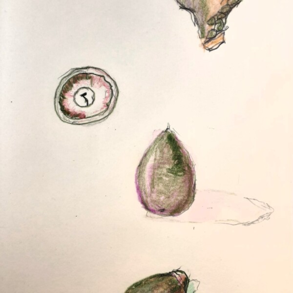
Doug Milne commented on Daniel Walsh's Photo 1 year, 3 months ago
Hi Daniel- you have been busy! This is a nice study page. Acorn nuts can be shiny. The shinier a subject is the whiter the highlight should be. With the inverted view of the cap on the top right I would suggest putting in some dark toning on the left side fading to a highlight on the right so you are conveying that it is an empty well. For fun,…[Read more]
-
Doug Milne commented on Daniel Walsh's Photo 1 year, 3 months ago
Hi Daniel- this is very nice! Strong bright colors and the placement of the highlight is great. You have a range of tones, but you could go even darker on the right side and bottom (transitioning lighter as you move toward the highlight) to emphasize the fruits form. With the cast shadow, it should be the darkest at the edge of the subject and…[Read more]
-
Doug Milne commented on Daniel Walsh's Photo 1 year, 3 months ago
Hi Daniel- I love the colors and patterning on your branch segments. What medium are you using? A couple of things to consider. I see you have cast shadows, but the branches are missing the arc toning (highlight thru shadows) we discussed on your first post. Arc toning will give the branches form. All though beautiful, right now the branches are…[Read more]
-

sheila y. commented on sheila y.'s Photo 1 year, 3 months ago
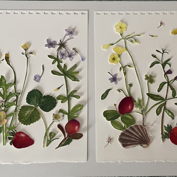
I’m working on this. Nothing glued yet. Thinking of a few more petals in the air and on the ground. Thoughts?
-
sheila y. added a Photo 1 year, 3 months ago
-
I’m working on this. Nothing glued yet. Thinking of a few more petals in the air and on the ground. Thoughts?
-
Hi Sheila! Great to see your work again! I love the colors and the open quality of the composition! The one piece that sticks out to me is the succulent on the very left side (of the left page). It seems too crowded there and is the one spot that differs from the light feel of the rest of the piece. Maybe moving it over to the left a little would…[Read more]
-
Thank you for the specific feedback, Doug. You hit it with the succulent and sprinkling a few more small bits around. I’ll work on it!
-
-
Denise Harris added a Photo 1 year, 3 months ago
-
Greetings Denise! You have done a really wonderful job illustrating the colors and textures! I am struggling to tell where your light source is coming from. Especially on the left side, at the very end where it curls up and the large curl to it’s right, which sticks up could both use some shadow toning which would help clarify it visually. You a…[Read more]
-
-
Becky Bruno commented on Becky Bruno's Photo 1 year, 3 months ago
@pgthompson and @doug-milne, THANK YOU for the feedback and for the edits online. That was definitely helpful. Yes, I drew these while alive but couldn’t finish so I had to refer to pictures, which I know wasn’t ideal but such is life sometimes, I guess! I actually put them under my desk lamp for the photo so that is probably why Doug was so…[Read more]
-
Becky Bruno commented on Becky Bruno's Photo 1 year, 3 months ago
@pgthompson and @doug-milne, First off, I am SOOO sorry that I missed the Webinar! Somehow I had the wrong date written down. Thank you both for the feedback. I will continue to tweak and share. To answer Pam’s question, I did do a little embossing for the fringe but mostly drew around. I embossed for the roots but that’s where I had some…[Read more]
-
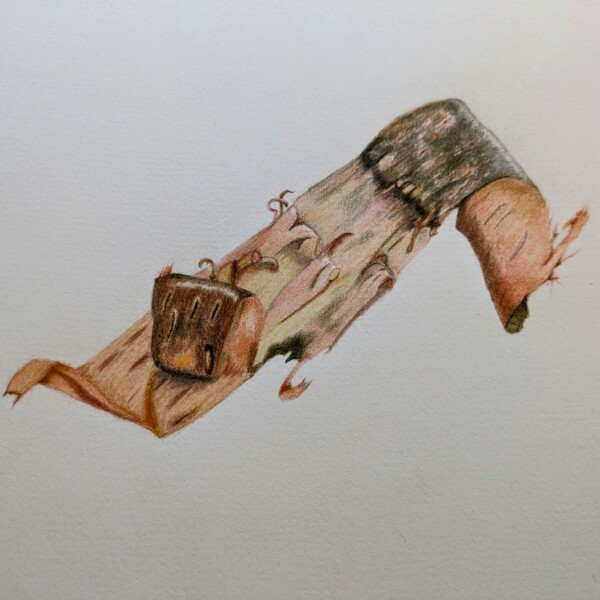
Daniel Walsh added a Photo 1 year, 3 months ago
-
Hi Daniel- you have been busy! This is a nice study page. Acorn nuts can be shiny. The shinier a subject is the whiter the highlight should be. With the inverted view of the cap on the top right I would suggest putting in some dark toning on the left side fading to a highlight on the right so you are conveying that it is an empty well. For fun,…[Read more]
-
-
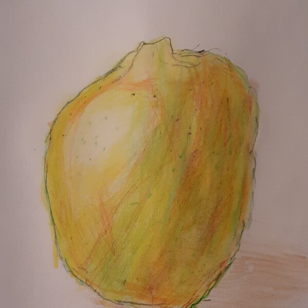
Daniel Walsh added a Photo 1 year, 3 months ago
-
Hi Daniel- this is very nice! Strong bright colors and the placement of the highlight is great. You have a range of tones, but you could go even darker on the right side and bottom (transitioning lighter as you move toward the highlight) to emphasize the fruits form. With the cast shadow, it should be the darkest at the edge of the subject and…[Read more]
-
-
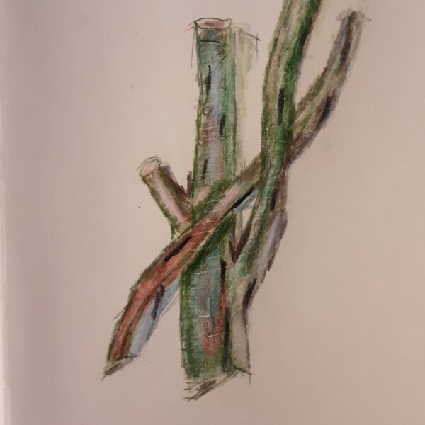
Daniel Walsh added a Photo 1 year, 3 months ago
-
Hi Daniel- I love the colors and patterning on your branch segments. What medium are you using? A couple of things to consider. I see you have cast shadows, but the branches are missing the arc toning (highlight thru shadows) we discussed on your first post. Arc toning will give the branches form. All though beautiful, right now the branches are…[Read more]
-
-
Daniel Walsh commented on Daniel Walsh's Photo 1 year, 3 months ago
Hi Doug. Thank you for your valuable critique. I am not satisfied with the paper quality I chose. I will correct the sharpness and tightness. Again thank you. -
Doug Milne commented on Karye Hood's Photo 1 year, 3 months ago
Beautiful colors Karye! Your toning is great and I really enjoy the cast shadow! It seems like that if your light is coming from the left side of the main vein on your green leaf would be dark instead of light. Nice job!
-
Doug Milne commented on Traci Deblieck's Photo 1 year, 3 months ago
Amazing Traci! All these fantastic details to discover! It is exciting isn’t it?
-
Doug Milne commented on Daniel Walsh's Photo 1 year, 3 months ago
Hi Daniel- welcome to the ArtFeed! Seeing this in these colors is refreshing to see! With the tone arc bottom the left edge should be 3-4 on the tone scale and transition lighter as it moves right toward the highlight. The tone to the right of the highlight is too dark. It should just be slightly darker. As the tones transition to the darkest tone…[Read more]
-
Doug Milne commented on Margaret Hahn's Photo 1 year, 3 months ago
Hi Margaret- we discussed this on the webinar. I can see it better in this post and the center pod is the curved backside, not the concave inside I thought from your original post. I think you could add a range of toning on the right side of that pod as I would expect it to be in shadow and it would emphasize it’s form. What a great job you did on this!
-

Karye Hood commented on Karye Hood's Photo 1 year, 3 months ago
Yes, there was a lot of reflected light bouncing off of the red onion. It was in a white box. I checked my reference photo. I will make some adjustments and thank you for your feedback. I appreciate this!
-
Karye Hood commented on Karye Hood's Photo 1 year, 3 months ago
Thank you for your comments. I will work a bit more on this.
- Load More