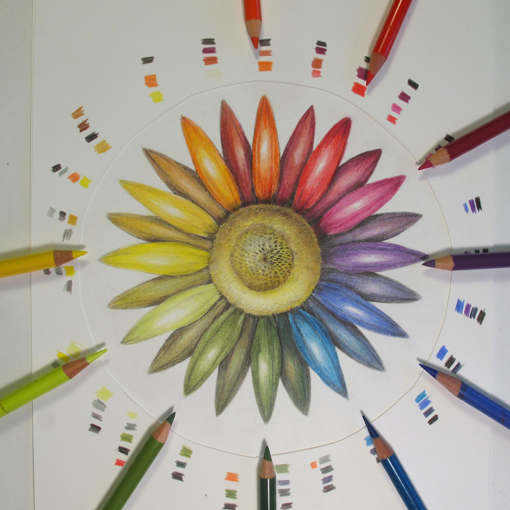
Learn more about the fascinating world of color theory!
Scroll through this post for some free tips to help you achieve realistic colors in your botanical illustrations.
Before we begin, we need to have a shared basic vocabulary for describing color. Visualizing a color using these definitions can make it easier to mix the color you’re trying to achieve.
Hue
the name of a color, also known as local color (ex. yellow, red, blue)
Value
how dark / light the color is, as it relates to a nine-step value scale
Intensity / Saturation
how bright / dull the color is
Helpful Example:

HUE: These images all have a yellow hue.
VALUE: The rose has the lightest value, and the pear has the darkest value, and the lemon is in between.
INTENSITY/SATURATION: The lemon has the highest intensity (purest, brightest yellow), and the pear has the lowest intensity (dirtiest, dullest yellow).
The rose is in between. Within the rose itself, there is higher intensity on some of the inner petals, but then the outer petals have more gray them, making their intensity less (more dull).
Don’t confuse intensity with value. The color of the yellow in the rose (overall) is relatively pure (so it still has a fairly high intensity). It’s value is light, but the color is still relatively pure.
Traditional Color Wheel
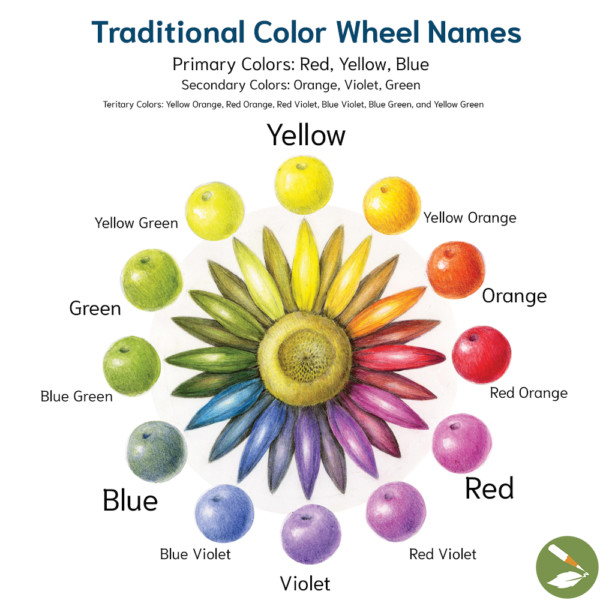
Have you heard of Tertiary Colors?
You’ve heard primary colors are Red, Yellow, and Blue and secondary colors are Orange, Violet, and Green, but have you heard of tertiary colors?
Tertiary colors are the colors that exist between the primary and secondary colors. For example, Yellow Orange is the tertiary color between primary Yellow and secondary Orange.
Tertiary Colors include Yellow Green, Yellow Orange, Red Orange, Red Violet, Blue Violet, and Blue Green.
Double Primary Color Theory
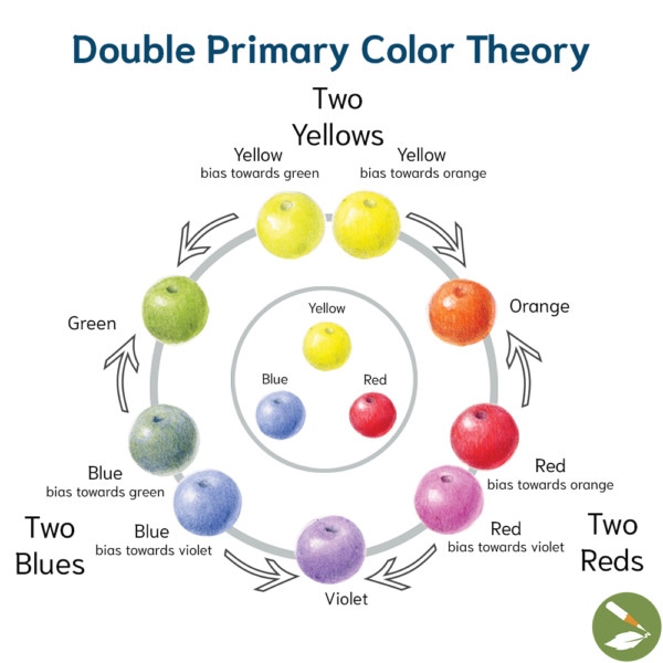
Instead of the traditional names on the traditional color wheel, Double Primary Color Theory explains that each primary color can be expressed by their biases toward secondary colors.
Basically, Double Primary Color Theory considers there to be two of each primary color, one toward each of their secondary biases. For example, two Blues: Blue bias towards Green and Blue bias towards Violet.
Bright or Dull
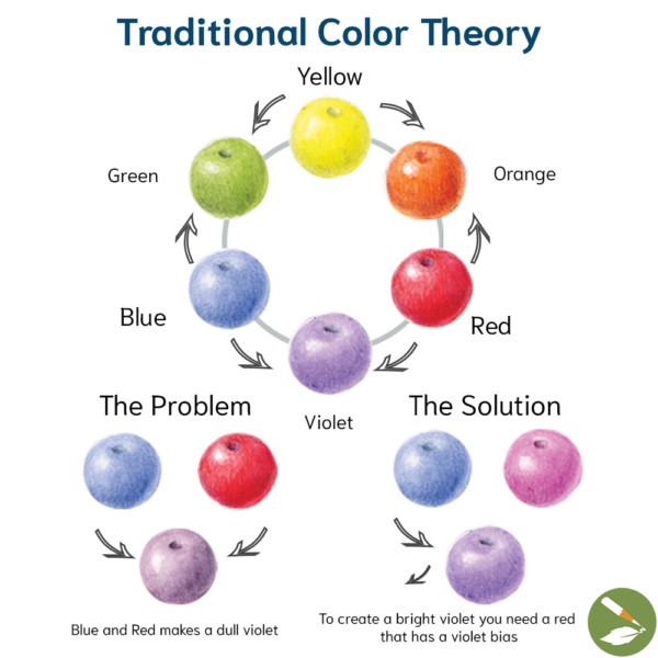
We sometimes run into the problem when mixing primary colors with opposing biases that we create a dull shade. For example, Blue with a bias toward Green and Red with a bias toward Orange combine into a dull Violet.
For bright shades, use primary colors with the same biases. To create a bright Violet, you need to mix Blue with a bias toward Violet and Red with a bias toward Violet, also referred to as tertiary colors Blue Violet and Red Violet!
Color Mixing
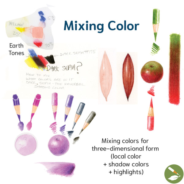
For the most three-dimensional looking forms, be sure to mix the local color, shadow colors, and highlight colors. Local color is the overall color of your object. Shadow colors and highlight colors shine in their respective areas, bringing depth and dimension to your form.
Complementary Colors
Complementary colors are colors opposite each other on the color wheel, like Red and Green. When you combine complementary colors, you mix all three primary colors into neutral colors. For example, if you are drawing a Green leaf that is beginning to turn Brown in Autumn, you could add Red to neutralize the Green.
Dark Sepia = All 3 Primary Colors
The final piece of this puzzle is to understand that two primary colors biased in the same direction do not have any of the third primary color when mixed together, so it will create a bright shade. When the third primary color is added to a mix, it dulls the color, which is very helpful when mixing colors found in nature. Dark Sepia is such an important shadow color because it’s a blend of all three primary colors.
Dive Deeper into Colors
Learn more about color theory in the recording of our Color Theory Zoom Workshop. Watch instructor demonstrations, and practice on your own. If you send us a photo, an instructor will respond with confidence-boosting constructive critiques on your work. (RECORDED January 19 & 22, 2025)
Explore the colorful world of botanical illustration! 🌿🎨 This workshop isn’t about perfection—it’s about practice, play, and discovery. Whether you’re just starting out or have more experience, you’ll enjoy experimenting with blending and mixing colors to capture nature’s beauty in your drawings and paintings. Gain confidence in your artistic skills, and celebrate the magic of color with us. Join us for two relaxed, fun, and interactive sessions where we’ll practice color matching. Bring your favorite botanical bits, and we’ll guide you in matching their unique… Learn more
Get Recording of Color Theory Zoom Workshop
Our course, The Practice of Botanical Drawing, details the practical application of Color Bias Theory and basic color mixing to help you choose which pencils to mix when trying to match a color in nature. It also covers the differences between hue, value, and intensity and how to use those as parameters to create the colors in your subject. Post images to the Art Feed with your questions, and get helpful feedback from our instructors!

