by Wendy Hollender & the Draw Botanical Team
When I study and draw from nature, I feel a presence of something that never fails to take my breath away. I “undress” the plant to study the mystery within, exploring flowers and plants on a micro level, almost as if I were an insect.
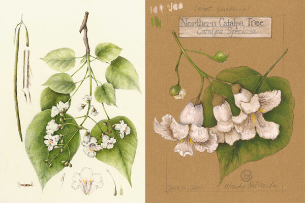
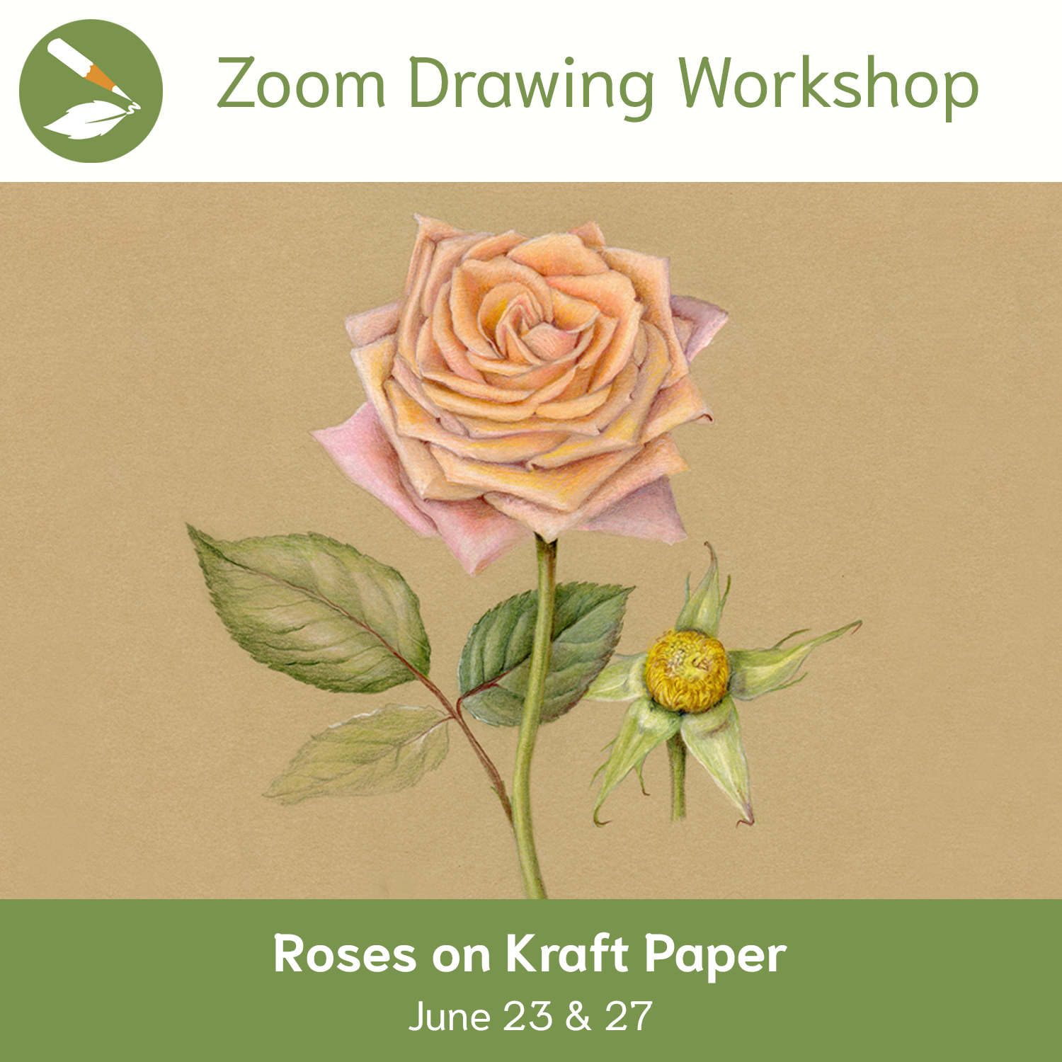
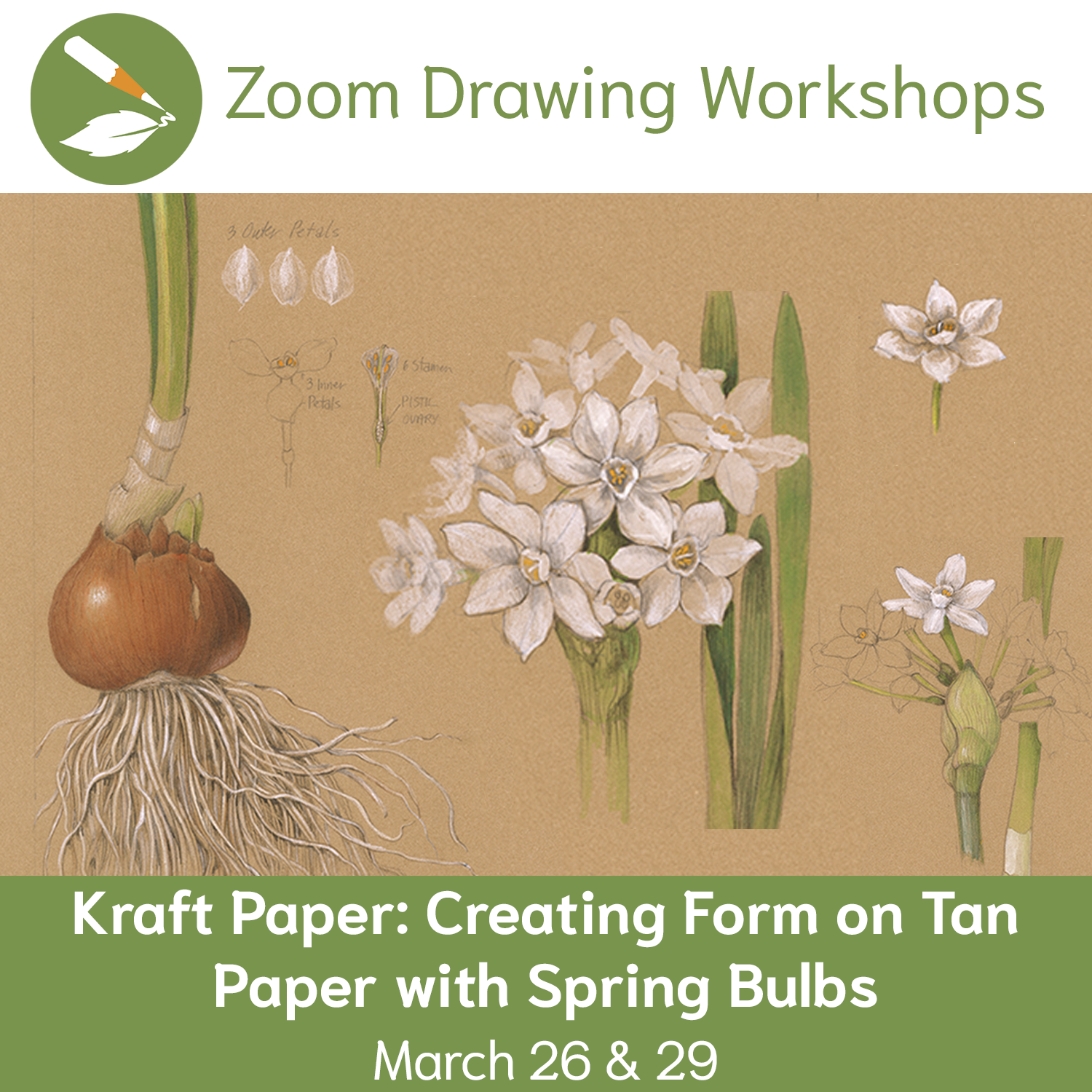
White or Cream paper used to be my go-to, but during quarantine in 2020, I began looking for something… quieter. Of the many different colors I experimented with, the tan kraft paper was my favorite. For an entire year, I followed nature with this feeling. I drew plants in my garden, foraged in the woods, and from my son’s farm, all on warm mid-tone kraft paper. My kraft paper prints are available for purchase here.
The tone of your paper sets the tone of your artwork. It’s nice to create a different feeling sometimes, and Kraft paper was fun for me to use because working on a mid-tone allows our brain to think differently about how we use shadows and highlights. Play around with a dark pencil (ex. dark sepia), a light pencil (ex. white), and a mid-tone pencil (ex. bistre), and see what you can create. Then if you like it, experiment with adding in color.
Join LIVE – Aug. 10 & 14, 2025
Tomatoes on Kraft Paper Zoom Workshop
Discover how the midtone tan of kraft paper acts as a perfect base, helping colors pop while allowing both shadows and highlights to shine. You’ll learn how to adjust your approach when working on toned paper and how to make the most of its warm, earthy surface. The best part of working on kraft paper is getting to add in bright highlights! Practice continuous toning from the lightest white to the darkest shadows to enhance your portrayal of its three-dimensional form. Explore how light interacts with… Learn more
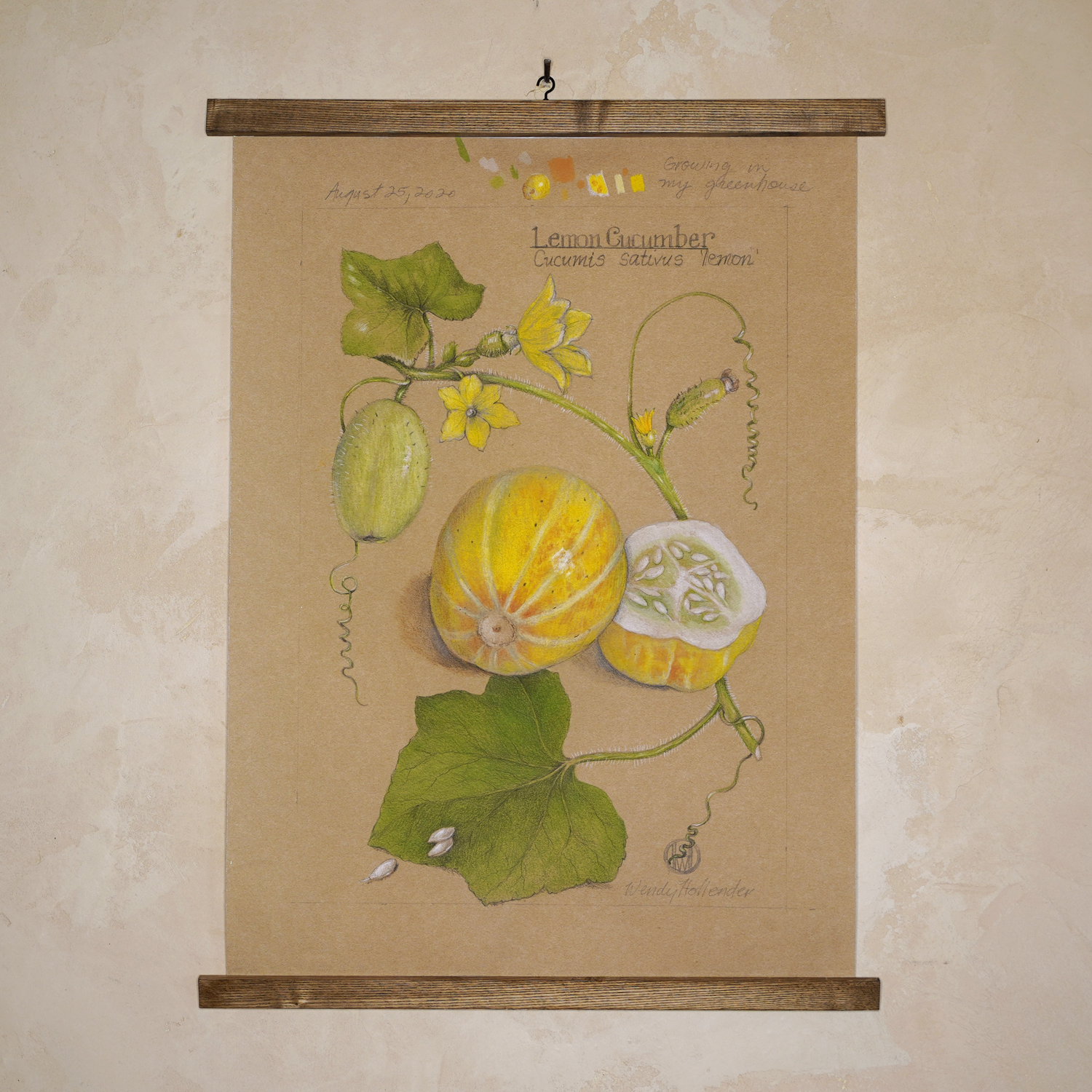
My favorite things about kraft paper:
WARM & INVITING
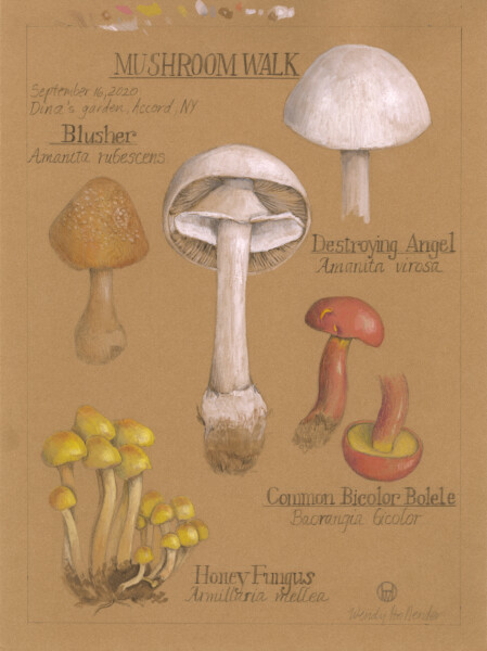
The mid-tone of kraft paper gives a nice contrast to lights and colors. It’s warmer and has a subtley, as earth tones tend to be. “Earth tones” are colors inspired by nature (usually browns, ochres, and other neutral colors).
Fun fact: The names of many earth tones (including umber, sienna and ochre) come directly from clay earth pigments!
ADD HIGHLIGHTS
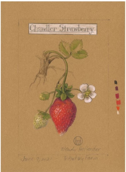
When working on white paper, we add darks for shadows to our drawings and leave our highlights the white of the page. The mid-tone of kraft paper provides the perfect opportunity to add in our highlights with white or ivory from the beginning and alternate layers between lights, shadows, and colors.
Picture your subject with one ideal light source. At 45 degrees from the upper left, your highlight(s) (where the light hits your form brightest) will be toward the left, and your shadow(s) (where your form bends away from the light) will be on the right side. For more information about Light Source, see this post.
Can you burnish (blend colors for a smooth finish) on kraft paper? Yes! Test it out. Art supplies are not meant to be preciously preserved; they’re meant to be enjoyed! So practice practice practice, and don’t be afraid to mess up or draw something “bad”. Just have fun!
TEXTURE
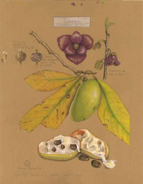
Stonehenge Kraft Paper originated as printmaking paper, so there’s a bit of texture to it. It interacts well with most art supplies, including colored pencil, graphite pencil, pen and ink, watercolor, pastel, and charcoal. As a textile designer, I enjoyed painting on kraft paper with gouache.
If you’re interested in specs, Stonehenge Kraft Paper is:
+ 250gsm / 90 lb
+ 100% Cotton
+ Acid Free
+ Neutral pH
+ Made in USA
Remember that texture plays a big part in making drawings come to life, so use the kraft paper’s unique interactions with your chosen art supplies to help communicate the feeling of your subject. (For free tips on texture, check out this post.)
WATERCOLOR
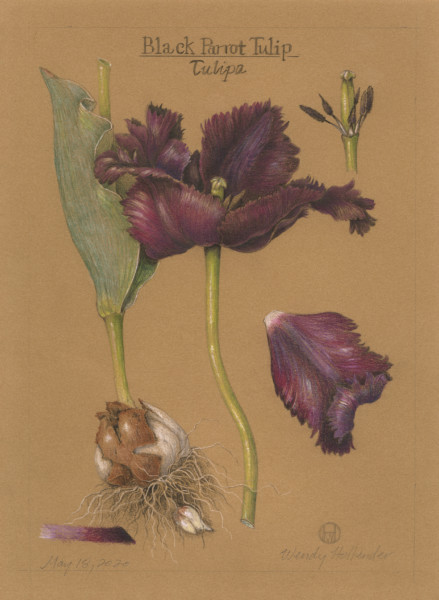
I have found that watercolor interacts well with kraft paper, as long as you don’t get it too wet. I LOVE how the paper absorbs the watercolor in its own way. Sometimes I can even lift color off if I want to make it more subtle. I can’t quite explain the phenomenon in words, so you’ll just have to experiment for yourself!
Colors on kraft paper may appear slightly differently than colors on white paper, so mix different colors, try sample swatches, and compare them with your subject to find the right match. A trick for a really bright color on kraft paper is to first put down a layer of white colored pencil or watercolor and then add the bright color on top.
Have fun playing around with different watercolor techniques, and see what you can create! Click here for more free tips on watercolor techniques.
EASILY EDIT
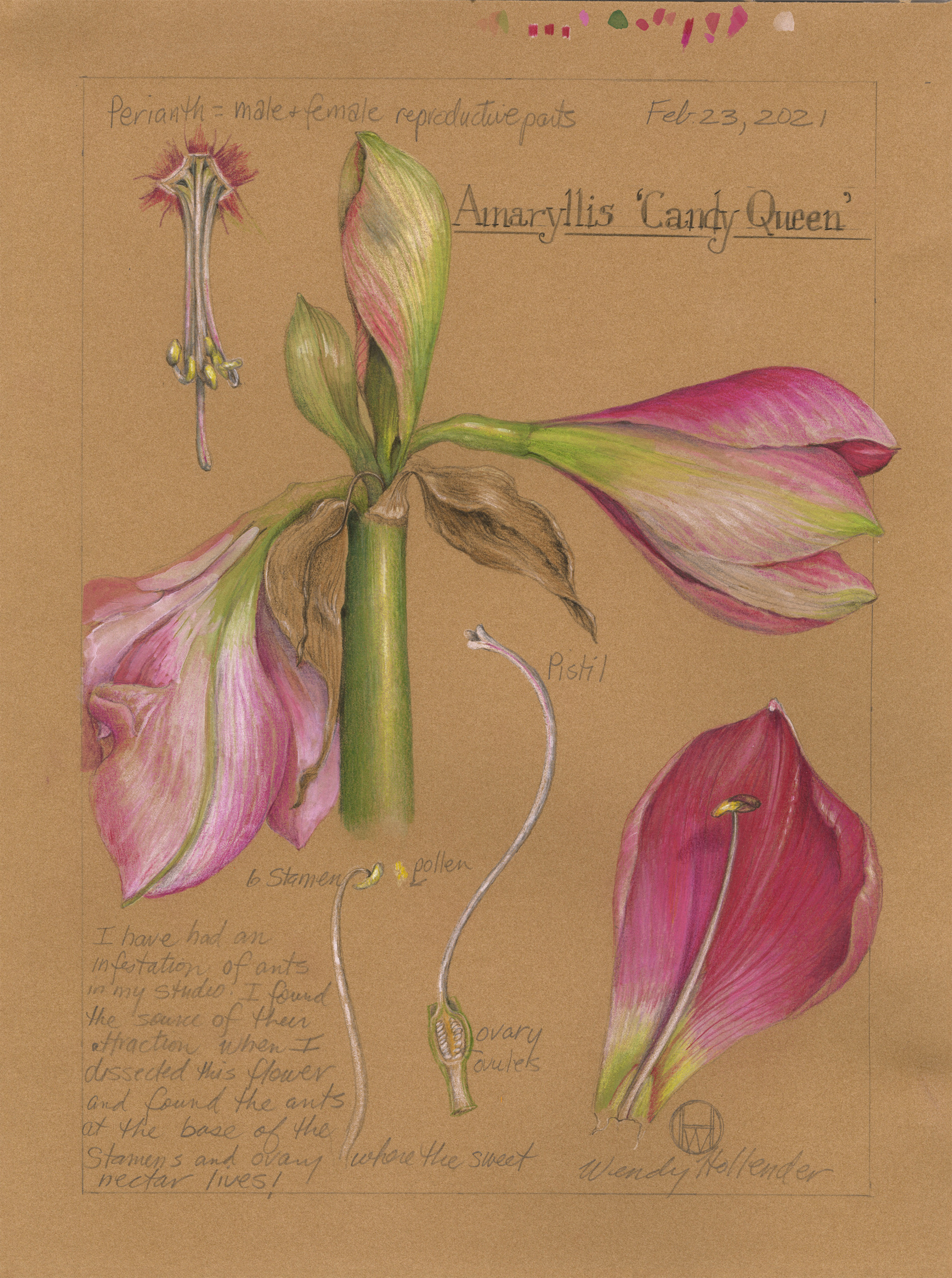
The days of having to throw out a project because of a mistake are over! If you draw very lightly on kraft paper with graphite or colored pencils, it’s easy to alternate between erasing mistakes and adding details until you’re satisfied. Just make sure not to press hard, especially with your graphite pencil.
Build tone and color slowly with layers of small strokes. After a few light layers, you can begin to press a bit harder to achieve fully saturated colors. Remember to get ALL values 1-9 and blend them evenly to breathe life into your subject.
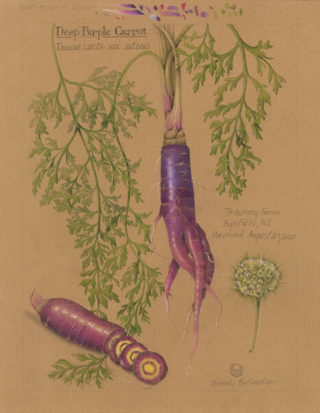
Throughout this refinement process, keep looking back-and-forth from your subject to your drawing. Ask, “Duller? Brighter? Darker? Lighter?” Then, do what needs to be done to make your drawing match your subject.
If your color is too bright, add complementary colors to dull it down. If your drawing is too light, add more layers of colors and darker tones for contrast. If you don’t know what to do next, take a break or try some small test samples first! Come back with fresh eyes, and you’ll figure it out. (Active subscribers can post progress photos to the Art Feed, and instructors will respond with positive feedback to help steer you in the right direction.)
In this Using Kraft Paper video, I give this gem of advice – “Smush your colors together! When in doubt, put a little of everything on there. Sometimes it works, I cross my fingers and hope for the best and sometimes I get a happy surprise.”
TRY THIS: Add final touches with dark sepia to darken your darkest shadows to bump up the contrast of your drawing.
FUN!
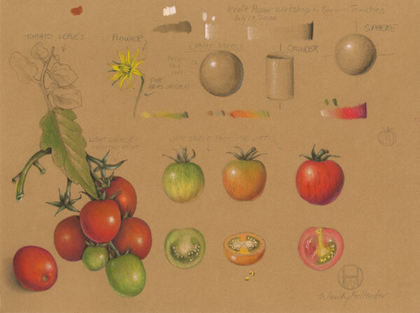
Just like athletes and musicians, artists enjoy developing their skills and sharing their talents. Kraft paper is much like a backhand in tennis in that practicing and mastering the art is an impressive feat!
TRY THIS: Once you learn the basics of light source,
- Practice drawing individual subjects that are simple shapes like spheres (ex. tomatoes) and cylinders (ex. branches, stems).
- Try multiple types of subjects of those simple shapes (ex. spheres: blueberries, oranges, grapefruits, etc.; cylinders: stems, pinecones, etc.).
- Then try subjects that combine multiple simple shapes (ex. mushroom = cylinder + cup, pear = sphere + cone, etc.)
- Keep finding new subjects and honing your craft!
I LOVE how kraft paper makes me think a bit differently, using the same ideal light source concepts in a new way. I have found so much joy in creating on kraft paper and hope that you will, too!
Join LIVE – Aug. 10 & 14, 2025
Tomatoes on Kraft Paper Zoom Workshop
Discover how the midtone tan of kraft paper acts as a perfect base, helping colors pop while allowing both shadows and highlights to shine. You’ll learn how to adjust your approach when working on toned paper and how to make the most of its warm, earthy surface. The best part of working on kraft paper is getting to add in bright highlights! Practice continuous toning from the lightest white to the darkest shadows to enhance your portrayal of its three-dimensional form. Explore how light interacts with… Learn more
Here are some of our Zoom Drawing Workshop Recordings to check out if you’re interested in kraft paper:
Want more info?
Take a look at these individual video lessons for Using Kraft Paper and White Flowers on Kraft Paper.

